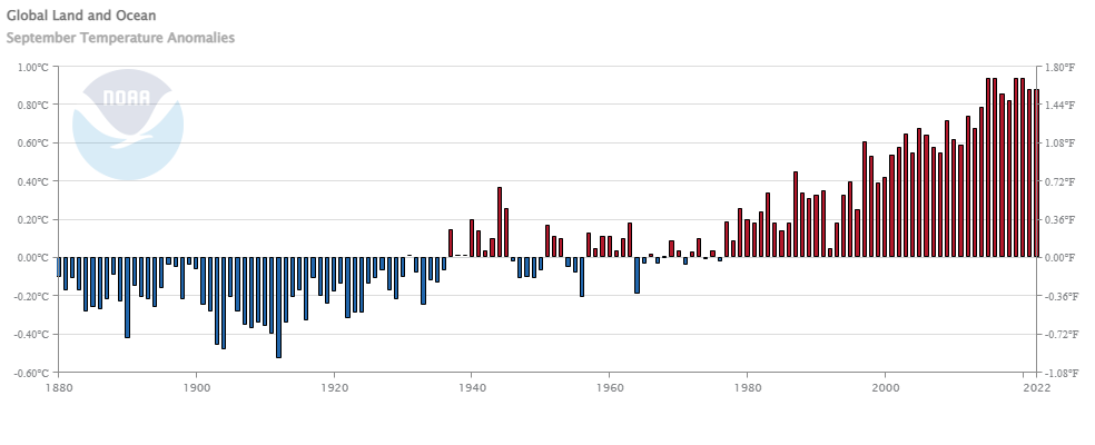
Are wildlife populations improving?

According to the Our World in Data article Wild mammals are making a comeback in Europe thanks to conservation efforts by Hannah Ritchie (9/27/2022) many mammal populations have increased as the chart shows.  The Eurasian beaver is thrilled:

The Eurasian beaver has made the most remarkable recovery. It’s estimated to have increased 167-fold, on average. There were likely only a few thousand beavers left in Europe in first half of the 20th century. Today there are more than 1.2 million.

Obtaining these estimate is a challenge and interesting:

For example, the result for Eurasian beavers is based on studies of 98 different populations. The grey wolf is based on 86 studies. For the Iberian lynx, high-quality time series were only available for 7 populations.

This means, for example, that the value of 16,705% for the Eurasian beaver means that there was, on average, a 16,705% increase in the numbers of beavers in each of the 98 populations that were included in this study. This does not mean that there was a 16,705% increase in all populations. Nor can we say that there was this level of increase for Eurasian beavers as a whole because we do not know the change in unmonitored populations, and the number of beavers in different populations will be different.

From a QL perspective it would be nice if the available data included the starting population size. It is also worth noting.

There are more than 250 European mammal species, so the ones that we covered here represent just 10% of the continent’s mammals. The fact that these species are doing well does not mean that all species are.

This article seems like it could be the basis for many projects.

How big is Ian’s storm surge?

If you go to NOAA’s Coastal Inundation Dashboard you can navigate the map and choose a station site. For example, here is the graph we get from selecting Naples FL.

If you’d like more information click on the Station Hope Page link at the bottom of the window that pops up when you select a station. From there use the top menu to select Station Info and then Data Inventory. On the next page select one of the categories by clicking on a bar. That will then take you to a page where you can select a date range and download the data by clicking the Data Only button on the bottom right.

Note that this is one location and others, even nearby, have different surges.

Who is driving U.S. population growth?

From Pew’s article Key facts about U.S. Latinos for National Hispanic Heritage Month by Jens Manuel Krogstad, Jeffrey S. Passel and Luis Noe-Bustamante (9/23/2022):

The U.S. population grew by 23.1 million from 2010 to 2021, and Hispanics accounted for 52% of this increase – a greater share than any other racial or ethnic group.

There is a great QL point here in that:

The 19% increase in the Hispanic population was faster than the nation’s 7% growth rate, but slower than the 23% increase in the Asian population.

In other words, the  Asian population grew faster but from a smaller count. There are numerous graphics in the article.

Has Lake Mead Improved?

Lake Mead saw a slight uptick in August after hitting a new low again in July. The graph clearly shows that the wet season, if we can call it that, is roughly November through March. Unfortunately a good year doesn’t even get 20 feet dating back to 2012. Lake Mead needs a 2011 year. I’ll check back in a few months. Data is from the Lower Colorado River Operation.  R code from the graph is linked on my July 2021 Lake Mead post.


Data here.

How much nuclear power does California use?

From the eia article Nuclear power provided about 10% of California’s total electricity supply (9/19/2022) by Slade Johnson and Katherine Antonio:

In 2021, three nuclear power plants supplied about 10% of California’s electricity. Diablo Canyon, located in San Luis Obispo County, is California’s last operating nuclear power plant, and it supplied over 8% of California’s electricity in 2021.

The graph provided is a little misleading because it is in-state generation but

California has the largest state economy in the United States and is the fourth-largest electricity producer in the nation, accounting for about 5% of U.S. utility-scale electricity generation in 2021. Because more electricity is consumed in California than is produced there, about 30% of its electricity supply is imported, and 36% of its nuclear electricity supply is imported,

In a state that an only generate about 60% of its electricity needs, one nuclear plant generates 8% of its needs. The article has links to the data.

How hot was Aug 2022?

From NOAA’s August 20022 Global Climate Report:

The August 2022 global surface temperature departure was the sixth highest for August in the 143-year record at 0.90°C (1.62°F) above the 20th century average of 15.6°C (60.1°F). The ten warmest Augusts on record have all occurred since 2009. August 2022 also marked the 46th consecutive August and the 452nd consecutive month with temperatures, at least nominally, above the 20th century average.

Highlights:

The contiguous U.S. had its eighth-warmest August on record. For the second month in a row, the contiguous U.S. monthly average minimum temperature was record warm.

Spain had its second-warmest August on record after August 2003.

The Royal Meteorological Institute confirmed that Belgium had its warmest August since records began in 1833.

Time series data is available at the top of the page.

What are the economic freedom rankings?

The Fraser Institute does an annual economic freedom report (9/8/2022), which ranks countries and interesting also states in the U.S. The main page includes an explanation of what goes in the economic freedom score. The most recent data, 2020, and the sub scores are available to download. The U.S. ranks as #7 overall, but as you can see by the map here there is considerable variable by state. They have put together an excellent interactive page, which is where the map here comes from, to explore the results in a number of formats. Great Stats/QL information here.

Do we have a new record for Greenland surface melt?

Obviously, I wouldn’t ask the question is the answer was no. The graph here is from the NSIDC Greenland Surface Melt Extent Interactive Chart. I’ve selected the years with notable peaks. The blue line is 2022 and we see what we might called a record late peak pushing about a week past the peak in 2003 (purple). Greenland surface melt data is available on the NSIDC site; start by clicking data at the top.

How much corn?

The image (2020), which I find fascinating, is from the NASA earth observatory article Falling for Corn:

The natural-color image above was acquired by the Moderate Resolution Imaging Spectroradiometer (MODIS) on Terra. The map below shows lands that were planted with corn in 2020 (marked in yellow). The map was built from the Cropland Data Layer product provided by the National Agricultural Statistics Service, which includes data from the USGS National Land Cover Database and from satellites such as Landsat 8, ResourceSat-2, and Sentinel-2.

That’s a lot of corn.

In its October 2021 report, USDA noted that corn production was up 3 percent this year, with an estimated 15 billion bushels of corn harvested from 93.3 million planted acres. Record-high yields were reported in ten states, including Illinois, Indiana, Kentucky, Michigan, and Ohio (all shown above).

More than one-third of the world’s corn is grown in the United States, and the largest share of it comes from a swath of land across the Midwest.

Together Iowa and Illinois grow and harvest about one-third of the entire U.S. crop, and each state alone produces more corn than many countries.

If you are looking for data check out the National Agricultural Statistics Service linked in the first quote. If you use GIS the National Land Cover Database is also a good data site. For a QL project, how do we understand 93.3 million acres?

How are teens using social media?

The Pew article Teens, Social Media and Technology 2022 by Emily A. Vogels, Risa Gelles-Watnick, and Navid Massarat (8/10/2022) is filled with data on teen social media use. I was a little surprised by the graph copied here and less surprised by this:

In addition, the share of teens who say they use the internet almost constantly has gone up: 46% of teens say they use the internet almost constantly, up from only about a quarter (24%) of teenagers who said the same in 2014-15.

I found this concerning:

In addition, the share of teens who say they use the internet almost constantly has gone up: 46% of teens say they use the internet almost constantly, up from only about a quarter (24%) of teenagers who said the same in 2014-15.

There are numerous charts and a methodology section. This article seems great for a stats or QL based course.