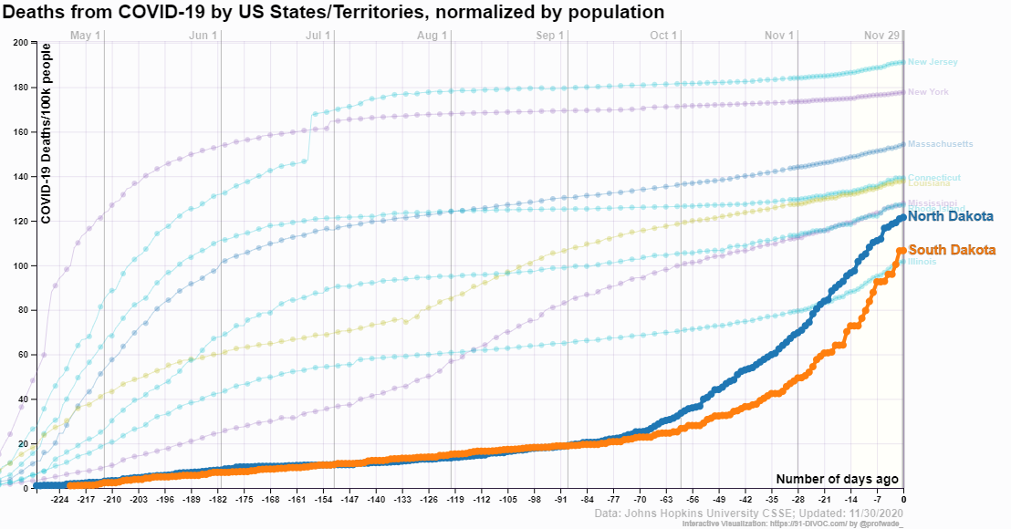
 The 91-DIVOC page An interactive visualization of the exponential spread of COVID-19 has excellent visualizations of state level data along with world data. For example, the graph downloaded from their visualization here is the top 10 states for deaths per 100,000 (day 0 is 11/30/2020). You might find it surprising the the Dakotas are in the top 10. The visualizations allow the user to select numerous categories and highlight selected elements. Each visualization has a csv link to download the data.
Fossil fuel free shipping?

This is not my typical post with charts, graphs, and data, but as a fan of both wood and boats the BBC article The futuristic cargo ship made of wood by Jocelyn Timperley (11/17/2020) is one I had to share.
In a small, rustic shipyard on the Pacific coast of Costa Rica, a small team is building what they say will be the world’s largest ocean-going clean cargo ship.
Ceiba is the first vessel built by Sailcargo, a company trying to prove that zero-carbon shipping is possible, and commercially viable. Made largely of timber, Ceiba combines both very old and very new technology: sailing masts stand alongside solar panels, a uniquely designed electric engine and batteries.
Ok, a little bit of data:
The global shipping sector emitted just over a billion tonnes of greenhouse gases in 2018, equivalent to around 3% of global emissions – a level that exceeds the climate impact of Germany’s entire economy.
A major study found shipping emissions rose by 10% between 2012 and 2018, and projected that they could rise up to 50% further still by 2050 as more and more things are shipped around the world.
Data on Sustainable Development Goals?
 The World Bank has 17 sustainable development goals and a portal to information about the goals as well as an abundance of data: Atlas of Sustainable Development Goals One path from this page is the World Development Indicators page:
The World Development Indicators is a compilation of relevant, high-quality, and internationally comparable statistics about global development and the fight against poverty. The database contains 1,600 time series indicators for 217 economies and more than 40 country groups, with data for many indicators going back more than 50 years.
One can explore data with interactive graph, query databases, or download data.
How hot was October 2020?
 From the NOAA Global Climate Report – October 2020:
The October 2020 global land and ocean surface temperature was the fourth highest for October since global records began in 1880 at 0.85°C (1.53°F) above the 20th century average of 14.0°C (57.1°F). Only Octobers of 2015 (+1.03°C / +1.85°F), 2019 (+0.95°C / +1.71°F), and 2018 (+0.93°C / +1.67°F) were warmer. The ten warmest Octobers have occurred since 2005, while the seven highest October temperature departures from average have occurred in the last seven years (2014–2020). October 2020 also marks the 44th consecutive October and the 430th consecutive month with temperatures, at least nominally, above the 20th century average.
Europe was warm:
According to NCEI’s regional analysis, Europe had its warmest October on record, with a temperature departure of +2.17°C (+3.91°F). This surpassed the previous record set in 2001 by 0.06°C (0.11°F).
For the year so far:
Averaged as a whole, this was the second warmest January–October for global land and ocean, with a temperature departure at 1.0°C (1.8°F) above the 20th century average. This value is only 0.03°C (0.05°F) shy of tying the record set in January–October 2016. According to our Global Annual Temperature Rankings Outlook, the year 2020 is very likely to rank among the three warmest years on record.
The data is available in the additional resources box near the top of the page.
How frequently are high tides occurring?
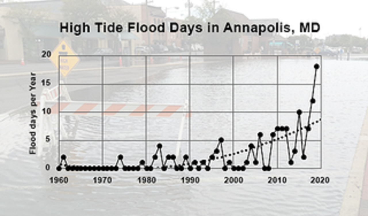
NASA’s Vital Signs of the Planet article Beating Back the Tides by Jenny Marder (11/11/2020) provides an update on the increasing frequency of high tides (see the graph copied here for one example).
Between 2000 and 2015, high-tide flooding in the U.S. doubled from an average of three days per year to six along the Northeast Atlantic, according to a 2018 NOAA report. It is especially common along the East Coast and Gulf Coast, where the frequency is up by roughly 200% over the last two decades. In some areas like Annapolis, the numbers are even more extreme. Annapolis had a record 18 days of high-tide flooding from May 2019 to April 2020, according to flooding thresholds for the city established by NOAA. That’s up from the previous record of 12 days in 2018. Before 2015, the record number of high-tide flood days in one year was seven, and the yearly average of high-tide floods from 1995 to 2005 was two.
The article includes a 7 minute video on high tide flooding. There is also a link to NOAA’s Tides and Currents page The State of High Tide Flooding and Annual Outlook. The page has a map of projected high tide flood days for 2020. For more detailed information, including lots of graphs, see the 2019 State of U.S. High Tide Flooding with 2020 Outlook technical report from NOAA.
Where are fish going?
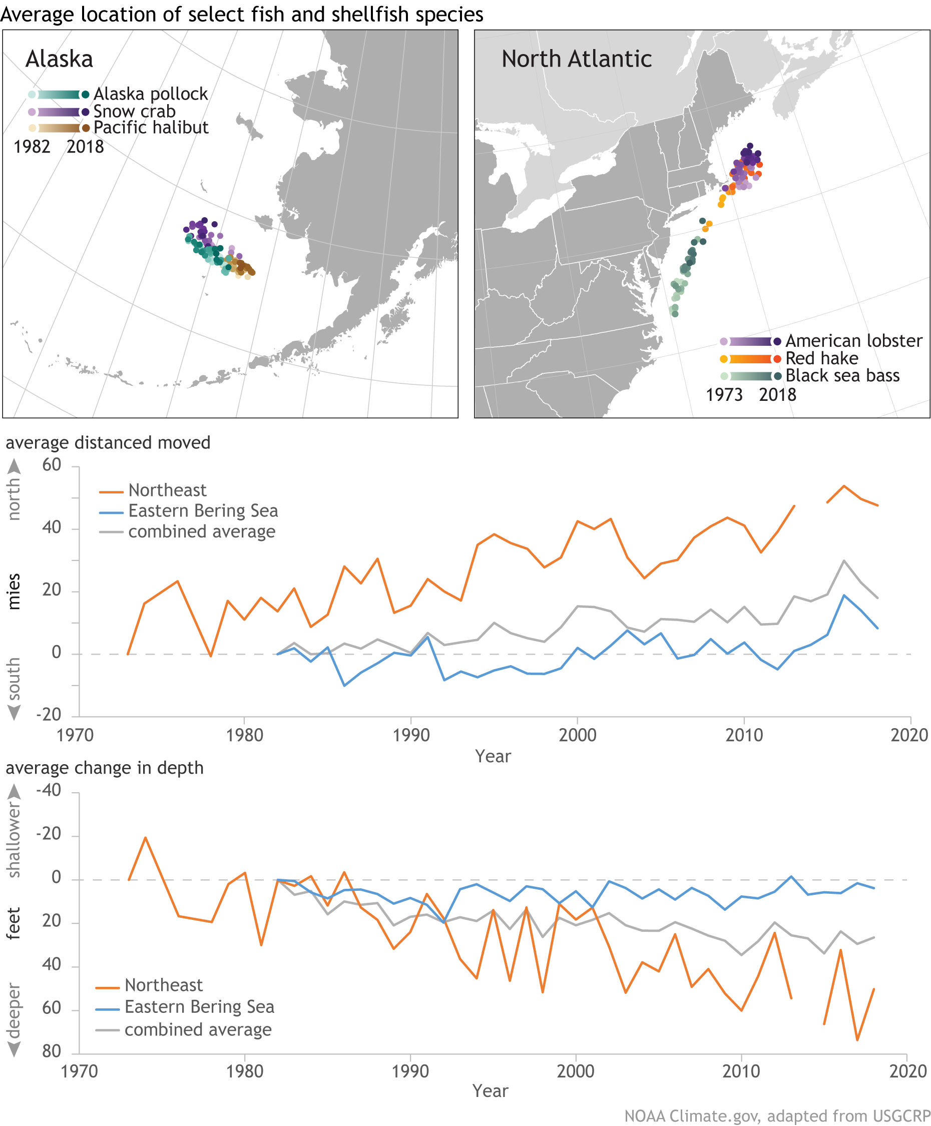
The Climate.gov article In search of cooler waters, marine species are shifting northward or diving deeper by John Dos Passos Coggin (4/3/2020) explains:
The graphs show the annual change in latitude and depth of 140 marine species along the northeastern U.S. coast and in the eastern Bering Sea. Changes in geographic distribution have been aggregated across all 140 species. In waters off the Northeast, fish and shellfish are moving northward at a significant rate; in the eastern Bering Sea, they are still shifting northward but at a lesser rate. Likewise, marine species in both regions are moving to deeper waters, but the rate of change in depth is especially high along the northeastern coast.
To learn more go to the GlobalChange.gov Marine Species Distribution page. On this page there is a link to oceanadapt.rutgers.edu to get data, although you will have to register.
Who earned the most in the 3rd quarter of 2020?

The U.S. Bureau of Labor Statistics has a Graphics for Economic News Releases page. The graph copied here is median usual weekly earnings of full-time wage and salary workers. Most of the patters are not a surprise, such as men earning more than women. What may be new here is that Asian women ($1224) out earned White men ($1122). Asian men out earned all others at $1542. The page includes seven other charts with the data.
Who Votes?
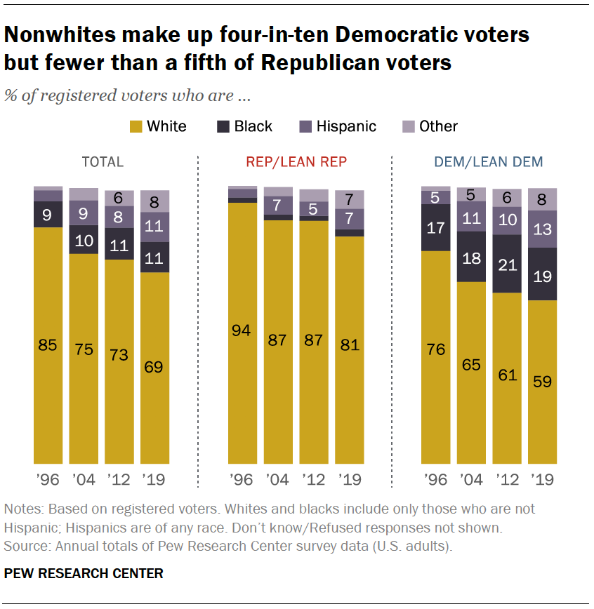 Pew has a summary of voter demographics by party in their article What the 2020 electorate looks like by party, race and ethnicity, age, education and religion by John Gramlich (10/26/2020). For example, see the graph copied here.
White Americans accounted for 67% of eligible voters nationally in 2018, but they represented a much larger share in several key battlegrounds in the Midwest and Mid-Atlantic, including Wisconsin (86%), Ohio (82%), Pennsylvania (81%) and Michigan (79%). The reverse was true in some battleground states in the West and South. For example, the White share of eligible voters was below the national average in Nevada (58%), Florida (61%) and Arizona (63%). You can see racial and ethnic breakdown of eligible voters in all 50 states – and how it changed between 2000 and 2018 – with this interactive feature.
Check out the interactive graph that is referenced in this quote, along with the half a dozen other graphs in the article. All great for a QL or stats based course.
How is the Greenland Ice Sheet Creating Change?
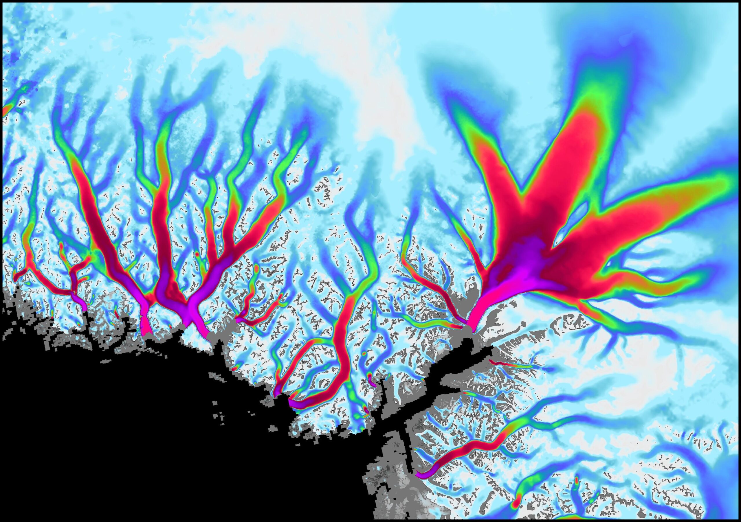
From NASA’s Vital Signs of the Planet feature Greenland’s Retreating Glaciers Could Impact Local Ecology (10/27/2020):
A new study of Greenland’s shrinking ice sheet reveals that many of the island’s glaciers are not only retreating, but are also undergoing other physical changes. Some of those changes are causing the rerouting of freshwater rivers beneath the glaciers, where it meets the bedrock. These rivers carry nutrients into the ocean, so this reconfiguring has the potential to impact the local ecology as well as the human communities that depend on it.
Some calculus language in the article:
Multiple studies have shown that the melting ice sheet is losing mass at an accelerating rate due to rising atmosphere and ocean temperatures, and that the additional meltwater is flowing into the sea.
The visualization copied here shows the flow velocity of the glaciers (white – slow, magenta – fastest). The article links to the ITS_LIVE data page with glacier data (mostly GIS). Greenland and Antarctica glacier mass times series data here.
How do we compare the racial differences in home ownership?
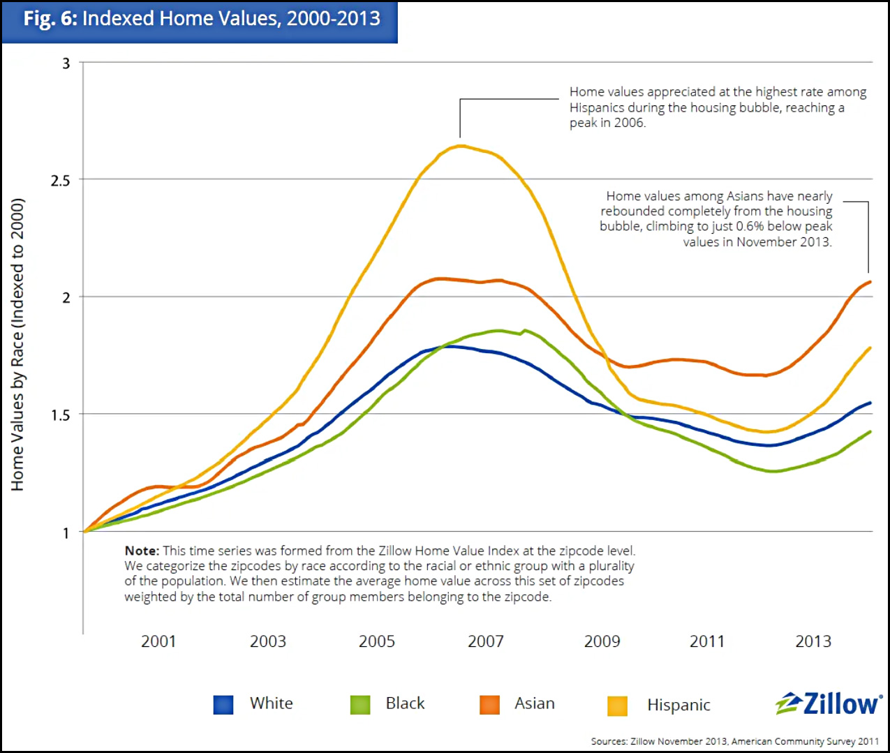 To address this question we start with a recent post by Kevin Drum (10/23/2020): Are Black Homeowners Suffering from Slow Price Growth?
There’s no question that homes in majority-Black neighborhoods are undervalued compared to similar homes in majority-White neighborhoods, but do they also appreciate more slowly?
The article goes through four charts with the last one copied here.
However, if I were forced to choose one of these as the most telling, I’d take the Zillow chart since its data covers the entire nation and it provides a useful time series that fits what I know about the bubble-era lending industry—although I’d sure like to see it extended to the present. It shows that over a somewhat longish term, home appreciation has been lower in Black neighborhoods than in white neighborhoods, primarily because of a huge drop following the housing bubble. The culprit here, however, is not Black neighborhoods per se, but the mortgage industry, which oversold to Black borrowers during the bubble and drove prices far higher than even normal bubble standards. That wretched episode has been documented in considerable detail in a lot of places, but you can read a good outline here if you want to learn more.
One of the articles linked to is Devaluation of housing in black neighborhoods, Part 2: Appreciation by Joe Cortright (7/24/2019):
A key question the Brooking’s report leaves unanswered is whether the black/white housing differential is larger or smaller than it was 10 or 20 years ago. If it was larger in the past and is smaller today, that implies that homes in majority black neighborhoods, although still undervalued relative to homes in predominantly white neighborhoods, have enjoyed greater relative appreciation. From the standpoint of wealth creation, the amount of appreciation since you bought your home is likely to matter more than whether the current price of your house is more or less than otherwise similar properties. Another way of expressing this is that homeowners in black neighborhoods had a lower purchase price (or basis) in their home, and even though it is still undervalued, it may have gained more value in percentage terms than homes in non-majority black neighborhoods.
Indeed, Dan Immergluck and his colleagues at the Georgia State University found that for those who bought homes in 2012, price appreciation for black homebuyers from 2012 through 2017 was higher than for white homebuyers. Immergluck’s data show that in most markets, homes bought by black buyers appreciated more than homes bought by white homebuyers.
This article also references the Zillow study, A House Divided – How Race Colors the Path to Homeownership by Skylar Olsen (1/15/2014), which includes a number of graphs related to homeownership by race. As Drum notes it would be nice if this study was updated.