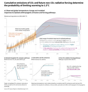
 The is too much in the new IPCC report (released this week) to cover here, but we can highlight a couple of points. The first is their graph copied here. The main graph provides projections for change in global temperature based on what happens to CO2 and non-CO2 radiative forcing gasses. For example, if net CO2 emissions reach zero by 2055 (CO2 emitted minus CO2 absorbed graph b) and non-CO2 gases are reduces (graph d), then we are likely to stay below the 1.5 °C threshold. What the graph does not say is what happens if society does nothing.
We recently posted about see level and here is an excerpt from the report about that:
Model-based projections of global mean sea level rise (relative to 1986-2005) suggest an indicative range of 0.26 to 0.77 m by 2100 for 1.5°C global warming, 0.1 m (0.04-0.16 m) less than for a global warming of 2°C (medium confidence). A reduction of 0.1 m in global sea level rise implies that up to 10 million fewer people would be exposed to related risks, based on population in the year 2010 and assuming no adaptation (medium confidence). {3.4.4, 3.4.5, 4.3.2}
The executive summary and/or the graphs could be used in QL rich courses.