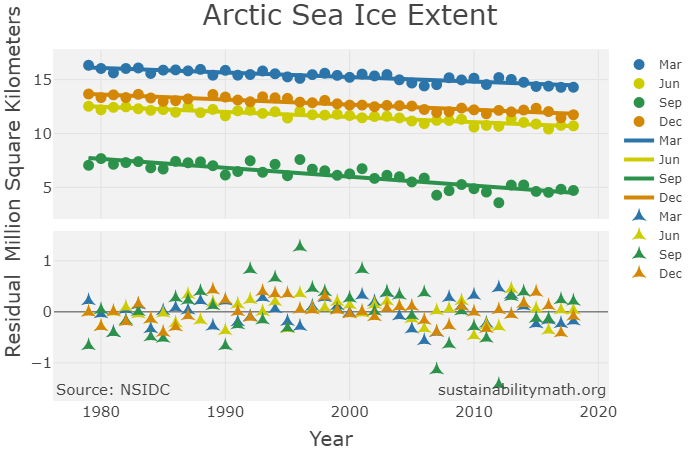
There are three more interactive graphs on the Interactive Graphs page for a total of five. One is Arctic Sea Ice extent by year for the months of March (high month), June, September (low month), and December, along with regression lines and residual plots (snapshot here). The other two represent the expected years to live at a given age. One of these is by race and gender, while the other is all females and males. Both graphs include a regression line and residual plot. The purpose of these graphs is to not only be interesting and informative, but to also be useful as classroom resource for projects or exercises.