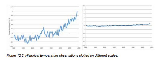
 If you would like to incorporate climate change in your math class, by say using the calculus or statistics project here, but you don’t feel like you know enough, then you need an overview for teachers. The Paleontological Research Institute has a teacher-friendly guide to climate change. The audience for the book, free in pdf form, is high school earth science and environmental science teachers, but it also works as a primer for those looking to add climate issues to their math class. There are useful graph and tidbits, such as FAQ 11 in Chapter 12 (see the graph copied here):
A second method that uses real data in order to create a false impression is manipulation of the scale on a graph. As discussed in the “warming hiatus” question above (Question 6), showing data over a very short time frame can be misleading. Similarly, using a vertical scale to either magnify or suppress a trend can also be misleading. For example, the temperature data plotted on the two graphs in Figure 12.2 is exactly the same (the same data from Question 5), but the scale has been expanded in the right-hand graph to compress the data and make the temperature increase appear non-existent. This procedure has been used by some who deny the existence or significance of climate change
to give an impression of “no problem.”
Chapter 6 in the text provides information specific to different regions in the U.S., which helps provide local background related to climate. All in all an excellent resource, especially if you want to know the basics so that you are comfortable raising climate issues in a math classroom.
