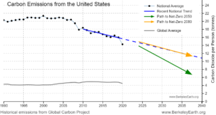
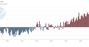
To answer the question Berkeley Earth has an interactive, What is your country’s carbon trend?, where you select a country and you get a table of information and a graph, such as the one copied here. The table of information provides such facts as the U.S. emits 14.2 tonnes per …
Read More »How much has your country warmed?
The Berkeley Earth page Actionable Climate Science for Policymakers has a Country-Level Warming Projections interactive graphic. Select a country and a graph, such as the one here for the U.S. appears. Click on the button below the graph, View More Details, and you will get extra text information and links …
Read More »What’s new from Tom?
This post is a bit of shameless self promotion, but since many of you that read this are in higher ed I thought you’d appreciate my post, Campuses Need Collaborative Decision-making More than Shared Governance, on the AAUP Academe blog. Feel free to click the link, leave a comment, and …
Read More »How hot was the UK?
I’m sharing this Washington Post article, Britain’s freakish heat demolishes records. Here’s what happened, because they have inserted this excellent graphic from Robert Rhode of Berkeley Earth. The graph says it all, but if you prefer words: The maximum temperature reached Tuesday in Coningsby, England — 130 miles north of …
Read More »Are there more animals than people in your county?
Here is one of a fun set of maps from the post Where is there more livestock than people? by the Data Stuff blog. The article links to the USDA site used to obtain the data. There are 7 other maps which are fun. One of them is a map …
Read More »How hot was June 2022?
From NOAA’s June 2022 Global Climate Report: The global surface temperature for June 2022 was the sixth-highest in the 143-year record at 0.87°C (1.57°F) above the 20th century average. This month was also 0.08°C (0.14°F) cooler than the warmest June on record set in 2019. The ten warmest Junes have …
Read More »ENSO, Alaska, and correlation, what’s the connection?
The climate.gov article Moose tracks through Alaska and ENSO by Brian Brettschneider (6/23/2022) is a great example of using statistics in a real world setting; in this case the Pearson correlation. The graph copied here is interesting but the footnote may be even more so: This statistical analysis uses the …
Read More »Which electricity generation uses the least land?
The Our World in Data article How does the land use of different electricity sources compare? by Hannah Ritchie (6/16/2022) looks to answer this question. Here is what they consider: To capture the whole picture we compare these footprints based on life-cycle assessments. These cover the land use of the …
Read More »How has the middle class changed?
The Pew article How the American middle class has changed in the past five decades by Rakesh Kochhar and Stella Sechopoulos (4/20/2022) has seven facts about changes in the middle class. Overall though, The share of adults who live in middle-class households fell from 61% in 1971 to 50% in …
Read More »How much has Lake Mead Dropped?
Lake Mead water levels continue to drop. At the end of May it was down to 1047.69 feet, which is a 13.8 foot drop since my post on April 25 with the end of March height. The west continues in drought according to the Drought Monitor. What about electricity generation? …
Read More »