What is the most recent PIP (poverty and inequity platform) update?

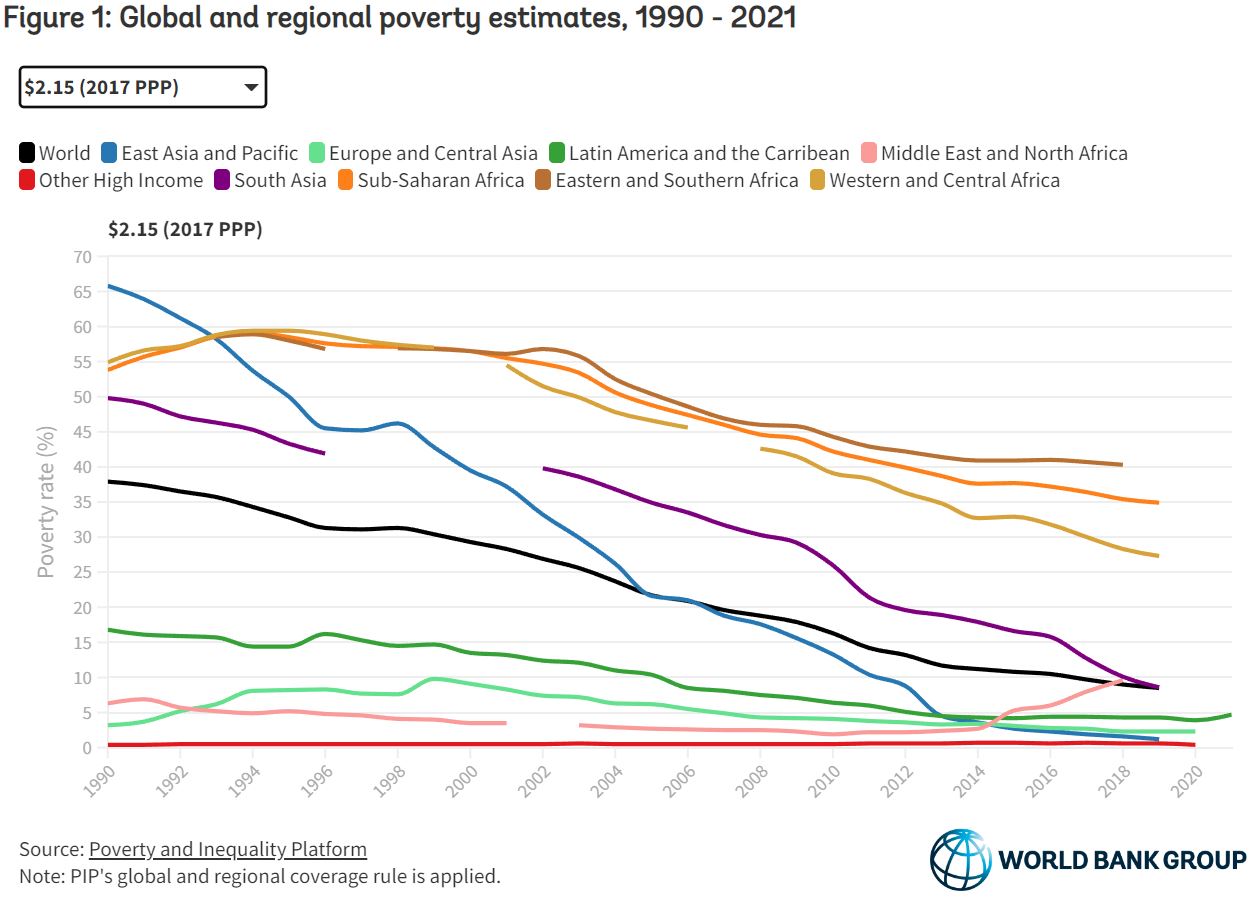
The World Bank article March 2023 global poverty update from the World Bank: the challenge of estimating poverty in the pandemic (3/29/2023) reports on poverty updates:

Global poverty estimates were updated today on the Poverty and Inequality Platform (PIP). This update includes new regional poverty aggregates in 2020 and 2021 for Latin America and the Caribbean, and in 2020 for Europe and Central Asia, and the group of advanced countries. These are the regions for which we now have sufficient survey data available during the COVID-19 pandemic. In total, 113 new country-years have been added, bringing the total number of surveys to more than 2,100.

The summary with calculus terms:

It is still the case that global poverty has been falling since the 1990s, and at a slower rate since 2014 (World Bank 2022). Extreme poverty has been falling in all regions, except the Middle East and North Africa due to conflict and fragility (World Bank 2020). Roughly 60% of the world’s extreme poor in 2019 lived in Sub-Saharan Africa alone, while 81% of the global poor at the poverty line of $3.6.

The PIP itself is a page worth exploring. It doesn’t look like much but if you start clicking you’ll find there is much to discover. Try the calculator on the bottom right of the graph or trying clicking a country.

How has electricity generation changed?

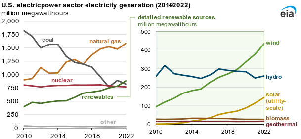
First some good news. The eia report Renewable generation surpassed coal and nuclear in the U.S. electric power sector in 2022 by Katherine Antonio (3/27/2023) notes

Last year, the U.S. electric power sector produced 4,090 million megawatthours (MWh) of electric power. In 2022, generation from renewable sources—wind, solar, hydro, biomass, and geothermal—surpassed coal-fired generation in the electric power sector for the first time. Renewable generation surpassed nuclear generation for the first time in 2021 and continued to provide more electricity than nuclear generation last year.

On the other hand, in 2021 solar, wind, hydro, and geothermal made up 18.5% of electricity generation and that moved to only 20.25% in 2022.  You can get his data from the electricity data browser from the eia. It is a great tool that provides graphs and downloads of the selected data.

What’s up with maternal mortality?

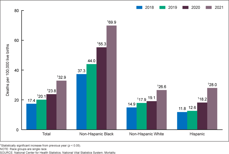
There has been some talk in the news about increasing maternal mortality in the U.S. This is due to the new CDC report Maternal Mortality Rates  in the United States, 2021 by Donna L. Hoyert (3/16/2023). The graph here is one from the report. Clearly the upward trend started before COVID and there is a racial difference. We should note that another graph shows upward trends by age group too.

Rates in 2021 were 20.4 deaths per 100,000 live births for women under age 25, 31.3 for those aged 25–39, and 138.5 for those aged 40 and over (Figure 2 and Table). The rate for women aged 40 and over was 6.8 times higher than the rate for women under age 25. Differences in the rates between age groups were statistically significant. The increases in the rates between 2020 and 2021 for each of these age groups were statistically significant.

The article includes a table of data and the number of births women 40+ have increased, which might explain some,  but not all, of the increase. Either way, the data is waiting for analysis is a statistics class.

As to the racial differences. In 2019 Kevin Drum reported on this in his post How Can We Reduce Black Maternal Mortality? He makes a case that the differences aren’t explained by racism; it is longish and worth reading.  A few quotes:

The differences in allostatic load are tiny—about the equivalent of one IQ point on an intelligence test—and Hispanics have a higher allostatic load than either blacks or whites but the lowest maternal mortality rate.

Poor blacks report less stress and higher levels of optimism than both poor whites and poor Hispanics. Put all this together and the toxic stress/weathering hypotheses look shaky.

What it seems to tell us is that there’s a difference in when black mothers die. Any pregnancy-related death within a year of delivery is counted as maternal mortality, and the difference in IHM rates suggests that in white hospitals black mothers die at high rates in the hospital, while in black hospitals they die at high rates after going home.
 

How are 35-44 year-olds doing?

There is a general narrative that younger generation are doing worse then older generations. When a narrative is “common knowledge” it is worth investigating if it is true or not. For the 35-44 year age range Kevin Drum has done just that in his post The (not kids anymore) are doing alright (3/2/2023). He has four graphs one of which is copied here. Some facts:

However, right now their unemployment rate is 2.6%, as low as it’s ever been.

Full-time workers are being paid more today than full-time workers of 20 years ago.

As with the full-time chart, annual earnings are higher now for 35-44 year-olds than they were 20 years ago.

This is not to say everything is perfect, but it does provide evidence that life isn’t that bad for the 35-44 cohort. The question then is why does this narrative exist?  The frustrating part here is this data is easily available at the BLS. Maybe journalist could take the time to look up a few facts before they make statements.


Where do I get a cool global temp poster?

From the NOAA article A look at all 173 of NOAA’s new global temperature maps by Rebecca Lindsey (2/17/2023):

Last week, NOAA National Centers for Environmental Information released a major update to the agency’s global surface temperature dataset. The new product tracks temperatures back to 1850, adding 30 additional years to the historical record, and it has complete geographic coverage over data-sparse areas at the poles.

In honor of the new release, Climate.gov has made a poster-size image showing global temperature patterns for every year in the new data set.

Enjoy the poster and put it to good use.


What is the new Antarctic sea ice minimum?

The Antarctic set a new record sea ice minimum at 1.788 million square kilometers beating out last years 1.924 million square kilometers. The graph here comes from the National Snow and Ice Data Center’s (NSIDC) Charctic Interactive Sea Ice Graph.  This is a great tool that allows the user to select Arctic or Antarctic, choose color schemes, and select the years to display. A link near the top right  corner of the graph allows users to download the data and the graph.

When are simple-cycle natural gas turbines used?

The eia article U.S. simple-cycle natural gas turbines operate at record highs in summer 2022 by Mark Morey (3/1/2023) reports:

The average monthly capacity factor for simple-cycle, natural gas turbine (SCGT) power plants in the United States has grown annually since 2020. Average capacity factors surpassed 20% for two consecutive summer months in 2022—the first time on record—to meet peak electricity demand, based on data from our Electric Power Monthly.

Why?

Electric grid operators can use SCGT power plants to respond quickly to fluctuating demand for electricity. The need for more electric grid support during the day is growing as the share of electricity generation from intermittent renewables grows. SCGT power plants can meet demand if there is a lull in wind or solar output. SCGT power plants can best provide grid support because they can produce electricity quickly to immediately fill gaps in electricity output on the grid, and they can ramp down just as quickly. Other natural gas-fired electricity generators, such as CCGT or steam boiler plants, can take two to three times longer than SCGT power plants to start and ramp up to full load.

The data is available from the article. Now, go and impress your friends with the fact that you know the difference between SCGT and CCGT.


How much time do teens spend with friends?

The  graph here come from the post The new CDC report shows that Covid added little to teen mental health trends  by Jon Haidt (2/16/2023). His thoughts on this graph:

Here you can see a clear covid effect from 2019 to 2020, for all of the age groups who are 25 and older. You can see how the lines bend downward between 2019 and 2020. But look closely at the line for the youngest group, ages 15-24, in blue. This age group used to spend 2 hours a day hanging out with friends because these are teens and young adults. Most are students, few are married. So 2 hours a day with friends was the norm right up to the time when teens traded in their flip phones for smartphones, in the early 2010s. Once they did that, they moved their social lives onto a few large social media platforms, especially Instagram, Snapchat, and later Tiktok. They were spending vastly more time online, even when they were in the same room as their friends, which meant that they had far less time for each other (in face-to-face interaction or physical play).

I suggest that this is why the effect of covid restrictions on teen mental health was not very large: Gen Z’s in-person social lives were decimated by technology in the 2010s. They were already socially distanced when Covid arrived.

Those of us in education are aware of the challenges teens face with the blame largely put on Covid.  Read Jon’s article as he makes a strong case that it isn’t Covid but trends that have been in play for a decade.

Has maternal mortality decreased?

The World Bank article Progress in reducing maternal mortality has stagnated and we are not on track to achieve the SDG target: new UN report by Emi Suzuki, Charles Kouame, and Samuel Mills (2/22/2023) provides an update on maternal mortality. The key summary:

Globally, the MMR dropped by 34% between 2000 and 2020, and maternal deaths either increased or stagnated in most regions between 2016 and 2020.

There are some issues here as the graph in the article is interactive but information can only be found for the years shown and not 2016. So why go from 2016 to 2020 and not from 2015 to 2020? A definition of stagnated would be helpful too. Based on the regions in the graph one could also simply say the world overall decreased with only one region really increasing (Latin America and the Caribbean). The good news is that there has been some real progress in the last 20 years. On the other hand, overall progress has slowed. This shouldn’t be surprising as early intervention likely have a bigger impact.

The article has a pie chart of the number of the deaths by region which is questionable as one really should normalize by population, as they do in the graph copied here. This is a good article for discussion in a QL course.