Tag Archives: calculus

How is the Greenland Ice Sheet Creating Change?

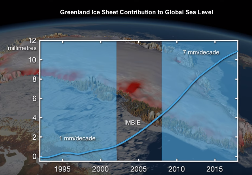
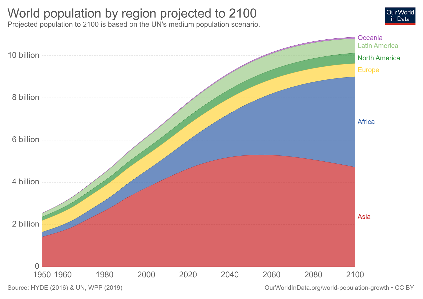
From NASA’s Vital Signs of the Planet feature Greenland’s Retreating Glaciers Could Impact Local Ecology (10/27/2020):

A new study of Greenland’s shrinking ice sheet reveals that many of the island’s glaciers are not only retreating, but are also undergoing other physical changes. Some of those changes are causing the rerouting of freshwater rivers beneath the glaciers, where it meets the bedrock. These rivers carry nutrients into the ocean, so this reconfiguring has the potential to impact the local ecology as well as the human communities that depend on it.

Some calculus language in the article:

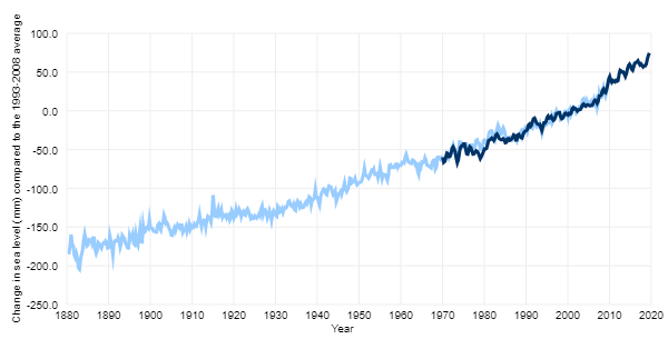
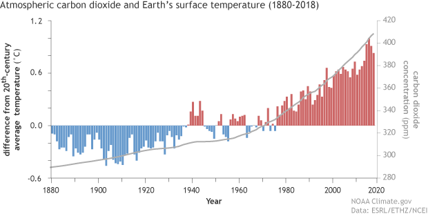
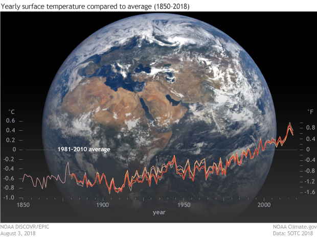
Multiple studies have shown that the melting ice sheet is losing mass at an accelerating rate due to rising atmosphere and ocean temperatures, and that the additional meltwater is flowing into the sea.

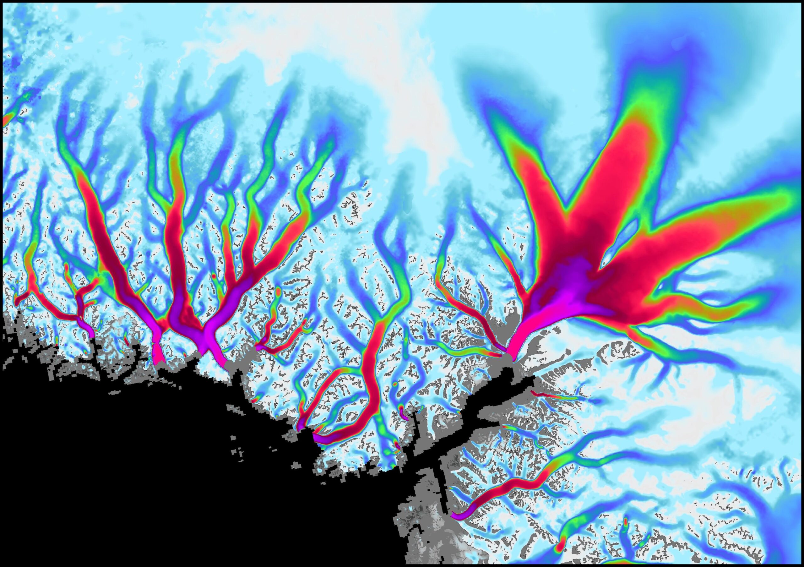
The visualization copied here shows the flow velocity of the glaciers (white – slow, magenta – fastest). The article links to the ITS_LIVE data page with glacier data (mostly GIS). Greenland and Antarctica glacier mass times series data here.

What’s new at sustainabilitymath?

There is now a new page that contains animations for concepts related to statistics and calculus. They are not sustainability related, but since I post materials for calculus and statistics and I have been playing with R, I decided to post these. There are 19 topics covered with 36 animations. In particular, if you teach calculus or statistics these animations may be helpful. So, go to the Animations page and take a look.

Where are COVID-19 predictions?

The COVID-19 Projections web page contains daily updates of predictions for COVID-19. For example, the graphs copied here provide predictions for deaths per day, total deaths, and the reproduction number. Users can select projections for individual states and countries. The pages provide full model details which can be useful for any course that studies SIR models. In brief:

To quickly summarize how an SEIR model works, at each time period, an individual in a population is in one of four states: susceptible (S), exposed (E), infectious (I), and recovered (R). If an individual is in the susceptible state, we can assume they are healthy but have no immunity. If they are in the exposed state, they have been infected with the virus but are not infectious. If they are infectious, they can actively transmit the disease. An individual who is infected ultimately either recovers or dies. We assume that a recovered individual’s chances of re-infection is low, but not zero. We can model the movement of individuals through these various states at each time period. The model’s exact specifications depend on its parameters, which we describe in the next section.

The model details page includes clear statements on the fixed parameters and variable parameters, as well as how they are estimated.  Along with the projections page there is an infections tracker page. Overall, there are numerous graphs, projections, and details about modeling.

How hot was 2019?

From the NOAA Global Climate Report – Annual 2019:

The year 2019 was the second warmest year in the 140-year record, with a global land and ocean surface temperature departure from average of +0.95°C (+1.71°F). This value is only 0.04°C (0.07°F) less than the record high value of +0.99°C (+1.78°F) set in 2016 and 0.02°C (0.04°F) higher than the now third highest value set in 2015 (+0.93°C / +1.67°F). The five warmest years in the 1880–2019 record have all occurred since 2015, …

The report contains summaries by region and has abundance of quantitative information such as:

North America was the only continent that did not have an annual temperature that ranked among its three highest on record. Overall, North America’s temperature was 0.90°C (1.62°F) above the 1910–2000 average, marking the 14th warmest year in the 110-year continental record. The yearly temperature for North America has increased at an average rate of 0.13°C (0.23°F) per decade since 1910; however, the average rate of increase is more than twice as great (+0.29°C / +0.52°F per decade) since 1981.

The graphic here is from NASA, NOAA Analyses Reveal 2019 Second Warmest Year on Record (1/15/2020). Time series data can be obtained from Climate at a Glance Global Time Series.


How much does Greenland melting contribute to sea level rise?

From NASA’s Greenland’s Rapid Melt Will Mean More Flooging (12/10/2019):

Increasing rates of global warming have accelerated Greenland’s ice mass loss from 25 billion tons per year in the 1990s to a current average of 234 billion tons per year. This means that Greenland’s ice is melting on average seven times faster today than it was at the beginning of the study period. The Greenland Ice Sheet holds enough water to raise the sea level by 24 feet (7.4 meters).

The graph here is a frame from a short video on the page that is worth watching.  The data for this graph does not seem to be easily available, but data on the melting of Greenland is available at NASA’s Vital Sings Ice Sheets page.

How much has sea level risen?

The Climate.gov post Climate Change: Global Sea Level by Rebecca Lindsey (11/19/2019) notes:

Global mean sea level has risen about 8–9 inches (21–24 centimeters) since 1880, with about a third of that coming in just the last two and a half decades. The rising water level is mostly due to a combination of meltwater from glaciers and ice sheets and thermal expansion of seawater as it warms. In 2018, global mean sea level was 3.2 inches (8.1 centimeters) above the 1993 average—the highest annual average in the satellite record (1993-present)

There are other graphs and information in the post. For example, What’s causing sea level to rise?

Global warming is causing global mean sea level to rise in two ways. First, glaciers and ice sheets worldwide are melting and adding water to the ocean. Second, the volume of the ocean is expanding as the water warms. A third, much smaller contributor to sea level rise is a decline in the amount of liquid water on land—aquifers, lakes and reservoirs, rivers, soil moisture. This shift of liquid water from land to ocean is largely due to groundwater pumping.

There are links to data at the end of the post and NOAA also has sea level data that is accessible.

How much energy will we use in the future?

The EIA article EIA projects nearly 50% increase in world energy usage by 2050, led by growth in Asia by ARi Kahan (9/24/2019) provides regional energy consumption projections by decade through 2050.  The report includes six other graphs including sources of energy.

With the rapid growth of electricity generation, renewables—including solar, wind, and hydroelectric power—are the fastest-growing energy source between 2018 and 2050, surpassing petroleum and other liquids to become the most used energy source in the Reference case. Worldwide renewable energy consumption increases by 3.1% per year between 2018 and 2050, compared with 0.6% annual growth in petroleum and other liquids, 0.4% growth in coal, and 1.1% annual growth in natural gas consumption.

The eia projects that even with the rapid growth of renewables they will only make up 28% of energy production. There are links to the data.

How closely linked are CO2 and Global Temperature?

The Climate.gov article, If carbon dioxide hits a new high every year, why ins’t every year hotter than the last by Rebecca Lindsey (9/9/19), provides a primer on the carbon dioxide and global temperature link, along with the role of the oceans.

Thanks to the high heat capacity of water and the huge volume of the global oceans, Earth’s surface temperature resists rapid changes. Said another way, some of the excess heat that greenhouse gases force the Earth’s surface to absorb in any given year is hidden for a time by the ocean. This delayed reaction means rising greenhouse gas levels don’t immediately have their full impact on surface temperature. Still, when we step back and look at the big picture, it’s clear the two are tightly connected.

There are nice rate of change statements:

Atmospheric carbon dioxide levels rose by around 20 parts per million over the 7 decades from 1880­–1950, while the temperature increased by an average of 0.04° C per decade.

Over the next 7 decades, however, carbon dioxide climbed nearly 100 ppm (5 times as fast!). . . . At the same time, the rate of warming averaged 0.14° C per decade.

There is another graph, a fun cartoon, and links to the data.

What happened with the Climate in 2018?

The NOAA article Reporting on the State of the Climate in 2018 by Jessica Blunden (8/12/19) summarizes key climate markers from 2018 such as

Last year was the fourth warmest year on record despite La Niña conditions early in the year and the lack of a short-term warming El Niño influence until late in the year.

Global sea level was highest on record. For the seventh consecutive year, global average sea level rose to a new record high in 2018 and was about 3.2 inches (8.1 cm) higher than the 1993 average, the year that marks the beginning of the satellite altimeter record.

Glaciers melted around the world. Preliminary data indicate that the world’s most closely tracked glaciers lost mass for the 30th consecutive year. Since 1980, the cumulative loss is the equivalent of slicing 79 feet (24 meters) off the top of the average glacier.

There are a number of graphs and plenty of quantitative information in this article.

In 2100, 80% or more of the population will live where?

The Our World in Data article More than 8 out of 10 people in the world will live in Asia or Africa by 2100 by Hannah Ritchie (7/15/19) includes the (interactive) chart copied here with population projections by the United Nations.

The United Nations projects that world population growth will slow significantly over the course of the 21st century, coming close to its peak at 10.9 billion by 2100.

The striking change between now and 2100 is the expected growth in the African population. Today, its population is around 1.3 billion; by 2100 it’s projected to more than triple to 4.3 billion.

North, Central and South America, and Oceania, are projected to also see a rise in population this century – but this growth will be much more modest relative to growth in Africa. Europe is the only region where population is expected to fall – today its population stands at around 747 million; by 2100 this is projected to fall to 630 million.

The chart and the data can be downloaded.