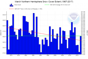
 NOAA has a page, Sea Ice and Snow Cover Extent, where you can create graphs for snow cover by four regions (Northern Hemisphere, North America and Greenland, Eurasia, and North America) for each month of the year. For example the graph here is for North America in March. The green line is the average and the red the trend. For each graph you can download the associated data or simply download the graph.
Tags climate change data source graph source ice snow
About Thomas J. Pfaff
Check Also
Is the world using less fossil fuels?
Nope. Wind and solar energy have increased, but so have coal, natural gas, and oil. …