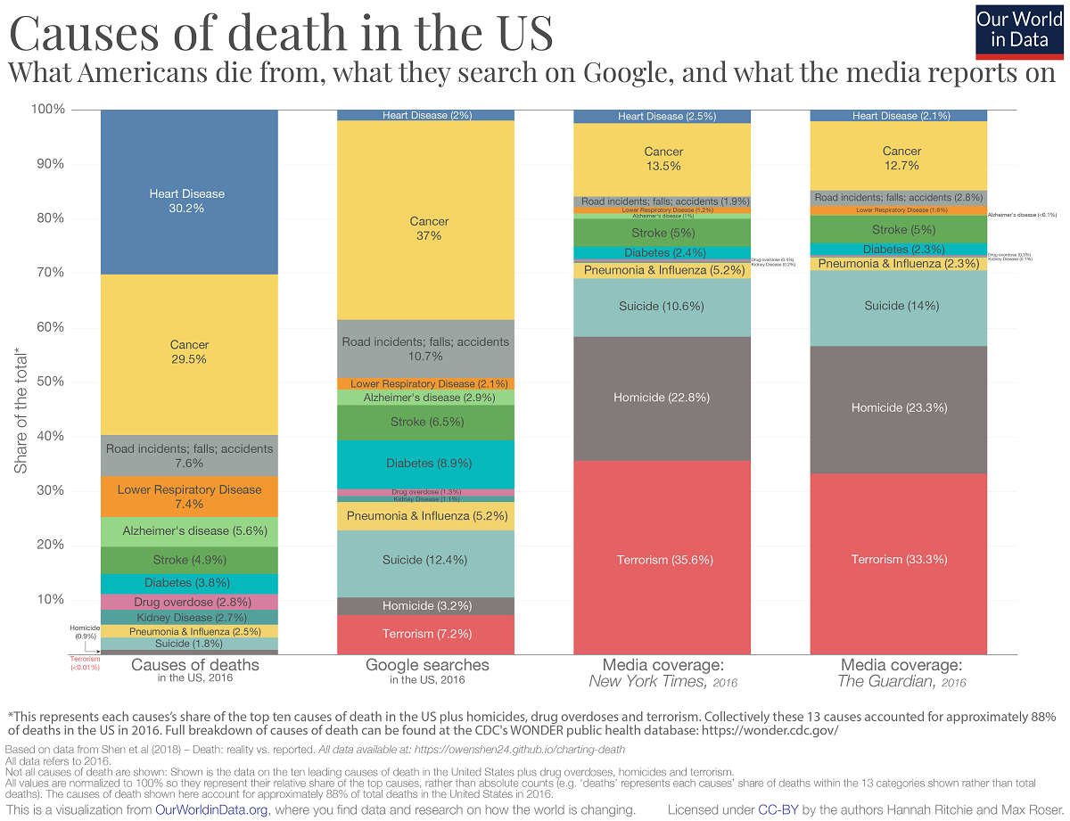
The Our World in Data article Does the news reflect what we die from? by Hannah Ritchie (5/29/19) provides data on causes of death, google searches, and media reports by the NYT and the Guardian. The graph copied here is for 2016. As you can see there is a big disconnect. Why does this matter?
Media and its consumers are stuck in a reinforcing cycle. The news reports on breaking events, which are often based around a compelling story. Consumers want to know what’s going on in the world — we are quickly immersed by the latest headline. We come to expect news updates with increasing frequency, and media channels have clear incentives to deliver. This locks us into a cycle of expectation and coverage with a strong bias for outlier events. Most of us are left with a skewed perception of the world; we think the world is much worse than it is.5
The article has four time series from 1999 to 2016 (2004 to 2016 for google searches) corresponding to each of the four categories in the chart here. The charts are interactive and the data is available.
Footnote 5 is worth noting and Factfulness in worth reading: There are many results which show we have a negative bias of global progress. Factfulness, published by the Roslings, is packed with public survey results of Gapminder’s Ignorance Test. The test shows that the vast majority of people get the most basic questions on global development wrong (nearly always thinking the world is in a worst state than it is).