 Climate.gov has put together a dashboard: Global Climate Dashboard – Tracking climate change and natural variability over time. The dashboard has graphs and information for greenhouse gases, arctic sea ice carbon dioxide, mountain glaciers, ocean heat, sea level, spring snow, incoming sunlight, and surface temperature under climate change (there are others under Natural Variability). This provides a nice one stop shopping for time series graphs for these variables.
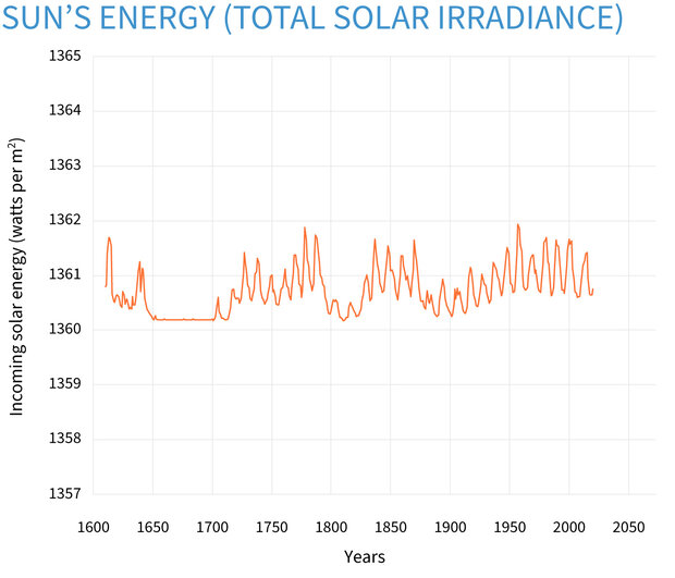
For example, copied here is the graph for incoming sunlight:
Averaged over the complete solar cycle, there’s been minimal long-term change in the Sun’s overall brightness since the start of the Industrial Revolution. Records of sunspots show increased solar activity during the first 7 decades of the 20th century, likely tied to the peak of the last 100-year Gleissberg Cycle. Following that peak around 1960, solar activity declined. In fact, activity during the most recent solar cycle is among the lowest in a century. Meanwhile, the rate of global warming has accelerated over the past few decades.
Each variable is linked to a page with detailed information about the given variable. There don’t appear to be direct links to data but there are plenty of graphs.