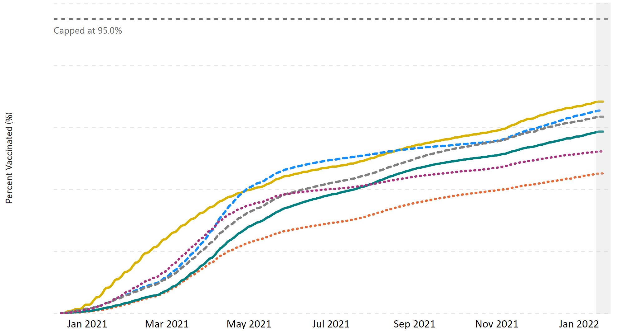
If you want data on vaccinated status the CDC page Demographic Trends of People Receiving COVID-19 Vaccination in the United States is a place to go. For example, one graph from their page is copied here and includes at least one dose by Race/Ethnicity. The graph are designed for interactivity so you don’t see categories and percent without placing a mouse pointer over the graph. Curious about the categories, then click the link.
What is interesting is they have administered data, the graph here, but also results from survey data. They aren’t the same. This seems like something to discuss or study in a stats or QL course. There are multiple interactive graphs and plenty of quantitative information.