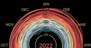
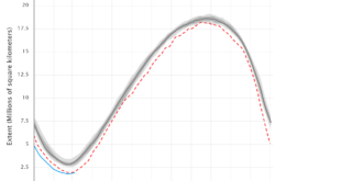
Climate Reanalyzer has an interactive time series chart of ocean temperatures. The dark black line at the top is the current year and shall we say we are in uncharted waters. It would be nice if this graph was colored by ENSO status in the way NOAA has a global …
Read More »How fast are seas rising?
The NASA post NASA Uses 30-Year Satellite Record to Track and Project Rising Seas (3/17/2023) has this to say (with calculus language): Since satellites began observing sea surface height in 1993 with the U.S.-French TOPEX/Poseidon mission, the average global sea level has increased by 3.6 inches (9.1 centimeters), according to NASA’s Sea …
Read More »What’s new as sustainabilitymath?
The calculus projects page has been updated with the most recent data available. Most of the trends didn’t change but solar did and hence there were some changes in the countries used in the graphs. There is also an updated Excel curve fitting directions for those using Excel (consider using …
Read More »What is the most recent PIP (poverty and inequity platform) update?
The World Bank article March 2023 global poverty update from the World Bank: the challenge of estimating poverty in the pandemic (3/29/2023) reports on poverty updates: Global poverty estimates were updated today on the Poverty and Inequality Platform (PIP). This update includes new regional poverty aggregates in 2020 and 2021 for …
Read More »How has electricity generation changed?
First some good news. The eia report Renewable generation surpassed coal and nuclear in the U.S. electric power sector in 2022 by Katherine Antonio (3/27/2023) notes Last year, the U.S. electric power sector produced 4,090 million megawatthours (MWh) of electric power. In 2022, generation from renewable sources—wind, solar, hydro, biomass, …
Read More »What’s up with maternal mortality?
There has been some talk in the news about increasing maternal mortality in the U.S. This is due to the new CDC report Maternal Mortality Rates in the United States, 2021 by Donna L. Hoyert (3/16/2023). The graph here is one from the report. Clearly the upward trend started before …
Read More »What is a climate spiral?
NASA calls this a climate spiral. The visualization is well done, so watch it. The NASA page includes a link to the data used to make the visualization.
Read More »How are 35-44 year-olds doing?
There is a general narrative that younger generation are doing worse then older generations. When a narrative is “common knowledge” it is worth investigating if it is true or not. For the 35-44 year age range Kevin Drum has done just that in his post The (not kids anymore) are …
Read More »Where do I get a cool global temp poster?
From the NOAA article A look at all 173 of NOAA’s new global temperature maps by Rebecca Lindsey (2/17/2023): Last week, NOAA National Centers for Environmental Information released a major update to the agency’s global surface temperature dataset. The new product tracks temperatures back to 1850, adding 30 additional years to the historical …
Read More »What is the new Antarctic sea ice minimum?
The Antarctic set a new record sea ice minimum at 1.788 million square kilometers beating out last years 1.924 million square kilometers. The graph here comes from the National Snow and Ice Data Center’s (NSIDC) Charctic Interactive Sea Ice Graph. This is a great tool that allows the user to …
Read More »