 The eia article Mixed water supply condition across western states affects 2023 hydropower outlook by Lindsay Aramayo (5/10/2023) has this to say
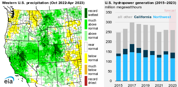
Record-breaking rain and snow in parts of the western United States contribute to our forecast 72% rise in hydropower generation in California this year compared with last year, according to our latest Short-Term Energy Outlook (STEO). However, below-normal precipitation and a mixed water supply outlook in the Pacific Northwest, which generates a significant portion of the country’s hydropower, offset the forecast increase in hydropower generation in California.
Interestingly,
The Pacific Northwest houses more than one-third of U.S. hydropower capacity and produces about half of the country’s total hydropower, on average.
There is another graph in the article and more about hydropower, as well as links to the data.