Where Do Carbon Emissions Go?

Where do carbon emissions go seems like an obvious question. Into the air of course. If so, then one would expect a near perfect linear relationship between emissions and atmospheric CO2.  The graph here has yearly carbon emissions in million tonnes per year (as reported by the Global Carbon Project)  vs atmospheric CO2 in ppm from Mauna Loa (see data in the calculus project page).  The graph may not be as linear as expected and, while maybe some of it is explained by issues of mixing in the atmosphere or the need for a lag, part of the answer is based on where the carbon goes after it has been emitted.  A recent NYT article, Carbon in the Atmosphere is Rising – Even as Emissions Stabilize, sheds some light on the issue:
Scientists have spent decades measuring what was happening to all of the carbon dioxide that was produced when people burned coal, oil and natural gas. They established that less than half of the gas was remaining in the atmosphere and warming the planet. The rest was being absorbed by the ocean and the land surface, in roughly equal amounts.

In essence, these natural sponges were doing humanity a huge service by disposing of much of its gaseous waste. But as emissions have risen higher and higher, it has been unclear how much longer the natural sponges will be able to keep up.

In fact, much of the carbon is absorbed in the ocean and land surface, and that will add variability to the relationship. The Global Carbon Project has this data available and it can be used by teachers. Go to their page and click on the global budget link for the data, which includes ocean and land sinks of carbon.  If you want the data that created the graph on this page go here.

Oceans as a Heat Sink: Possible Feedback Loop

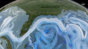
Ocean currents are a complex mechanism that contribute to absorbing CO2 and heat. The NASA article, NASA-MIT study evaluates efficiency of oceans as heat sink – atmospheric gases sponge, discusses the role of ocean currents as part of climate change. The possible feedback loop is suggested by this:

In addition, they found that in scenarios where the ocean current slows down due to the addition of heat, the ocean absorbs less of both atmospheric gases and heat, though its ability to absorb heat is more greatly reduced.

The article includes this must see 40 seconds animation of ocean currents and a engaging 3D graph with the depth of the ocean as the z-axis:

Life Expectancy vs Income Per Person

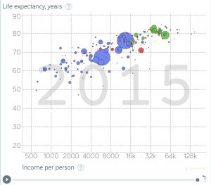
With health care in the news, let’s take a look at the knowledge that can be gained by using Gapminder. For example, the graph here is life expectancy vs income per person for 2015, with the bubbles representing population size of the country. Can you guess the bubble for the U.S.? Go to the graph on Gapminder to find out.  As a bonus their is a play button so that the graph will scroll from 1800 to 2015. You will also find a number of tools to change the graph and create others. All the data used by the Gapminder graphs is located on their data page.

New Data: Pretax Income Growth

How much has pretax income grown by earner percentiles? The graph here, from Chicago Booth Review’s article New Data: Inequality Runs Deeper than Previously Thought, provides the answer.

So Piketty, Saez, and Gabriel Zucman of University of California at Berkeley combined tax, survey, and national-accounts data to create distributional accounts that they say capture 100 percent of US income since 1913. The new accounts include transfer payments, employee fringe benefits, and capital income, which weren’t in previous data.

The data set reveals since 1980 a “sharp divergence in the growth experienced by the bottom 50 percent versus the rest of the economy,” the researchers write. The average pretax income of the bottom 50 percent of US adults has stagnated since 1980, while the share of income of US adults in the bottom half of the distribution collapsed from 20 percent in 1980 to 12 percent in 2014. In a mirror-image move, the top 1 percent commanded 12 percent of income in 1980 but 20 percent in 2014. The top 1 percent of US adults now earns on average 81 times more than the bottom 50 percent of adults; in 1981, they earned 27 times what the lower half earned.

If you click on the top right of the graph in the article and go to edit chart you can get a table of the data used for the chart.  Great for use in a QL or stats course. Of course Piketty and Saez are know for creating the World Wealth and Income Database, which we have highlighted on this blog before.

A Trillion Ton Iceberg

Map of Larsen C, overlaid with NASA MODIS thermal image from July 12 2017, showing the iceberg has calved

If you have been following this blog you might know that we are talking about Larsen C. Project MIDAS reports: Larsen C calves trillion ton iceberg. What does this mean?

The iceberg weighs more than a trillion tonnes (1,000,000,000,000 metric tonnes), but it was already floating before it calved away so has no immediate impact on sea level. The calving of this iceberg leaves the Larsen C Ice Shelf reduced in area by more than 12%, and the landscape of the Antarctic Peninsula changed forever.

The article also notes:

Whilst this new iceberg will not immediately raise sea levels, if the shelf loses much more of its area, it could result in glaciers that flow off the land behind speeding up their passage towards the ocean. This non-floating ice would have an eventual impact on sea levels, but only at a very modest rate.

There is now some interesting modeling of where the iceberg will go and how long it will take to melt.  There should be a good differential equations project in here. Please read the full article, which includes a nice picture of the full break in the ice. Quiz question: What melting ice will have a significant impact on sea level?

Arctic Ice and Global Warming

An article from this past February, Rapid warming and disintegrating polar ice set the stage for ‘societal collapse’ – Carbon pollution is destabilizing both the Arctic and Antarctic, provides a nice overview of issues of warming and ice. For instance, there is the albedo feedback loop:

Climate models have long predicted that if we keep using the atmosphere as an open sewer for carbon pollution, the ice cap would eventually enter into a death spiral because of Arctic amplification — a vicious cycle where higher temperatures melt reflective white ice and snow, which is replaced by the dark land or blue sea, which both absorb more solar energy, leading to more melting.

The graph here is historical January Arctic ice extent and the data can be downloaded from the National Snow and Ice Data Center Sea Ice Data and Analysis Tools page.  Go to Sea ice analysis data spreadsheets and then to monthly data by year. As you’ll see there is other data there worth exploring. There are projects using Arctic ice data on both the calculus and statistics pages on this blog. If you are a real ice junkie take a look at the interactive sea ice graph and keep track of the current ice extent.  Finally, as a reader of this blog you know that you can make your own global temperature maps like the one in the article from reading April Second Warmest on Record.


Who eats more fast food the poor or wealthy?

Data helps us understand the world as it really is as opposed to what we think is true. The article Do poor people eat more junk food than wealthier American? uses the Bureau of Labor Statistics longitudinal data, accessible in the article, to answer the question.

Because it’s considered relatively inexpensive, there’s an assumption that poor people eat more fast food than other socioeconomic groups – which has convinced some local governments to try to limit their access.

Read the article to learn more and take advantage of the data sources for statistics or QL courses.

Fact Checking Coal Mining Jobs

The Washington Post’s Fact Checker article Pruitt’s claim that ‘almost 50,000 jobs’ have been gained in coal includes links to the Bureau of Labor Statistics data for each of their three screen shots of spreadsheets that back up their statements. The article notes:

In the last four months of the Obama administration, September to January, there was a gain of 1,400 jobs. In the first four months of the Trump administration, there has been a gain of 1,000 jobs.

While not part of the article, the graph here from the BLS is seasonally adjusted coal mining jobs since 1985.  Interestingly there was a drastic decline in coal mining jobs from 1985 until about 2000.

Worldwide LGBTQ Rights Scorecard with Data and Methodology

Most countries score an F on our LGBT human rights report card is a recent article in The Conversation.

Our research gives most countries in the world a failing grade in LGBTQ rights, reflecting widespread persecution of sexual minorities. Only one country in 10 actively protects the human rights of sexual minorities.

The article includes three charts with data that can be used in a statistics or QL based course.  There is also a link to the related paper, Human Rights and the Global Barometer of Gay Rights (GBGR): A Multi-Year Analysis, that describes the methodology used in the rankings.

Glacier Pairs

NASA’s Global Ice Viewer for Glaciers provides stunning pairs of images of glaciers taken many years apart at the same location. The viewer starts with a map of the world with links for seven locations. Each link brings you to glacier pair images from that location with information about the images. For example, here is a pair of images from Bear Glacier in the Alaskan Range. The top image was taken on July 20, 1909 and the second on Aug 5, 2005. Here is what the site says about glaciers:

Glaciers are sentinels of climate change. Ice that took centuries to develop can vanish in just a few years. A glacier doesn’t melt slowly and steadily like an ice cube on a table. Once glacial ice begins to break down, the interaction of meltwater with the glacier’s structure can cause increasingly fast melting and retreat.

Widespread loss of glaciers would likely alter climate patterns in complex ways. Glaciers have white surfaces that reflect the sun’s rays.  This helps keep our current climate mild. When glaciers melt, darker surfaces are exposed, which absorb heat.  This raises temperatures even more.