Arctic Sea Ice Visual

Thanks to the folks at the NASA Scientific Visualization Studio for this visualization of Annual Arctic Sea Ice Minimum 1979-2015 with Area Graph (click on the visual to play). Arctic ice data is available in the calculus and statistics sections. A recent Economist article The thawing Arctic threatens an environmental catastrophe adds some context.

The Arctic has been warming at twice the rate of the rest of the world for decades because of feedback loops that have reduced the albedo effect, a measure of the way Earth reflects heat. Unlike the rest of the planet the polar regions release more heat into space than they absorb, in effect cooling the planet, because sunlight is reflected by ice and snow. When it is replaced by water or dark ground, more heat is retained. That is precisely what is happening in the Arctic’s defrosting landscape.

Climate Change, Melting Permafrost, and Disease

This blog has already noted a the feedback loop from melting permafrost, Methane Bubbles – A Feedback Loop. A recent BBC article, There Are Diseases Hidden In Ice And They Are Waking Up – Long-dormant bacteria and viruses, trapped in ice and permafrost for centuries, are reviving as Earth’s climate warms, is a well referenced article about the possible consequences of melting permafrost (picture from the article with caption: Bacteria have been found dormant in Antarctic ice (Credit: Colin Harris/Era Images/Alamy)).

“Permafrost is a very good preserver of microbes and viruses, because it is cold, there is no oxygen, and it is dark,” says evolutionary biologist Jean-Michel Claverie at Aix-Marseille University in France. “Pathogenic viruses that can infect humans or animals might be preserved in old permafrost layers, including some that have caused global epidemics in the past.”

If you are incorporating climate change issues in the classroom then the article provides for excellent classroom discussions with interesting science. The article concludes:

How much should we be concerned about all this?

One argument is that the risk from permafrost pathogens is inherently unknowable, so they should not overtly concern us. Instead, we should focus on more established threats from climate change. For instance, as Earth warms northern countries will become more susceptible to outbreaks of “southern” diseases like malaria, cholera and dengue fever, as these pathogens thrive at warmer temperatures.

The alternative perspective is that we should not ignore risks just because we cannot quantify them.

“Following our work and that of others, there is now a non-zero probability that pathogenic microbes could be revived, and infect us,” says Claverie. “How likely that is is not known, but it’s a possibility. It could be bacteria that are curable with antibiotics, or resistant bacteria, or a virus. If the pathogen hasn’t been in contact with humans for a long time, then our immune system would not be prepared. So yes, that could be dangerous.”

It would be nice if these articles discussed the populations most at risk. It is often the case that those of lower socioeconomic status are more vulnerable.  Many issues related to climate change have both a social justice component, as well as an ethical question related to the fact that those that contribute little to climate change are often impacted disproportionately.

Is Life Fair or Not?

Stats classes are always looking for interesting data. One place to look in YouGov. For example, they did a poll (Note: it is not clear how the sample was obtained but they do provide a sample size.) asking people if life is fair.  Here are the results by gender.

  1. Do you think life is fair or not fair?
% TOTAL Male Female
Life is fair 38 46 31
Life is not fair 46 40 51
Not sure 16 14 18

You are set for a statistical test comparing Male vs Female perception of life being fair or not. This now allows for a discussion of why women would respond differently than men. One extra bonus on the site is you can look at the same questions broken down by other categories including income. Go to the YouGov Results page to see the data they have.

Larsen C in the News

The crack in the Larsen C ice shelf has been in the news recently. For instance Newsweek’s Another Huge Crack has Appeared on the Antarctica’s Larsen C Ice Shelf or the BBC’s The Crack that is Redrawing the World’s Map. Both articles seem to stem from the Project Midas news release A new branch of the rift on Larsen C (they made the map here).  The Newsweek article notes:

Current projections indicate that if the Larsen C ice shelf disintegrates, it could raise sea levels by up to 10cm.

A NASA report, Breaking the ice: Antarctic rifts and future sea level is a little more precise:

Yet even if the whole ice shelf were to break up, Fricker said, the resulting sea level rise would be minimal. The glaciers held back by the shelf are not so imposing.

“The Larsen C ice shelf only holds back about one centimeter of global sea level rise,” she said.

Still, the crack in Larsen C could be a bellwether for ice shelves elsewhere on the continent, Rignot said.

“What we are seeing on Larsen C has implications for the big ice shelves farther south that hold considerable (sea level) potential,” he said. The loss of these larger ice shelves and the resulting acceleration of glacial calving could amount to meters of sea level rise in the decades and centuries to come.

The NASA article does provide some balance:

Ice shelf demise, or business as usual?

The crack could be the start of a period of sustained retreat, similar to what happened to Larsen B, said Ala Khazendar, a JPL scientist who has investigated both Larsen B and Larsen C. An increasingly weakened ice shelf allows glaciers to speed their flow into the ocean, and the shelf, unable to recover its former bulk and solidity, disintegrates.

Or, this could turn out to be a normal calving episode.

“We have no way yet of knowing whether Larsen C is doing what Larsen C has been doing for thousands of years, or whether we are witnessing the beginning of the end of Larsen C,” he said.

If you are talking about climate change in the classroom, the NASA article is excellent for further readings and discussion as well as the Project Midas site. There is some interesting science here in understanding ice.

Greenland Ice Mass and Data

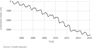
Vital Signs of the Planet from NASA is a place for graphs and data. The graph here is change in the mass of the Greenland Ice Sheet. On the Land Ice page there is also a graph of changes in the Antarctica Ice. Underneath each graph is a link to data (HTTP), which will give you data for both Greenland and Antarctica ice as well as sea level change. All three sets can be used for linear regression or multiple regression predicting sea level change based on both ice mass changes (recall that melting sea ice doesn’t raise sea levels but land ice does).

A Record Warm March

A NOAA news report, Global Climate Report – March 2017 Monthly temperature anomalies versus El Niño, provides us with the graph here of monthly temperature colored coded by ENSO events. The report notes that

March 2017 marks the first time since April 2016 that the global land and ocean temperature departure from average is greater than 1.0°C (1.8°F).

This is also the first time a monthly temperature departure from average surpasses 1.0°C (1.8°F) in the absence of an El Niño episode in the tropical Pacific Ocean.

March 2017 tied with January 2016 as the fifth highest monthly global land and ocean temperature departure from average on record (1,647 monthly records).

Atmospheric CO2 growth

According to the NOAA report Carbon dioxide levels rose at record pace for 2nd straight year (graph here from their report).

“The rate of CO2 growth over the last decade is 100 to 200 times faster than what the Earth experienced during the transition from the last Ice Age,” Tans said. “This is a real shock to the atmosphere.”

Globally averaged CO2 levels passed 400 ppm in 2015 — a 43-percent increase over pre-industrial levels. In February 2017, CO2 levels at Mauna Loa had already climbed to 406.42 ppm.

NOAA provides an interactive website with data: Trends in Atmospheric Carbon Dioxide. The calculus materials page here also has Mauna Loa CO2 data and a project.

Data Spotlight: Employment and Wages by Race and Gender

The Economic Policy Institute has a State of Working America Data Library. Here you will find downloadable excel files on employment and wages by race and gender.  For example, you might be interested in the median hourly wages for men and women over time (see the graph – you can guess which is women and men). Not only is the data suitable for regression, but also for rich discussion on equality and policy.  This data set will get added to the statistics material pages.