Antarctica Ice Hits a Record Low

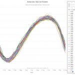
The WunderBlog has an excellent summary of the current state of Antarctica Ice in their post Sea Ice Extent in Antarctica Bottoming Out at Lowest on Record.  The chart here comes from the NSIDC Interactive Chart and is a full version of the one in the article.

A few tips on using the interactive chart.  On the top left you can click to get a chart for Antarctic or the Arctic. In the top right of the years menu there is a button to press that allows you to download the chart you create as a jpeg or png file. The bottom of the years menu has a scroll down button to get to more recent years. The chart is updated daily.


World Development Indicators: Proportion of seats held by women in national parliaments

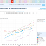
If you are looking for graphs and data on a variety of sustainability issues you should look at the World Bank’s Sustainable Development Goals – World Development Indicators 2017. The site contains interactive related to 17 development goals. For example, the chart here (downloaded from the site) is the proportion of seats held by women in national parliaments. The U.S. is the bold light blue line. You can also download the data to be analyzed.

Melting Permafrost and a Feedback Loop

The BBC has a great article on a Siberian crater, the Batagaika crater, that is growing quickly due to melting permafrost. Excerpt from the article:

As more permafrost thaws, more and more carbon is exposed to microbes. The microbes consume the carbon, producing methane and carbon dioxide as waste products. These greenhouse gases are then released into the atmosphere, accelerating warming further.

“This is what we call positive feedback,” says Günther. “Warming accelerates warming, and these features may develop in other places. It’s not only a threat to infrastructure. Nobody can stop this development. There’s no engineering solution to stop these craters developing.”

The article provides some great context in understanding the impacts of global warming.

Peso Dollar Exchange rate in the News

This is not exactly a sustainability example, but it does exhibit the value of some basic regression skills. Drum’s post from yesterday, Fact Check: President Trump Has Nothing To Do With the Decline of the Peso, provides a graph of the Peso Dollar exchange rate for the last couple of years (please read the short post). The graph you see here is made using R and  monthly average exchange rate data from FRED or you can download the excel file.  Note that the graph here is the number of Pesos to purchase 1 dollar and so the graph increasing is a decline in the Peso.

There are two points here. The change in the peso dollar exchange rate has been reasonably linear for the last couple of years and so there is no evidence that the recent change in the U.S. presidency has had an impact, so far. Second, using examples like this in classrooms empowers students.