Tag Archives: data source

How much has sea level changed?

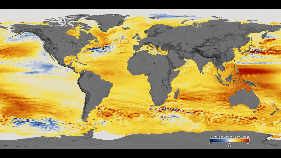
NASA’s Vital Signs of the Planet Sea Level Sea Level page provides data on sea level. For example, since 1993 sea level has increased  by about 94mm, but this is an average. In their Sea Level 101, Part Two: All Sea Level is `Local’ by Alan Buis (7/14/2020) they provide the map copied here. There is noticeable variation in sea level change around the globe. They note:

“Relative sea level” refers to the height of the ocean relative to land along a coastline. Common causes of relative sea level change include:

    • Changes due to heating of the ocean, and changes in ocean circulation

    • Changes in the volume of water in the ocean due to the melting of land ice in glaciers, ice caps, and ice sheets, as well as changes in the global water cycle

    • Vertical land motion (up or down movements of the land itself at a coastline, such as sinking caused by the compaction of sediments, or the rise and fall of land masses driven by the movement of continental or oceanic tectonic plates)

    • Normal, short-term, frequent variations in sea level that have always existed, such as those associated with tides, storm surges, and ocean waves (swell and wind waves). These variations can be on the order of meters or more (discussed in more detail in our previous blog post).

There are other graphics in the post including an animation of Greenland ice loss with a scatter plot.

How efficient is electricity?

In the eia post, More than 60% of energy used for electricity is lost in conversion, by Bill Sanchez (7/21/2020), includes the flow diagram here. Note the flow across the top represents conversion losses.

Electricity is a secondary energy source that is produced when primary energy sources (for example, natural gas, coal, wind) are converted into electric power.

The technology and the type of fuel used to generate electricity affect the efficiency of power plants. For example, in 2019, of the 11.9 quads of natural gas consumed for electricity generation, natural gas plants converted 45% (5.4 quads) into net generation of electricity. By contrast, of the 10.2 quads of coal consumption, coal plants converted 32% (3.3 quads) into net generation.

The post has three other graphs and links to electricity data.

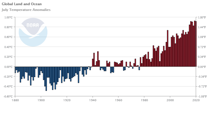
How hot was June 2020?

From NOAA’s Global Climate Report – June 2020:

Averaged as a whole, the global land and ocean surface temperature for June 2020 was 0.92°C (1.66°F) above the 20th century average of 15.5°C (59.9°F), tying with 2015 as the third highest June temperature departure from average in the 141-year record.

Nine of the 10 warmest Junes have occurred since 2010; the seven warmest Junes have occurred in the last seven years (2014–2020).

The June 2020 global land-only surface temperature was also the third highest for June at 1.29°C (2.32°F) above average. The global ocean-only surface temperature of 0.77°C (1.39°F) was also the third highest for June in the 141-year record.

The links in the quotes are to the related time series data.

Is there a relationship between education level and marriage?

The U.S. Bureau of Labor Statistics post 60 percent of college graduates born from 1980 to 1984 were married at age 33 (6/30/2020) provides the chart copied here.

At age 33, people with higher levels of education were more likely to be married and less likely to be cohabiting than those with lower levels of education. At the time of their 33rd birthday, 32 percent of high school dropouts, 42 percent of high school graduates with no college, 49 percent of people with some college or an associate degree, and 60 percent of college graduates were married. Twenty-eight percent of those with less than a high school diploma were cohabiting, compared with only 13 percent of those with a bachelor’s degree and higher.

For related data, see the Census Bureau Educational Attainment in the United States: 2019 Table 2.  For people 25 years and over no more than 53% of those that didn’t complete at least an Associates degree here married. For those that have a Bachelor’s degree, Master’s degree, Professional degree, and Doctoral degree the percentage are 63%, 68%, 71%, and 73% respectively.

How has Black educational attainment changed?

The Census Bureau post Black High School Attainment Nearly on Par with National Average  by Jennifer Cheeseman Day (6/10/2020) notes:

In 1940, when the U.S. Census Bureau started asking about educational attainment, only 7% of Blacks had a high school education, compared with 24% for the nation as a whole.

In recent years, Black educational attainment has been much closer to the national average and today, 88% of Blacks or African Americans have a high school diploma, just shy of the national average, according to census data released last month from the Current Population Survey.

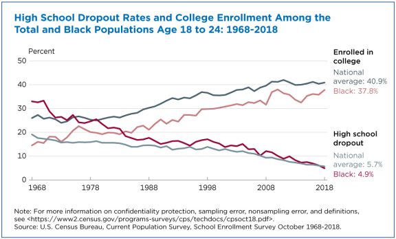
Related to the graph copied here:

The national average dropout rate declined from 19% in 1968 to about 6% in 2018. The Black dropout rate fell more steeply from 33% to 5%, bringing it in line with the national average.

Average enrollment for young adults increased from 26% to 41%. At the same time, the proportion of Black young adults in college more than doubled, rising from 15% to 38%.

The article contains five other graphs and links to the Census Bureau data sources.


How hot was May 2020?

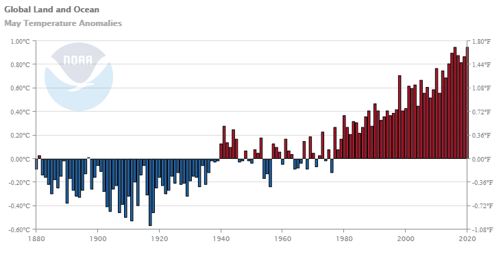
From the NOAA Global Climate Report – May 2020:

The global land and ocean surface temperature for May 2020 tied with 2016 as the highest in the 141-year record at 0.95°C (1.71°F) above the 20th century average of 14.8°C (58.6°F). The 10 warmest Mays have all occurred since 1998; however, the 2014–2020 Mays are the seven warmest in the 141-year record. May 2020 also marked the 44th consecutive May and the 425th consecutive month with temperatures, at least nominally, above the 20th century average.

The global land-only surface temperature for May 2020 was also the highest on record at 1.39°C (2.50°F) above the 20th century average of 11.1°C (52.0°F). This was 0.04°C (0.07°F) above the previous record set in 2012. The 10 highest May global land-only surface temperature departures have occurred since 2010.

The May 2020 global ocean-only surface temperature was near-record warm at 0.79°C (1.42°F) above average. This value was only 0.01°C (0.02°F) shy of tying the record warm May of 2016.

May time series data here. Climate.gov provides a summary of May 2020 in their post Was May 2020 warm and dry or cool and wet across the U.S.? It depends… by Rebecca Lindsey (6/9/2020)

What is the connection between crime and lead?

Kevin Drum asks a good question in his post How Many Cops Does New York City Need?  First note that violent crime has been dropping since around 1990 (see his graph copied here for examples). In particular for NYC:

The per capita number of police officers increased by about 10 percent through 2000 and then declined by about 20 percent through 2018. That’s nearly flat over the entire period. Violent crime, by contrast, plummeted 60 percent from its peak in 1990 through 2000 and then declined another 40 percent through 2018. That’s a total decrease of nearly 80 percent between 1990 and 2018.

Violent  crime has decreased even though the per capita number of cops has been nearly flat. So, why did crime decrease? There is overwhelming evidence that removing lead emissions from cars is the main driver of crime decline. I strongly encourage you to read Drum’s 2018 summary of the evidence.

So, why doesn’t anyone talk about lead and crime?

The second problem is among activists on both left and right who have their own pet theories. On the left, we tend to blame poverty, institutional racism, poor schooling, lousy housing, and so forth. On the right, the favorite targets are the breakdown of the family, too few cops, too few prisons, drugs, the decline of religion, and so forth. There is very little convincing evidence for any of this, while lead poisoning explains everything. But if lead poisoning is the answer, then everyone has to give up their pet theories about what happened between 1960 and 2010. That’s a tough ask.

We forget that there was a lot of violent crime in the 1980s. It had an impact on society in many ways. But, we are past that and removing lead from the environment is a permanent fix to the violent crime wave of the past. This should allow us to think differently about societal needs for policing.

The Drum post has two other graphics. The Statistics Projects page has the relevant lead and crime data.
 

How has Covid-19 impacted unemployment by race?

The chart here comes from using FRED (Federal Reserve Economic Data). Since at least the 1970s Hispanic or Latino (using FRED terms) unemployment was consistently between Black or African American and White and more recently slightly closer to White unemployment. For possibly the first time since the 1970s Hispanic or Latino unemployment (18.9%) exceeded Black or African American (16.7%) in April 2020. The Feb 2020 to April 2020 increase in unemployment for the four groups in the chart are (in order from smallest to largest) Black or African American (10.9%), White (11.1%), Asian* (11.8%), Hispanic or Latino (14.5%). It would seem that by both the total increase and the magnitude of unemployment that the Hispanic or Latino population was hit hardest by Covid-19. Moving to May, while Hispanic or Latino unemployment has decreased, along with White unemployment while Black or African American is stable and Asian increasing, they still exceed the other three groups.

The link here to FRED is only for the graph of Black or African American unemployment. Use the Edit Graph button (top right) and then Add Line (middle top tab). Search for the other groups and add them to the chart. The chart will provide data starting in 1972. The graph is interactive and the data is available.

*Asian Unemployment numbers are not seasonally adjusted while the other three are – FRED didn’t have seasonally adjusted for Asians or I couldn’t find it.

How many jobs from 18-32?

The U.S. Bureau of Labor Statistics post People born in early 1980s held an average of 8.2 jobs from ages 18 through 32 (6/3/2020) includes the graph copied here. They note

Women with higher levels of education held more jobs than women with lower levels. Women with a bachelor’s degree held 8.8 jobs from ages 18 through 32, compared with 6.5 jobs for female high school dropouts. Men held a similar number of jobs regardless of their level of education.

People held an average of 4.5 jobs from ages 18 to 22. The average number of jobs dropped to 3.3 from ages 23 to 27, and then dropped more, to 2.3 jobs, from ages 28 to 32. The pattern of people holding fewer jobs as they aged was similar among women and men and across racial and ethnic groups and levels of education.

The chart data is available and there are links to the original survey.

Do we use more coal or renewable energy?

The EIA article U.S. renewable energy consumption surpasses coal for the first time in over 130 years by Mickey Francis (5/28/2020) has the data.

In 2019, U.S. annual energy consumption from renewable sources exceeded coal consumption for the first time since before 1885, according to the U.S. Energy Information Administration’s (EIA) Monthly Energy Review. This outcome mainly reflects the continued decline in the amount of coal used for electricity generation over the past decade as well as growth in renewable energy, mostly from wind and solar. Compared with 2018, coal consumption in the United States decreased nearly 15%, and total renewable energy consumption grew by 1%.

The obvious question is are we using less electricity and if not what other source is picking up the slack? The eia Electricity explained page has an interactive time series of electricity generation.  Natural gas has picked up the slack.

The first article has two other charts and links to data.