EPI has released its report: State of Working America Wages 2018, Wage inequality marches on – and is even threatening data reliability by Elise Gould (2/20/19). The report includes 19 tables and charts. The data and charts are easily downloaded, such as the chart here. The report is thorough and anyone reading it will likely be surprised about something. A few selection from the report:
From 2017 to 2018, men at the 95th percentile saw large wage gains, while those at the middle and very bottom of their wage distribution experienced downright wage losses.
The gender wage gap at the 10th percentile remains the smallest across the wage distribution and it has narrowed since 2000; it is currently at 5.9 percent. The regression-adjusted average gender wage gap narrowed slightly from 2000 to 2018 and is currently at 22.6 percent.
In both comparison periods, both men and women at the 10th percentile saw greater wage growth in states with minimum wage changes versus those without.
Over the last 18 years, wage growth for white and Hispanic workers has been about four times faster than that of black workers in the 20th through the 70th percentiles of their respective wage distributions. The 60th and 70th percentiles of the black wage distribution remain below their 2000 levels.
The wages of those with a high school diploma rose faster than the wages of those with a college degree over the last two years, narrowing the gap between college and high school wages. As a result, the college wage premium—the regression-adjusted log-wage difference between the wages of college-educated and high school–educated workers—fell from 50.6 percent to 48.4 percent between 2016 and 2018.
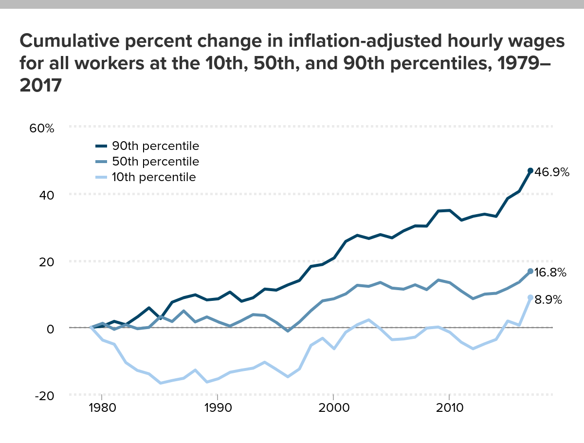
Related posts: How have wages grown since 1980?
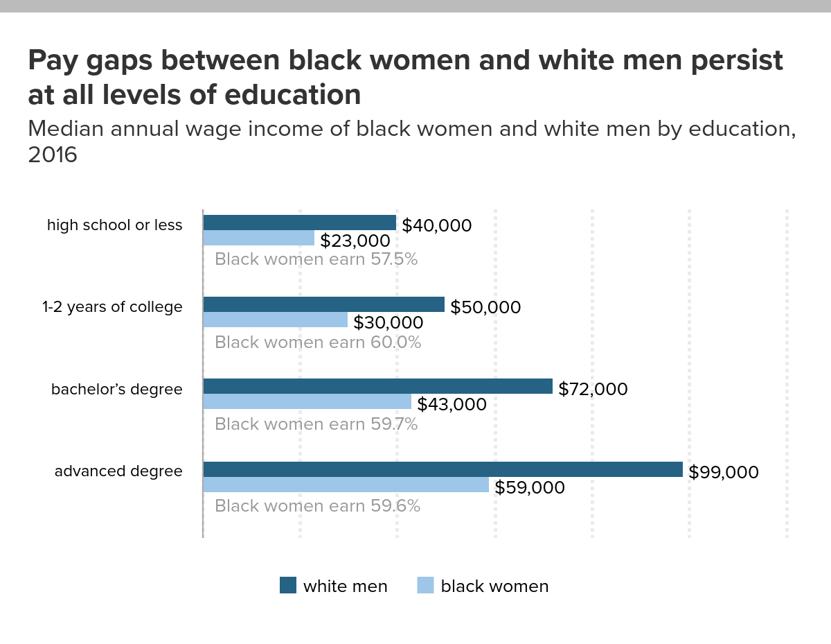
What is the pay gap between black women and white men?
What are the prospects for high school grads?
The Interactive Graphs page has two charts on wages.