Tag Archives: social justice

Do people in poverty work?

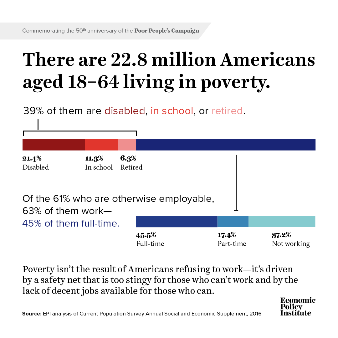
The EPI article, 50 years after the Poor People’s Campaign poverty persists because of a stingy safety net and a dysfunctional labor market by Elise Gould and Jessica Schieder (5/24/2018), answers the question with a graph (reposted here) and this:

The bottom bar shows us that, among those working-age individuals who are otherwise employable, 63 percent are working and 45.5 percent are working full time. An additional 37.2 percent are not working, but this share includes 1.6 million people living below the poverty line who are actively seeking a job. The data make it clear that millions of people who are active participants in the labor market are unable to make ends meet, either due to insufficient hours or low wages.

What is the Great Gatsby curve?

From The 9.9 Percent Is the New American Aristocracy: The class divide is already toxic, and is fast becoming unbridgeable – You’re probably part of the problem by Matthew Stewart (June 2018) in The Atlantic. (Figure 2)

The Great Gatsby curve represents the correlation between income inequality and intergenerational income elasticity. In short, the greater the income inequality in a country the greater the relationship between a child’s income and their parent’s income.

The Atlantic article, The 9.9 Percent Is the New American Aristocracy: The class divide is already toxic, and is fast becoming unbridgeable – You’re probably part of the problem by Matthew Stewart (June 2018)  is an excellent example of weaving important quantitative information (great for a QL course), including the Great Gatsby curve, to tell an important story.

Rising immobility and rising inequality aren’t like two pieces of driftwood that happen to have shown up on the beach at the same time, he noted. They wash up together on every shore. Across countries, the higher the inequality, the higher the IGE (see Figure 2). It’s as if human societies have a natural tendency to separate, and then, once the classes are far enough apart, to crystallize.

The post What is The Great Gatsby Curve? by David Vandivier (6/11/2013) has an animated gif that explains the curve well. To update or recreate the chart, you can get country gini values from the CIA World Factbook.  Intergenerational income elasticity can be found in figure 1 of a the paper Inequality from generation to generation:the United States in Comparison by Miles Corak (2012).  Intergenerational Social Mobility in OECD Countries January 2010 OECD Journal: Economic Studies 2010(1):6-6 Orsetta Causa  and Åsa Johansson is another source.  If you find more recent data let us know.

Never miss a post. Go to sustainabilitymath.org and sign up for email alerts or follow us on twitter @SustMath.


What is an explanation for the racial disparities in student loan debt?

From Parents’ Wealth Helps Explain Racial Disparities in Student Loan Debt by Fenaba R. Addo

Fenaba R. Addo has an explanation in the article Parents’ Wealth Helps Explain Racial Disparities in Student Loan Debt at the Federal Reserve bank of St Louis.

An analysis of data from a youth survey found that 58 percent of black young adults reported that their parents contributed an average of $4,200 over the course of their college career. That compares to an average of $12,000 given by 72 percent of white families.

Finances by race is summarized in table 1, copied here. It is note that “All averages are statistically different at the 5 percent level by race, indicating that the differences are not a result of random chance.”  (This can be used in a statistics course and if you contact the author you might even get the data.) The article goes on to note how this may impact the future of these students:

As early as age 25, racial wealth gaps begin to emerge. In the age 25 asset survey, college-educated white young adults reported having approximately $17,000 more wealth than black young adults who had attended college. We calculated that a $10,000 increase in young adult net wealth is associated with 7.6 percent less student loan debt. Young adults with high net wealth may have benefited from transfers of wealth from their parents and subsequently may be in a better position to pay down their student loans quicker.


What is the state of food security and nutrition in the world?

Read the FAO report How close are we to #ZeroHunger? The state of food security and nutrition in the world (2017) .  The online report has numerous chart that can be downloaded, such as the one here.

After steadily declining for over a decade, global hunger appears to be on the rise, affecting 11 percent of the global population.

In addition to an increase in the proportion of the world’s population that suffers from chronic hunger (prevalence of undernourishment), the number of undernourished people on the planet has also increased to 815 million, up from 777 million in 2015.

The report provides information on stunting, wasting, overweight children and adults, anemia, and breastfeeding. The data isn’t directly available on the web page, but some of it can be found in the full report.

Where does the U.S. rank on the world press freedom index?

According to the Reporters Without Borders index, the U.S. ranks 45 (out of 180) in 2018, just behind Romania and South Korea. Here is what they have to say about the U.S.

US press freedom, enshrined in the First Amendment to the 1787 constitution, has been under increasing attack over the past few years, and the first year of President Donald J. Trump’s presidency has fostered further decline in journalists’ right to report. He has declared the press an “enemy of the American people” in a series of verbal attacks toward journalists, attempted to block White House access to multiple media outlets, and routinely uses the term “fake news” in retaliation for critical reporting. He has even called for revoking certain media outlets’ broadcasting licenses. The violent anti-press rhetoric from the highest level of the US government has been coupled with an increase in the number of press freedom violations at the local level as journalists run the risk of arrest for covering protests or simply attempting to ask public officials questions. Reporters have even been subject to physical assault while on the job. It appears the Trump effect has only amplified the disappointing press freedom climate that predated his presidency. Whistleblowers face prosecution under the Espionage Act if they leak information of public interest to the press, while there is still no federal “shield law” guaranteeing reporters’ right to protect their sources. Journalists and their devices continue to be searched at the US border, while some foreign journalists are still denied entry into the US after covering sensitive topics like Colombia’s FARC or Kurdistan.

You can download their data and since the rankings stared in 2002 you might be able to get  access to past data (some of it is available in their archives). Their methodology is explained and they have an interactive map.

What are the differences in infant mortality by race?

The NYT has a lengthy article, Why America’s Black Mothers and Babies Are in a Life-or-Death Crisis (4/11/18 by Linda Villarosa)  and Kevin Drum follows this up with the handy chart posted here in his post Our Disgraceful Infant Mortality Epidemic.  He notes that although infant morality has decreased the difference between Black and White infant morality has increase (by percentage):

In 1950, according to the CDC, the black rate of infant mortality was 64 percent higher than the white rate. Today it’s 133 percent higher

We also aren’t keeping up with the rest of world:

In 1960, we ranked 11th in infant mortality among rich countries. Not great, but not terrible. Today we rank 24th out of 27 rich countries, ahead of only Turkey, Mexico, and Chile.

You can find infant mortality data at the CDC’s National Center for Health Statistics page  (tables 10-13).

What is known about world income inequality?

The World Inequality Report 2018 provides a complete summary of world income inequality.  The executive summary contains thirteen charts to explore such as the one here.

The poorest half of the global population has seen its income grow significantly thanks to high growth in Asia (particularly in China and India). However, because of high and rising inequality within countries, the top 1% richest individuals in the world captured twice as much growth as the bottom 50% individuals since 1980 (Figure E4). Income growth has been sluggish or even zero for individuals with incomes between the global bottom 50% and top 1% groups. This includes all North American and European lower- and middle-income groups.

The executive summary also notes:

Research has demonstrated that tax progressivity is an effective tool to combat inequality. Progressive tax rates do not only reduce post-tax inequality, they also diminish pre-tax inequality by giving top earners less incentive to capture higher shares of growth via aggressive bargaining for pay rises and wealth accumulation. Tax progressivity was sharply reduced in rich and some emerging countries from the 1970s to the mid-2000s. Since the global financial crisis of 2008, the downward trend has leveled off and even reversed in certain countries, but future evolutions remain uncertain and will depend on democratic deliberations. It is also worth noting that inheritance taxes are nonexistent or near zero in high-inequality emerging countries, leaving space for important tax reforms in these countries.

The methodology page includes files with all the data.

How do NYC securities employee bonuses compare to U.S. household income?

Statista has your answer with their post Wall Street Bonuses Outpace Household Income  (3/28/18 by Dyfed Loesche) and their chart here.

Compared to the average U.S. household income this is quite some money, keeping in mind these are payments on top of the regular pay. In 2016, the average Wall Street bonus stood at close to $158,000 and thus 2.5 times as high as the median household income of a little more than $59,000. (The U.S. Census Bureau has not yet released official household figures for 2017). The average number of people living in an American household stands at 2.5.

The post has links to the median household data as well as the bonuses. Not only is this useful data for a stats course, but there is also an interesting discussion to be had on the use of mean and median in this post.

What is the connection between race and generational income mobility?

The recent paper, Race and Economic Opportunity in the United States: An Intergenerational Perspective, by the Equal Opportunity Project, has the answer and makes the data available.  The executive summary has seven key findings, here are three:

Finding #1: Hispanic Americans are moving up in the income distribution across generations, while Black Americans and American Indians are not.

Finding #2: The black-white income gap is entirely driven by differences in men’s, not women’s, outcomes.

Finding #6: Within low-poverty areas, black-white gaps are smallest in places with low levels of racial bias among whites and high rates of father presence among blacks.

There is something in this paper to challenge everyone’s views at some point. For example,

We find analogous gender differences in other outcomes: black-white gaps in high school completion rates, college attendance rates, and incarceration are all substantially larger for men than for women. Black women have higher college attendance rates than white men, conditional on parental income.

At the bottom of the executive summary are links to data, slides, and the full paper. You can go directly to the data here.

Is wage inequality growing?

The EPI article, The State of American Wages 2017 by Elise Gould, has a full summary of growing wage inequality. A few of their key findings:

From 2000 to 2017, wage growth was strongest for the highest-wage workers, continuing the trend in rising wage inequality over the last four decades.

While wage inequality has generally been on the rise for both men and women, wage inequality is higher and growing more among men than among women.

At every decile and at the 95th percentile, wage growth since 2000 was faster for white and Hispanic workers than for black workers.

This is an in depth article with over 30 bullet points of key findings. There are numerous graphs, such as the on posted here, with data sets. The cumulative graph here is broken into female and male graphs farther down in the article. What you will find is that, for example, the increase in the median wages is almost entirely due to increases in the median female wage (7.9% since 2000).  There is a lot to learn in this post and plenty of material for courses.