Tag Archives: social justice

Is sexual harassment a serious problem?

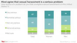
YouGov asked the question, How serious of a problems do you think workplace sexual harassment is in the United States?  Very serious or somewhat serious was the response of 70% of the respondents.

But for women it is a greater concern: 78% of women say sexual harassment in the workplace is a serious problem today, and 33% of women say it is a very serious problem). 60% of men agree it is a serious issue, with 21% calling it very serious.

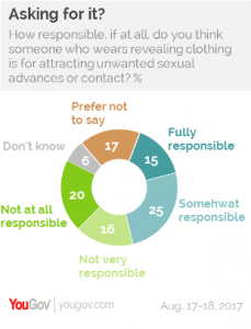
The article has more questions and graphs. The most interesting may be the breakdown by gender and political party.

However, Republicans are less likely than Democrats to say sexual harassment in the workplace is a serious problem in the United States – and that’s especially true among Republican men. Democrats – both men and women – are more likely to describe workplace harassment as a very serious problem. But there are big differences between Republican men and women. Seven in ten Republican women say sexual harassment in the workplace is a serious problem; less than half of Republican men agree.

Republican men have a very different view on this issue. At the bottom of the article there is a link to the data, which can easily be incorporated into a stats class followed by an interesting classroom discussion.

People Impacted by Climate Change – The Nenets

The Nenets are reindeer herders in Russia’s Arctic that migrate 800 miles each year. The National Geographic Article, They Migrate 800 Miles a Year. Now It’s Getting Tougher, tells their story.

The Nenets have undertaken this annual migration for centuries, and at 800 miles round-trip, it’s one of the longest in the world. Yuri’s group, called Brigade 4, is a relic of a Soviet collective—under Soviet rule the Nenets endured decades of forced collectivization and religious persecution. They survived centuries of Russian rule before that. Through it all, they’ve managed to sustain their language, their animist worldview, and their nomadic traditions.

The Nenets are facing challenges.

As I talk to Yuri, the region is suffering another record-hot summer; the thermometer has already hit 94°F. It hasn’t rained for weeks, and it’s hard for reindeer to pull the loaded sleighs across the dry tundra. Before the summer is out, a boy and more than 2,300 reindeer will die from anthrax on southern Yamal, and dozens of people will get sick—a direct result of thawing permafrost, which allowed animal carcasses buried during an outbreak in the 1940s to reemerge, still bearing infectious microbes.

And it isn’t just climate related challenges.

Yet climate change isn’t even the greatest threat to the Nenets. Development is. Russia’s quest for new sources of hydrocarbons has encroached on pastures that were already tight for the estimated 255,000 reindeer and the 6,000 nomadic herders that live on Yamal.

Read the article, which includes a video and a number of great photos and maps: They Migrate 800 Miles a Year. Now It’s Getting Tougher.

Related permafrost articles from this blog: Climate Change, Melting Permafrost, and Disease, Melting Permafrost and a Feedback Loop, Climate Change – Impacts on People, and Methane Bubbles – A Feedback Loop.

Who is Responsible for Unwanted Sexual Advances?

A recent YouGov article, Is anyone ever “asking for it?” Americans seem to think so, provides the pie chart to the left. According to the data, 40% of adults believe that a women wearing revealing clothing is fully or somewhat responsible for unwanted sexual advances.  Along with that, another 17% prefer not to say and 6% don’t know. Maybe a better way of reporting the results is that only 36% of adults say that the person is not at all or not very responsible. There is other data in the article as well as a link to the full survey results. This data that is sure to generate a conversation in stats or QL course.

How strong is the relationship between women’s education and fertility?

Our World in Data has an interactive graph of women’s educational attainment vs fertility, by country and colored by region, from 1950-2010.  The correlation between the average years of education for women and the countries fertility rate is clear.  A world bank article, Female Education and Childbearing: A Closer Look at the Data, from 2015 provides evidence that the relationship is causal.

Why does female education have a direct effect on fertility? The economic theory of fertility suggests an incentive effect: more educated women have higher opportunity costs of bearing children in terms of lost income. The household bargaining model suggests that more educated women are better able to support themselves and have more bargaining power, including on family size.

According to the ideation theory, more educated women may learn different ideas of desired family size through school, community, and exposure to global communication networks. Finally, more educated women know more about prenatal care and child health, and hence might have lower fertility because of greater confidence that their children will survive.

Of course, education isn’t the only factor contributing to fertility rates.  Data is provided by Our World in Data, along with the graph. The data can be used for tests of correlation, regression, and one can compare by county and region for specific years.

When Were Confederate Statues Built?

Kevin Drum’s post, The Real Story Behind All Those Confederate Statues, provides the associated chart about the timing of confederate monument and statue building.

This illustrates something that even a lot of liberals don’t always get. Most of these monuments were not erected after the Civil War. In fact, all the way to 1890 there were very few statues or monuments dedicated to Confederate leaders. Most of them were built much later.

This is an excellent example of how data and a good graphic helps tell an important story.

Yes, these monuments were put up to honor Confederate leaders. But the timing of the monument building makes it pretty clear what the real motivation was: to physically symbolize white terror against blacks. They were mostly built during times when Southern whites were engaged in vicious campaigns of subjugation against blacks, and during those campaigns the message sent by a statue of Robert E. Lee in front of a courthouse was loud and clear.

Drum’s post, worth a quick read, links to the Southern Poverty Law Center report that contains this and other data and excellent graphics for a QL course. It is worth recalling the first statement of sustainability on our Defining Sustainability Page:  The current state of people is not a morally acceptable endpoint of societal development.

CEOs Still Doing Fine

The EPI has detailed report on CEO pay, CEO pay remains high relative to the pay of typical workers and high-wage earners. The article includes data, such as the ratio of CEO-to-worker pay that was used to create the graph here. Although the ratio has decreased since its peak of 347.5 in 2007, it was still a healthy 270.5 in 2016, which is over 10 times the 20 it was in 1965.  From the report:

From 1978 to 2016, inflation-adjusted compensation, based on realized stock options, of the top CEOs increased 937 percent, a rise more than 70 percent greater than stock market growth and substantially greater than the painfully slow 11.2 percent growth in a typical worker’s annual compensation over the same period. CEO compensation, when measured using the value of stock options granted, grew more slowly from 1978 to 2016, rising 807 percent—a still-substantial increase relative to every benchmark available.

Over the last three decades, compensation, using realized stock options, for CEOs grew far faster than that of other highly paid workers, i.e., those earning more than 99.9 percent of wage earners. CEO compensation in 2015 (the latest year for data on top wage earners) was 5.33 times greater than wages of the top 0.1 percent of wage earners, a ratio 2.15 points higher than the 3.18 ratio that prevailed over the 1947–1979 period. This wage gain alone is equivalent to the wages of more than two very-high-wage earners.

As noted, the report which is worth reading, has data that can be used in the classroom and ample quantitative information for QL based classes.

How Big is the Pay Gap Between Black Women and White Men?

A recent article, Black women have to work 7 months into 2017 to be paid the same as white men in 2016, from the EPI answers this question. The article has pertinent comparisons.

Myth #2: Black women can educate themselves out of the pay gap.

The truth: Two-thirds of black women in the workforce have some postsecondary education, 29.4 percent have a bachelor’s degree or higher. Black women are paid less than white men at every level of education.

There are three tables/charts, such as the one here, with the data so it can be used in a classroom.  The EPI maintains a data that was highlighted in this blog’s post Data Spotlight: Employment and Wages by Race and Gender.

NOTE: Sustainability Math now has a Twitter account. Consider following @SustMath

Life Expectancy by Health Expenditure with Comments on Differences by Race

Our World in Data has an interactive graph of life expectancy by health expenditure for a number of countries, with downloadable data. The U.S. spends more money per person on health care, by far, than the other countries represented, without corresponding gains in life expectancy. At the same time, there are large differences in life expectancy by race in the U.S.  For example, the 2013 CDC National Vital Statistics Report life tables has life expectancy at birth for Non-Hispanic Black males of 71.9 years, which would be at the bottom of the chart.  Hispanic females are at the top in the U.S. with a life expectancy at birth of 84.2 years; a 12.3 year difference (data on page 3 here).  At the same time, the money spent on health care is also not likely to be equally distributed. The CDC is a source of life expectancy data and if you ask them they might have excel files. For an example of using life expectancy data, here is a 2012 paper Period Life Tables: A Resource for Quantitative Literacy published in Numeracy and freely available.

New Data: Pretax Income Growth

How much has pretax income grown by earner percentiles? The graph here, from Chicago Booth Review’s article New Data: Inequality Runs Deeper than Previously Thought, provides the answer.

So Piketty, Saez, and Gabriel Zucman of University of California at Berkeley combined tax, survey, and national-accounts data to create distributional accounts that they say capture 100 percent of US income since 1913. The new accounts include transfer payments, employee fringe benefits, and capital income, which weren’t in previous data.

The data set reveals since 1980 a “sharp divergence in the growth experienced by the bottom 50 percent versus the rest of the economy,” the researchers write. The average pretax income of the bottom 50 percent of US adults has stagnated since 1980, while the share of income of US adults in the bottom half of the distribution collapsed from 20 percent in 1980 to 12 percent in 2014. In a mirror-image move, the top 1 percent commanded 12 percent of income in 1980 but 20 percent in 2014. The top 1 percent of US adults now earns on average 81 times more than the bottom 50 percent of adults; in 1981, they earned 27 times what the lower half earned.

If you click on the top right of the graph in the article and go to edit chart you can get a table of the data used for the chart.  Great for use in a QL or stats course. Of course Piketty and Saez are know for creating the World Wealth and Income Database, which we have highlighted on this blog before.

Corporate Taxes, Jobs, and Income

A recent Economic Policy Institute report, Competitive” distractions – Cutting corporate tax rates will not create jobs or boost incomes for the vast majority of American families, provides some useful data and charts. For example, the graph here compares changes in productivity and hourly compensation (Data are for average hourly compensation of production/nonsupervisory workers in the private sector and net productivity of the total economy. “Net productivity” is the growth of output of goods and services minus depreciation per hour worked.) You can download the data which can be used for linear regression.  There are other graphs in the article with data that can also be used.

Beyond that the article is rich with quantitative information that can be used in a QL based course.  For example, there is a lengthy discussion on the statutory and effective tax rates of corporations and how the U.S. compares to the rest of the world. The conclusion:

We find their central argument—that U.S. corporations face high corporate taxes—to be empirically false. While U.S. statutory tax rates are higher, the effective tax rate paid by corporations is in fact roughly equivalent to the effective tax rates of our peer countries, due to loopholes in the U.S. tax code.