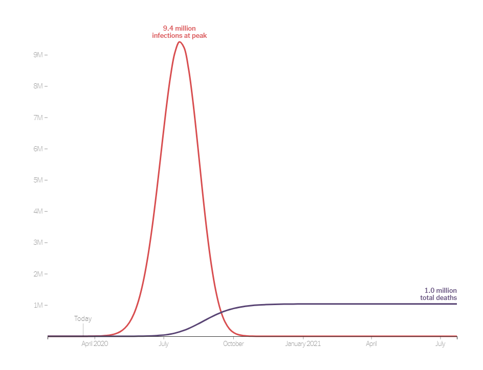
 The New York Times article How Much Worse the Coronavirus Could Get, in Charts by Nicholas Kristof and Stuart A. Thompson (3/13/2020) has a great interactive set of graphs that illustrate the importance of flattening the curve. The graphs start with the one copied here.
What’s at stake in this coronavirus pandemic? How many Americans can become infected? How many might die?
The answers depend on the actions we take — and, crucially, on when we take them. Working with infectious disease epidemiologists, we developed this interactive tool that lets you see what may lie ahead in the United States and how much of a difference it could make if officials act quickly.
One of the interesting features is that the user can drag a bar which is the date interventions begin and see how the curve changes.