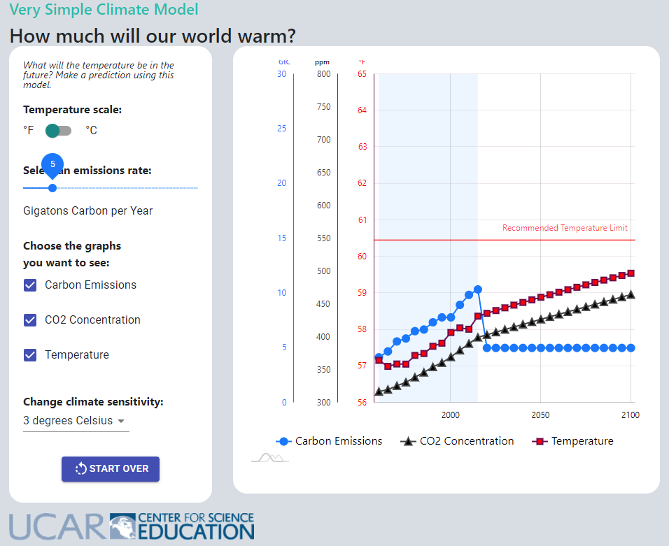
UCAR (University Corporation for Atmospheric Research) has The Very Simple Climate Model page with a climate model where you set the emissions and then run the model until 2100. You get graphs of carbon emissions, CO2 concentration, and temperature. For example, the output in the graph here set emissions at about half the current level. Even then temperature goes up a degree F by 2100. The model can be run 1 year at a time with different emissions each year. There is a link to an activities page as well as some scenarios to explore.