The NASA article Nope Earth Isn’t Cooling by Alan Buis (7/12/19) is a good primer on short and long term trends as it relates to global climate change. The main graphic (copied here), which is an animation zooming into a short time period and then back to the longer time period, demonstrates the classic misleading graph of selecting only a short time period to view.
So, what’s really important to know about studying global temperature trends, anyway?
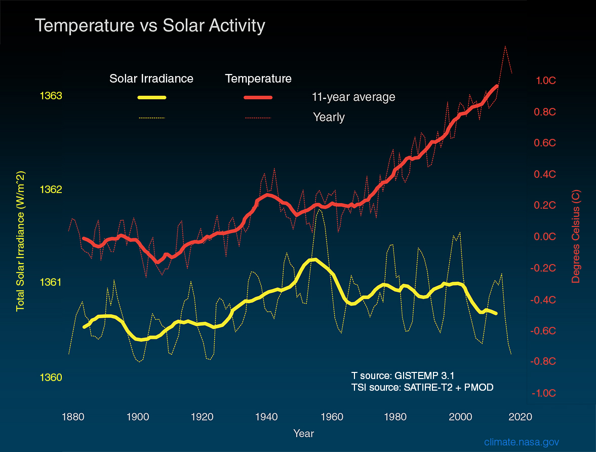
Well, to begin with, it’s vital to understand that global surface temperatures are a “noisy” signal, meaning they’re always varying to some degree due to constant interactions between the various components of our complex Earth system (e.g., land, ocean, air, ice). The interplay among these components drive our weather and climate.
For example, Earth’s ocean has a much higher capacity to store heat than our atmosphere does. Thus, even relatively small exchanges of heat between the atmosphere and the ocean can result in significant changes in global surface temperatures. In fact, more than 90 percent of the extra heat from global warming is stored in the ocean. Periodically occurring ocean oscillations, such as El Niño and its cold-water counterpart, La Niña, have significant effects on global weather and can affect global temperatures for a year or two as heat is transferred between the ocean and atmosphere.
This means that understanding global temperature trends requires a long-term perspective. An examination of two famous climate records illustrate this point.
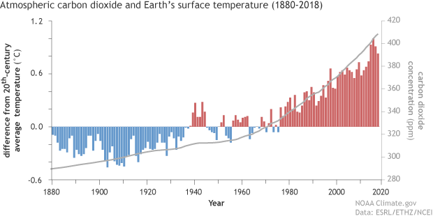
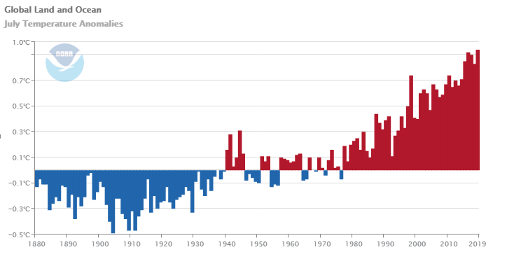
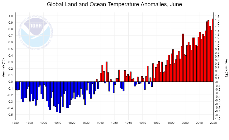
There are two other graphs. Global temp and CO2 can be found on the Calculus Projects page.
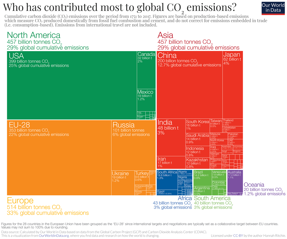 The our world in data post, Who has contributed most to global CO2 emissions? by Hannah Ritchie (10/1/2019) provides this chart of cumulative CO2 emissions from 1751 to 2017 by region and country.