In 2016 clinker contributed almost 2 billion tonnes of CO2, about 7% of the world total. What is clinker? The BBC article Climate change: The massive CO2 emitter you may not know about by
Cement is the source of about 8% of the world’s carbon dioxide (CO2) emissions,according to think tank Chatham House.
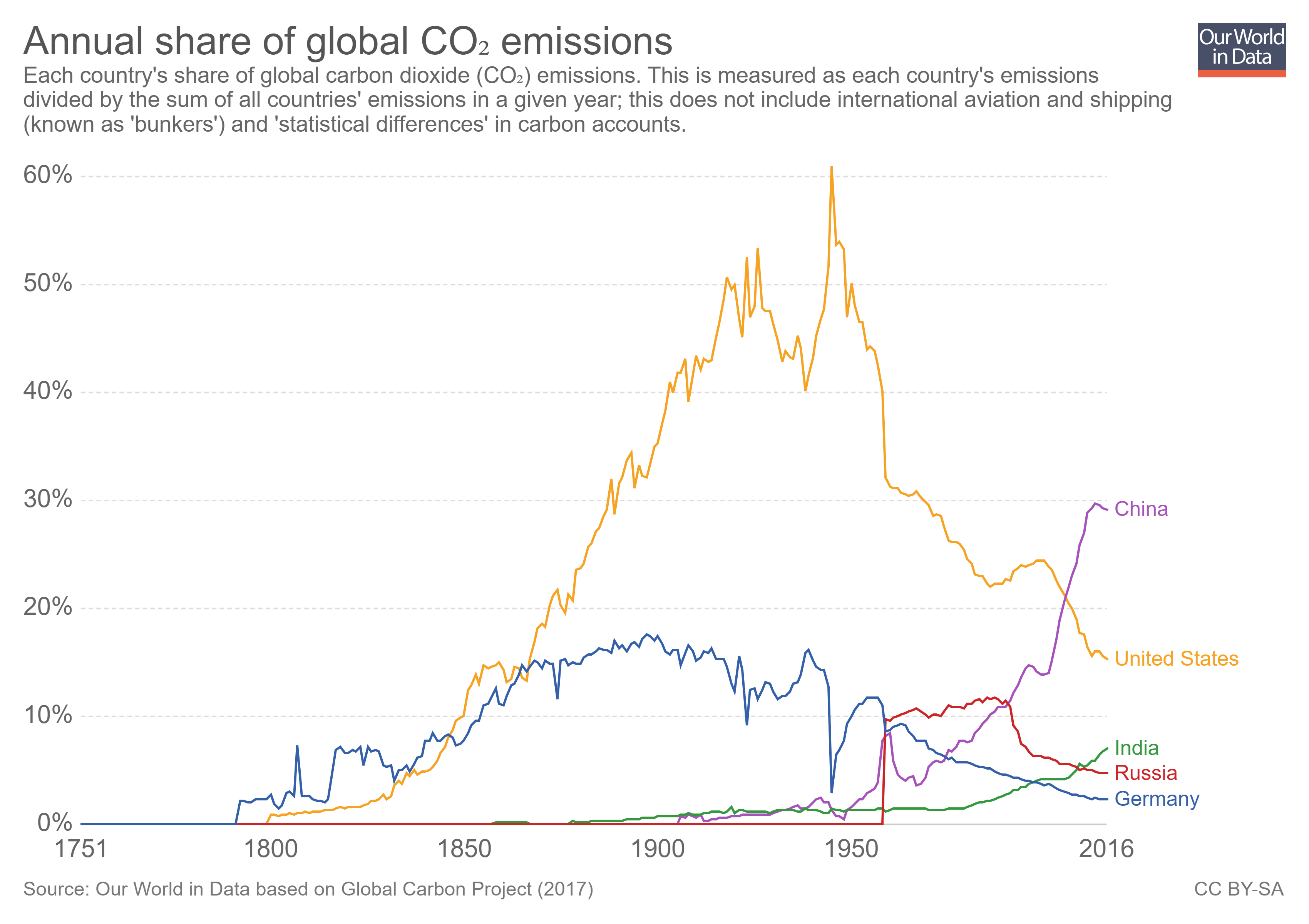
If the cement industry were a country, it would be the third largest emitter in the world – behind China and the US. It contributes more CO2 than aviation fuel (2.5%) and is not far behind the global agriculture business (12%).
Clinker accounts for about 90% of the CO2 emissions related to concrete and so 90% of the 8% of world CO2 from cement is due to clinker. Historical data for world cement production can be found on the USGS page Historical Statistics for Mineral and Material Commodities in the United States. For the last couple of years see the Cement Statistics can Information page. The BBC article has another a couple of other nice graphs and a diagram with an explanation of how cement is made.