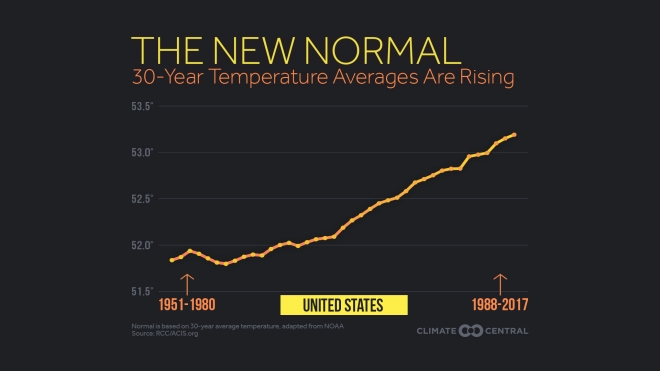
 Changes in 30 year temperature averages depend on where you live, but Climate Central’s New Normal: Temperatures Are Trending Up Across U.S. (3/16/18) has graphs for major cities across the U.S. The one here is for the U.S.
Normal temperatures, generally defined to be the 30-year average at a location, are trending up across most of the U.S. Since 1980, the average continental U.S. temperature has risen 1.4°F.
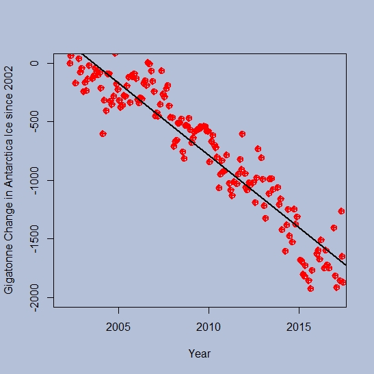
This is a change in the 30 year average so that the value for 2017 is the average from 1988-2017. In other words, the climate is changing. A nice primer on the difference between weather and climate can be found at the NSIDC Climate vs Weather page:
Weather is the day-to-day state of the atmosphere, and its short-term variation in minutes to weeks. People generally think of weather as the combination of temperature, humidity, precipitation, cloudiness, visibility, and wind. We talk about changes in weather in terms of the near future: “How hot is it right now?” “What will it be like today?” and “Will we get a snowstorm this week?”
Climate is the weather of a place averaged over a period of time, often 30 years. Climate information includes the statistical weather information that tells us about the normal weather, as well as the range of weather extremes for a location.
The Climate Central post has a drop down menu and you can choose the graph for the city closest to you to see how much your climate has changed. They don’t post the data that was used to create the graphs, but you can find the data for a location near you. Try starting with this NOAA map (look for a future post on using this portal for local data). This could be a great stats project for students.