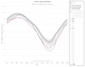
 We are within about a month of the peak of Arctic sea ice in its yearly cycle of freezing and thawing. At the moment, sea ice is at a record low (see chart) tracking close to 2017 and 2016, where as 2012 holds the record for the lowest extent of ice. NSID has an interactive real time chart (the last data point here is Feb 25) where you can select any and all years from 1979 to the present and download the graph. The data can be downloaded in an Excel spreadsheet from their Sea Ice Data and Analysis Tools page where they also have links to animations. There are materials in both the Calculus Projects and Statistics Projects pages using this data.
What is the state and future of snowpack out west?
 Climate.gov has your answer with the article Winter so far has people out west asking, Where’s the snow? (Feb 15, 2018) by Tom DiLiberto.
Farther south in Arizona, snows across the Rockies and in the Upper Colorado River Basin have been extremely low so far this year. Snow water equivalents—the amount of liquid water that would result if the snow melted in an instant—are between 0 and 30% of the median for this time of year for a broad region. In fact, the “best” areas for snow this season lie along the Front Range in Colorado and are only just around normal.
Why does this matter?
For areas in the Upper Colorado River Water Basin along the southern Rockies which rely on snow melt for water resources later in the year, snow amounts this low bring fears. Particularly, is there going to be enough snowmelt to fill Lakes Mead and Powell, which provide water to major cities like Tucson and Phoenix?
What is the cause? A second La Nina year in a row is part of the explanation, but (as their graph here shows)
As we continue to warm the planet due to emissions of greenhouse gases, mountain snowpack out west will likely continue to dwindle. Assuming we continue to increase global emissions of greenhouse gases (A2 scenario), the snow water equivalent of the snowpack in California by the end of the century will be 43% of what it was from 1971-2000. In Colorado, the snow water equivalent will be 26% less than that observed from 1971-2010.
A smaller and earlier-melting snowpack means less water to runoff into streams and tributaries in lower elevations. For places in the Sierra Nevada Mountains, Upper Colorado, and Upper Rio Grande River basins that rely heavily on a melting snowpack to provide the bulk of their annual runoff, climate change will have profound impacts on reservoir levels, water storage, and the people and ecosystems who rely on them.
There is enough quantitative information to use this article in a QL based course.
How does a small increase in average temperature increase the chance of extremes?
 The Climate Central post, Small Change in Average -Big Change in Extremes, summarizes the idea well with the graph. As the mean shifts to the right, there is a significant increase in the chance of extreme temperature. The animated gif on the site is perfect in expressing the idea.
That’s what we are seeing across much of the country. Average summer temperature have risen a few degrees across the West and Southern Plains, leading to more days above 100°F in Austin, Dallas and El Paso all the way up to Oklahoma City, Salt Lake City, and Boise. It’s worth noting that this trend has been recorded across the entire Northern Hemisphere, as shown in this WXshift animation.
You should check out the WXshift page they link to. This material is perfect for a stats course. It is also worth pointing out that the pictures here assumes the standard deviation stays the same, but there is evidence that it may be increasing. The effect is a flatter more stretched out density, with even greeter likelihood of extremes.
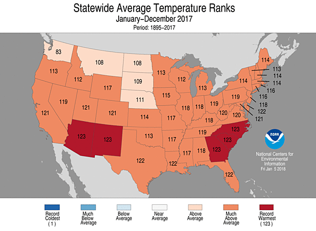
How hot was the U.S. in 2017?
 According to NOAA’s article, Assessing the U.S. Climate in 2017, it was the third hottest year on record for the U.S. It also wasn’t an El Nino year. In summary,
This was the third warmest year since record keeping began in 1895, behind 2012 (55.3°F) and 2016 (54.9°F), and the 21st consecutive warmer-than-average year for the U.S. (1997 through 2017). The five warmest years on record for the contiguous U.S. have all occurred since 2006.
For the third consecutive year, every state across the contiguous U.S. and Alaska had an above-average annual temperature. Despite cold seasons in various regions throughout the year, above-average temperatures, often record breaking, during other parts of the year more than offset any seasonal cool conditions.
The article has other useful graphs and information, including a summary for December. Related data is linked to their Climatological Rankings page.
How are beavers creating a climate feedback loop?

The New York Times article, Beavers Emerge as Agents of Arctic Destruction, explains:
… as climate change warms the Arctic and thaws the permafrost, the growing season extends. What was once tundra gives way to brush.
This may allow beavers to move north.
But in the tundra, the vast treeless region in the Far North, beaver behavior creates new water channels that can thaw the permanently frozen ground, or permafrost.
What remains is a pitted landscape, with boggy depressions, that directs warmer water onto the permafrost, leading to further thawing. As permafrost thaws it releases carbon dioxide and methane, which in turn contributes to global warming and helps increase the speed that the Arctic, which is already warming faster than the rest of the planet, defrosts.
This is an interesting article with satellite photos showing how beavers have changed the landscape.
In which city has winter warmed the most?
 Find out by going to Climate Central’s post, See How Much Winters Have Been Warming in Your City. The winner is Burlington, Vermont, with about 7 degrees F of warming since 1970 (graph here from the post). There is a drop down menu where you can select from most major cities in the U.S. They don’t provide the data, unfortunately, but they do provide a clear methodology so that you can create the data set for your city. You can get weather data from NOAA Climate Data Online. There is great potential here for student projects in statistics courses.
Where do you go to find the major climate events in the last 7 years?
![]() You go to NOAA’s Event Tracker. The initial page is captured in the image here. Each dot represents an event. Scroll over the dot to get a title and summary, which you can then click on to go to the main story. On the bottom right you can select a month since December 2010 to see the events from just that month.
You go to NOAA’s Event Tracker. The initial page is captured in the image here. Each dot represents an event. Scroll over the dot to get a title and summary, which you can then click on to go to the main story. On the bottom right you can select a month since December 2010 to see the events from just that month.
What is the connection between Greenland and the East Coast of the U.S.?
 In NASA’s post, Greenland melt speeds East Coast sea level rise, they explain:
The recent work reveals a substantial acceleration in sea level rise, roughly from Philadelphia south, starting in the late 20th century. And it is likely a strong confirmation of sea-level “fingerprints,” one of the most counter-intuitive effects of large-scale melting: As ice vanishes, the loss of its gravitational pull lowers sea level nearby, even as sea level rises farther away.
Their analysis shows that the Greenland and Antarctic influence alone would account for an increase in the rate of sea level rise on the East Coast of 0.0016 to 0.0059 inches (0.04 to 0.15 millimeters) each year, varying by location. That’s equivalent to 7.8 inches (0.2 meters) of sea-level rise on the northern East Coast over the next century, and 2.5 feet (0.75 meters) in the south, though the estimates are quantitative and not an attempt at an actual projection.
Emphasis here in increase as this is in addition to the increases based on the meted water and thermal expansion of the water. Connected to this article, is the graph here, change in Greenland ice in Gt, which is from NASA’s Greenland page where you can also get the data.
How are king tides changing?
 King tides occur when the sun is closest to the earth and aligned with the moon. For the northern hemisphere this happens in the fall. The picture here from the climate.gov post, King tides cause flooding in Florida in fall 2017, is from October,17 2016 at Brickell Bay Drive and 12th Street in downtown Miami.
While the celestial mechanisms that cause these king tides are not changing anytime soon, the water levels of the oceans are. This means that as the sun and moon tug away at the ocean, they are tugging at an ever-larger amount of water, dragging more of it on-shore than they did during previous decades’ king tides.
The article includes the graph here of maximum daily water levels during king tides near Miami, with a  regression line. The trend shows a water level increase of almost 10 inches since 1994. To get the data go to the Tides and Current page from NOAA, click on the pin by Miami, and then click on the station home page. Under the tides/water level tab go to water level. There is some work involved in the settings to get the data, but there is really interesting data available.
How much later are frosts occurring?
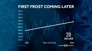 Climate Central has your answer with its post The First Frost is Coming Later. They provide graphs, like the one here for NYC (about 20 days later since 1970), for most major cities in the U.S. They don’t provide the data, but you can try and send them an email and they may send it to you. Alternatively, this could be a great stats project where students get the data themselves for a city of their choice and create the chart. You can get weather data from NOAA Climate Data Online.