From NASA’s Vital Signs of the Planet feature, Arctic winter warming events becoming more frequent, longer-lasting, we learn
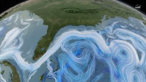
Arctic winter warming events – winter days where temperatures peak above 14 degrees Fahrenheit (minus 10 degrees Celsius) – are a normal part of the climate over the ice-covered Arctic Ocean. But new research by an international team that includes NASA scientists finds these events are becoming more frequent and lasting longer than they did three decades ago.
and why does this matter?
Storms that bring warm air to the Arctic not only prevent new ice from forming, but can also break up ice cover that is already present, Graham said. He added that the snowfall from storms also insulates current ice from the cold atmosphere that returns to the Arctic after the cyclones, which can further reduce ice growth.
We know that reduced ice changes albedo, creating a feedback loop (see the Arctic Ice and Global Warming post). The NASA article is from the paper Increasing frequency and duration of Arctic winter warming events where the graph here originates (see supporting information pdf). The data is hard to track down but if you email the authors they may provide you the data used to create these graphs, especially if you mention you want to use it for a linear regression project in a class.


 Where do carbon emissions go seems like an obvious question. Into the air of course. If so, then one would expect a near perfect linear relationship between emissions and atmospheric CO2. The graph here has yearly carbon emissions in million tonnes per year (as reported by the