Tag Archives: climate change

People Impacted by Climate Change – The Nenets

The Nenets are reindeer herders in Russia’s Arctic that migrate 800 miles each year. The National Geographic Article, They Migrate 800 Miles a Year. Now It’s Getting Tougher, tells their story.

The Nenets have undertaken this annual migration for centuries, and at 800 miles round-trip, it’s one of the longest in the world. Yuri’s group, called Brigade 4, is a relic of a Soviet collective—under Soviet rule the Nenets endured decades of forced collectivization and religious persecution. They survived centuries of Russian rule before that. Through it all, they’ve managed to sustain their language, their animist worldview, and their nomadic traditions.

The Nenets are facing challenges.

As I talk to Yuri, the region is suffering another record-hot summer; the thermometer has already hit 94°F. It hasn’t rained for weeks, and it’s hard for reindeer to pull the loaded sleighs across the dry tundra. Before the summer is out, a boy and more than 2,300 reindeer will die from anthrax on southern Yamal, and dozens of people will get sick—a direct result of thawing permafrost, which allowed animal carcasses buried during an outbreak in the 1940s to reemerge, still bearing infectious microbes.

And it isn’t just climate related challenges.

Yet climate change isn’t even the greatest threat to the Nenets. Development is. Russia’s quest for new sources of hydrocarbons has encroached on pastures that were already tight for the estimated 255,000 reindeer and the 6,000 nomadic herders that live on Yamal.

Read the article, which includes a video and a number of great photos and maps: They Migrate 800 Miles a Year. Now It’s Getting Tougher.

Related permafrost articles from this blog: Climate Change, Melting Permafrost, and Disease, Melting Permafrost and a Feedback Loop, Climate Change – Impacts on People, and Methane Bubbles – A Feedback Loop.

Are Falls Getting Warmer?

Climate Central has your answer by providing graphs of the number of above average warm days in the fall since 1970, for most major cities in the U.S.  Here is their graph for Duluth MN from their article More Warm Fall Days Across the U.S.   In 2016 Duluth had over 70 days in the fall of above average temperatures, almost the entire fall. They don’t provide the data, but you can contact them and they might provide it to you. Alternatively, their methodology is listed and so you can create a graph for your town with some effort (maybe a student project?). There are potential linear regression assignments waiting to be created here that could include comparing cities.

How can we investigate snow cover?

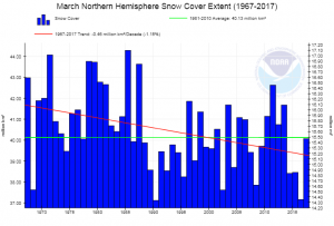
NOAA has a page, Sea Ice and Snow Cover Extent, where you can create graphs for snow cover by four regions (Northern Hemisphere, North America and Greenland, Eurasia, and North America) for each month of the year. For example the graph here is for North America in March. The green line is the average and the red the trend. For each graph you can download the associated data or simply download the graph.

County Level Temperature Data and Projections

One of the best ways to engage students in sustainability discussions is to use local information. NOAA has you covered with The Climate Explorer.  You can type in your zip code and get historical and projected climate data.  Today we highlight temperature. For example, the associated graph is the average annual maximum temperature for Tompkins County (home of this blog). The dark gray boxes are historical data. The blue and red lines are projections based on low and high emission scenarios. You can download the graph (just like we did here) and the data. There are numerous choices including average annual minimum temperatures, days above 95 degrees and days below 32 degrees.  You can also select monthly or seasonal data. The site is phenomenal and there must be numerous courses that can take advantage of the graph and data.

The Human Impact of Climate Change – The Guna People

This blog focuses on data, but we pause periodically to put the data into perspective. When educating about sustainability we want stories along with the data. The BBC provides such a story: The island people with a climate change escape plan.  The Guna people live on small islands off Panama.

Most Guna communities live on the archipelago, and have done for centuries, after they were driven offshore by disease and venomous snakes. But now many believe that only a move back to the mainland can secure their future.

They have a plan, but completing the plan isn’t simple.

However, today work on the school and hospital has halted, as a result of a litany of contractual hiccups – and crucially, a failure to plan for adequate supplies of water and electricity. Work never began on the 300 houses.

Along with rising water there are other environmental issues.

“Coral reefs stop wave action. So when you remove the coral, even down to 3m in depth, you have no protection. This has created chaos for people,” says Dr Hector Guzman, a research scientist at the Smithsonian Tropical Institute in Panama City.

This is an excellent story with great photos. Take the time to read it.

Ocean Heat Content and Climate Change

NOAA’s Climate Change: Ocean Heat Content page provides a summary of the role the Ocean plays in Climate Change.

Heat absorbed by the ocean is moved from one place to another, but it doesn’t disappear. The heat energy eventually re-enters the rest of the Earth system by melting ice shelves, evaporating water, or directly reheating the atmosphere. Thus, heat energy in the ocean can warm the planet for decades after it was absorbed. If the ocean absorbs more heat than it releases, its heat content increases. Knowing how much heat energy the ocean absorbs and releases is essential for understanding and modeling global climate.

The page is dated July 2015, but the interactive graph and the data, used to create the graph here, is up to date.  Connected to this is NOAA’s Hurricanes form over tropical oceans, where warm water and air interact to create these storms.

Recent studies have shown a link between ocean surface temperatures and tropical storm intensity – warmer waters fuel more energetic storms.

NOAA State Temperature Trend Charts

Are you interested in historical temperature trends for your state? NOAA’s State Annual and Seasonal Time Series page has it for you. You can create graphs of annual average min and max temperatures as well as the annual mean temperature, for almost all states (Alaska and Hawaii aren’t listed) . This can be done for annual data or for each of the four seasons.  The graphs are from 1805 to 2015.  The graph hear is the annual mean temperature for New York State.

These charts present three color-coded time series. The gray line represents the annual (or seasonal) temperature value. The blue line shows the overall trend in a fashion that smoothes out the year-to-year variability in temperature. The light blue shaded area represents the 95% confidence interval for the trend. The smoothed temperature is constructed using a locally estimated scatterplot methodology known as LOESS.

There does not appear to be easy access to the data, but if you contact them (Contact link on the top bar) they may send it to you. Either way, the graphs include confident intervals, useful in stats, and can be used in QL courses. There is also an interactive U.S. temperature map.

How hot was July 2017?

The headline from NASA’s Goddard Institute for Space Studies says almost all you need to know, July 2017 equaled record July 2016.

July 2017 was statistically tied with July 2016 as the warmest July in the 137 years of modern record-keeping, according to a monthly analysis of global temperatures by scientists at NASA’s Goddard Institute for Space Studies (GISS) in New York.

Last month (July) was about 0.83 degrees Celsius warmer than the mean July temperature of the 1951-1980 period. Only July 2016 showed a similarly high temperature (0.82 °C), all previous months of July were more than a tenth of a degree cooler.

But, the subtitle of NASA shocker: Last month was hottest July, and hottest month, on record says more

It’s the first time we’ve seen such a record month in the absence of an El Niño boost.

In other words, we are setting records without the help of El Niño.  The map here, which you can create here, is interesting because the distribution of temperature anomalies is rather uniform (use in a stats class).  You can get the data for the graph below from NOAA’s Climate at a Glance.

Climate Literacy Resource for Educators and Others

GlobalChange.gov has a helpful resource page for educators, although it is useful for anyone who wants to learn more about global change.  In particular, their 18 page (really only about 9 pages of text given the pictures) climate literacy guide will be valuable in helping educators understand key climate ideas so they are comfortable incorporating climate assignment into the classroom.

Climate Literacy: The Essential Principles of Climate Science is an interagency guide that provides a framework and essential principles for formal and informal education about climate change. It presents important information for individuals and communities to understand Earth’s climate, impacts of climate change, and approaches for adapting and mitigating change. Principles in the guide can serve as discussion starters or launching points for scientific inquiry. The guide can also serve educators who teach climate science as part of their science curricula.

The page contains links to other resources such as an energy literacy guide, a wildlife and wetlands toolkit, and climate change educational videos.

What are Arctic Winter Warming Events?


From NASA’s Vital Signs of the Planet feature, Arctic winter warming events becoming more frequent, longer-lasting, we learn

Arctic winter warming events – winter days where temperatures peak above 14 degrees Fahrenheit (minus 10 degrees Celsius) – are a normal part of the climate over the ice-covered Arctic Ocean. But new research by an international team that includes NASA scientists finds these events are becoming more frequent and lasting longer than they did three decades ago.

and why does this matter?

Storms that bring warm air to the Arctic not only prevent new ice from forming, but can also break up ice cover that is already present, Graham said. He added that the snowfall from storms also insulates current ice from the cold atmosphere that returns to the Arctic after the cyclones, which can further reduce ice growth.

We know that reduced ice changes albedo, creating a feedback loop (see the Arctic Ice and Global Warming post). The NASA article is from the paper Increasing frequency and duration of Arctic winter warming events where the graph here originates (see supporting information pdf). The data is hard to track down but if you email the authors they may provide you the data used to create these graphs, especially if you mention you want to use it for a linear regression project in a class.