Tag Archives: climate change

How hot was Australia in 2019?

The graph here is from the Australian Bureau of Meteorology Climate changes – trends and extremes page.  In 2019, the temperature was 1.52 deg C (2.7 deg F) above the 30 year average from 1961-1990, which is a new record. The second highest year is 2013 at  1.33 deg C above the average. The data is available on the page (there is a link in the box above the graph) and other attributes can be plotted. For instance, the maximum temperature for 2019 was 2.09 deg C (3.76 deg F) above the 30 year average, which is a new record with the second highest in 2013 at 1.59 deg C above the average.

How hot was November 2019?

From the NOAA Global Climate Report – November 2019:

The November 2019 global land and ocean surface temperature was 0.92°C (1.66°F) above average and the second highest November temperature in the 140-year record. Only November 2015 was warmer at +1.01°C (+1.82°F). The five warmest November global land and ocean surface temperature departures from average have occurred since 2013.

The Data can be obtained from the Climate at a Glance page.

Is the Arctic “greening”?

MaxNDVI (Maximum Normalized Difference Vegetation Index) during 1982-2018 for the North American Arctic (bottom), Eurasian Arctic (top), and the circumpolar Arctic (middle).


One section of NOAA’s Arctic Report Card: Update for 2019 is on Tundra Greenness.  The graph here from their report is for maximum NDVI:

Normalized Difference Vegetation Index (NDVI), which is sensitive to the unique properties of photosynthetically-active vegetation in the Red and Near Infrared wavelengths. NDVI is highly correlated with the quantity of aboveground vegetation, or “greenness,” of Arctic tundra (Raynolds et al. 2012).

The graph here shows an upward trend, but it’s complicated:

Arctic lands and seas have experienced dramatic environmental and climatic changes in recent decades. These changes have been reflected in progressive increases in the aboveground quantity of live vegetation across most of the Arctic tundra biome—the treeless environment encircling most of the Arctic Ocean. This trend of increasing biomass is often referred to as “the greening of the Arctic.” Trends in tundra productivity, however, have not been uniform in direction or magnitude across the circumpolar region and there has been substantial variability from year to year (Bhatt et al. 2013, 2017; Park et al. 2016; National Academies of Sciences, Engineering, and Medicine 2019). Sources of spatial and temporal variability in tundra greenness arise from complex interactions among the vegetation, atmosphere, sea-ice, seasonal snow cover, ground (soils, permafrost, and topography), disturbance processes, and herbivores of the Arctic system.

The report has two maps and another graph.

Got water?

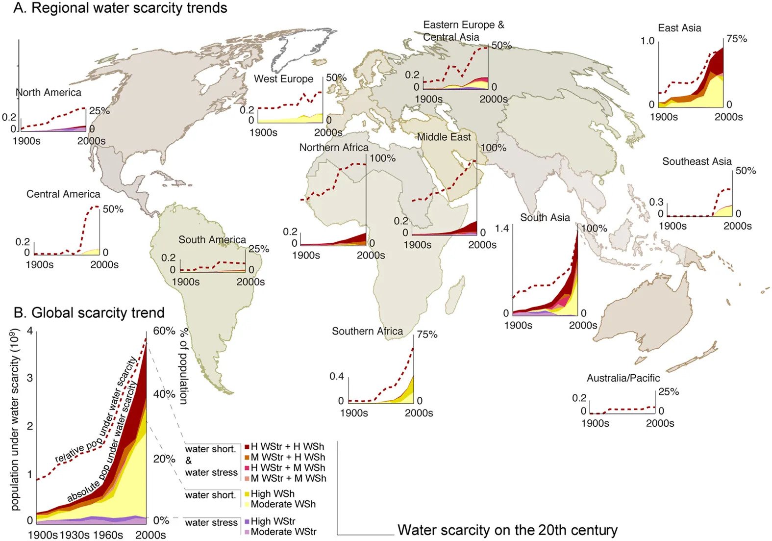
A 2016 article in Nature, The world’s road to water scarcity: shortage and stress in the 20th century and pathways towards sustainability by M. Kummu et. a., looks at water scarcity and shortages (The dotted red line in the graph copied here is the proportion of the population dealing with water scarcity issues. )

Due to increasing population pressure, changing water consumption behavior, and climate change, the challenge of keeping water consumption at sustainable levels is projected to become even more difficult in the near future5,6.

The increases in population and per capita water consumption resulted in a total water consumption increase from 358 km3 yr−1 in the 1900s to 1500 km3 yr−1 in the 2000s (Fig. 1B).

The article has 6 figures and two data sets available (under electronic supplementary material – right side bar). The richness of the figures makes them useful in a QL or stats course.

A related article from National Geographic, The world’s supply of fresh water is in trouble as mountain ice vanishes by Alejandra Borunda (12/9/2019), discusses the impact of climate change on water supplied by glaciers.

The high mountains cradle more ice and snow in their peaks than exists anywhere else on the planet besides the poles. Over 200,000 glacierspiles of snow, high-elevation lakes and wetlands: All in all, the high mountains contain about half of all the fresh water humans use.

The high mountains are warming faster than the world’s average; temperatures in the high Himalaya, for example, have crept up nearly 3.6 degrees Fahrenheit (2 degrees Celsius) since the beginning of the century, compared to a planetary average of just about 1.8 degrees F (1 degree C).

“120 million people live along the Indus,” says Immerzeel, “but the Indus plain is like a desert. It’s completely reliant on the water from the thick glaciers above.”

Of the five most important water towers in the world, three are in Asia: the Indus, the Tarim, and the Amu Darya.

How hot was October 2019?

From the NOAA Global Climate Report – October 2019 page:

The combined global land and ocean surface temperature departure from average for October 2019 was the second highest for October in the 140-year record at 0.98°C (1.76°F) above the 20th century average 14.0°C (57.1°F). This value is just 0.06°C (0.11°F) shy of tying the record warm October set in 2015. The 10 warmest Octobers have occurred since 2003; however, the five warmest Octobers have all occurred since 2015.

This occured with ENSO-neutral conditions during October 2019. Also, January through October for 2019:

The first ten months of 2019 ranked as the second warmest January–October on record, with a combined global land and ocean surface temperature of 0.94°C (1.69°F) above the 20th century average of 14.1°C (57.4°F). This is only 0.09°C (0.16°F) shy of tying the record warm January–October set in 2016.

October time series data from 1880 through 2019 is available here.

Where can we find regional weather data?

Go to the NOAA Climate at a Glance Divisional Mapping page. From the first drop down menu choose a state. Below that a state map appears and now click on a region. If time series data is desired click on the second tab along the top that says time series.  At this point the first drop down menu is to choose a parameter. There are seven choices including average, max, and min temperature as well as precipitation. A time scale can be chosen such as a single month or annual. For example, the graph here created from the site is average annual temperature for the finger lakes region in NYS. Along with a graph, a spreadsheet of the data can be downloaded.

How hot was September 2019?

From the NOAA Global Climate Report – September 2019:

The average global land and ocean surface temperature for September 2019 was 0.95°C (1.71°F) above the 20th century average and tied 2015 as the highest September temperature departure from average since global records began in 1880.

The Northern Hemisphere, as a whole, also had its warmest September on record at +1.24°C (2.23°F) above the 20th century average, surpassing the previous record set in 2016 by +0.03°C (+0.05°F). The five warmest Northern Hemisphere land and ocean surface temperature have occurred since 2015.

So far for 2019:

Each of the first nine months of the year had a global land and ocean temperature departure from average that ranked among the five warmest for their respective months. This gave way to the second warmest January–September in the 140-year record at 0.94°C (1.69°F) above the 20th century average.

Global time series data for September.

Northern Hemisphere time series data for September.


Which country is most responsible for atmospheric CO2?

The our world in data post, Who has contributed most to global CO2 emissions? by Hannah Ritchie (10/1/2019) provides this chart of cumulative CO2 emissions from 1751 to 2017 by region and country.

Since 1751 the world has emitted over 1.5 trillion tonnes of CO2.1 To reach our climate goal of limiting average temperature rise to 2°C, the world needs to urgently reduce emissions. One common argument is that those countries which have added most to the CO2 in our atmosphere – contributing most to the problem today – should take on the greatest responsibility in tackling it.

The article has three other interactive graph, with data, to explore CO2 emissions by country over time, although none of them consider per capita emissions.

How closely linked are CO2 and Global Temperature?

The Climate.gov article, If carbon dioxide hits a new high every year, why ins’t every year hotter than the last by Rebecca Lindsey (9/9/19), provides a primer on the carbon dioxide and global temperature link, along with the role of the oceans.

Thanks to the high heat capacity of water and the huge volume of the global oceans, Earth’s surface temperature resists rapid changes. Said another way, some of the excess heat that greenhouse gases force the Earth’s surface to absorb in any given year is hidden for a time by the ocean. This delayed reaction means rising greenhouse gas levels don’t immediately have their full impact on surface temperature. Still, when we step back and look at the big picture, it’s clear the two are tightly connected.

There are nice rate of change statements:

Atmospheric carbon dioxide levels rose by around 20 parts per million over the 7 decades from 1880­–1950, while the temperature increased by an average of 0.04° C per decade.

Over the next 7 decades, however, carbon dioxide climbed nearly 100 ppm (5 times as fast!). . . . At the same time, the rate of warming averaged 0.14° C per decade.

There is another graph, a fun cartoon, and links to the data.

Is the sun causing climate change?

The NASA post, What is the Sun’s Role in Climate Change (9/6/19) make it clear that the sun isn’t to blame for climate change.

For more than 40 years, satellites have observed the Sun’s energy output, which has gone up or down by only .01 percent during that period. Since 1750, the warming driven by greenhouse gases coming from the human burning of fossil fuels is over 50 times greater than the slight extra warming coming from the Sun itself over that same time interval.

Even a grand minimum won’t help:

Several studies in recent years have looked at the effects that another grand minimum might have on global surface temperatures.2 These studies have suggested that while a grand minimum might cool the planet as much as 0.3 degrees C, this would, at best, slow down (but not reverse) human-caused global warming. There would be a small decline of energy reaching Earth, and just three years of current carbon dioxide concentration growth would make up for it. In addition, the grand minimum would be modest and temporary, with global temperatures quickly rebounding once the event concluded.