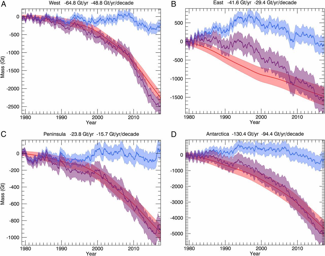
 Kevin Drum has an excellent post, Here’s a Closer Look at President Trump’s Big Lie About El Paso, addressing El Paso crime as an example of deceiving with charts. He first quotes the state of the union:
The border city of El Paso, Texas, used to have extremely high rates of violent crime — one of the highest in the country, and considered one of our Nation’s most dangerous cities. Now, with a powerful barrier in place, El Paso is one of our safest cities.
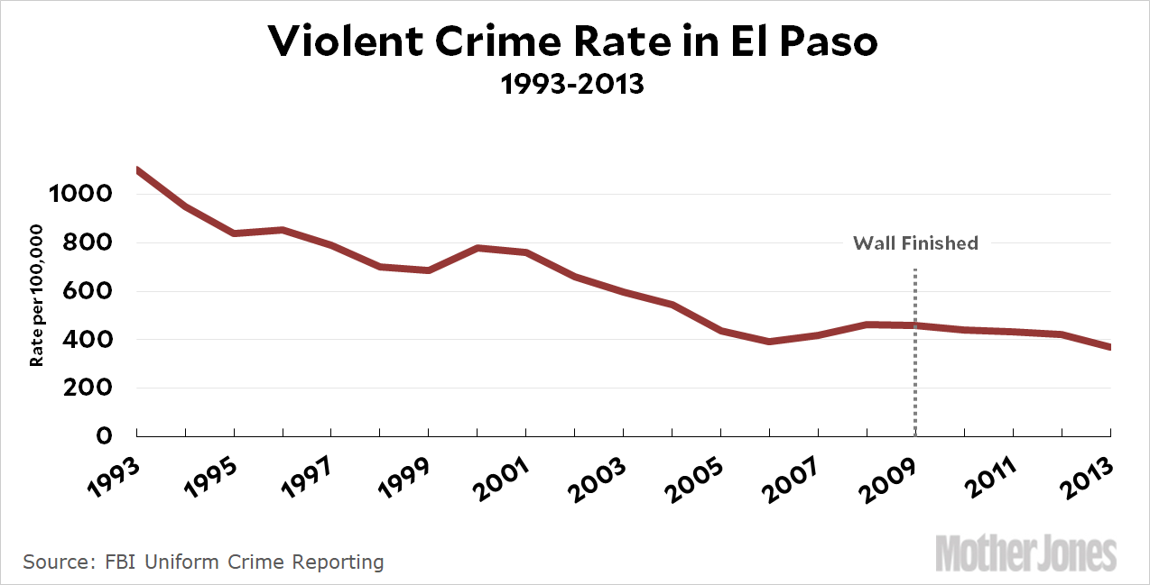
He then provides three charts. The first is El Paso violent crime rate, as reported by the El Paso Police Department, from 2006 through 2013 with a line noting the wall completion in 2009. The second, copied here, is the El Paso crime rate from 1993 to 2013. By the first graph it appears the wall had an impact by picking the low point in 2006 as the starting point, but based on the graph here it doesn’t appear the wall had much of an impact. The final graph is a selection of mid-size cities which shows El Paso has historically had a low crime rate. The post is worth reading to see all three graphs.
The FBI post crime data and a place to start is their Crime Data Explorer. The Crime in the U.S. page is also useful.