Tag Archives: data source

How much money do migrants send home to individuals?

Pew has an interactive graph on their Remittance flows worldwide in 2017 page where you can select a country and either outgoing or incoming. The result is get a map of how much money was sent to other countries or came into the country. For example, the graph here is for money sent from the U.S. to other countries. Along with the map, a table of data is updated to match the selection on the map.  A related Pew article, Immigrants sent a record amount of money home to sub-Saharan African countries in 2017 by Abby Budiman and Phillip Connor (4/3/19), highlights this data.

Money sent by immigrants to their home countries in sub-Saharan Africa reached a record $41 billion in 2017. This represents a 10% jump in remittances from the previous year, the largest annual growth for any world region, according to a Pew Research Center analysis of World Bank data.

Worldwide, immigrants sent a record $625 billion (in 2018 U.S. dollars) back to their home countries in 2017, a 7% increase from the previous year.


What is Population Bracketology?

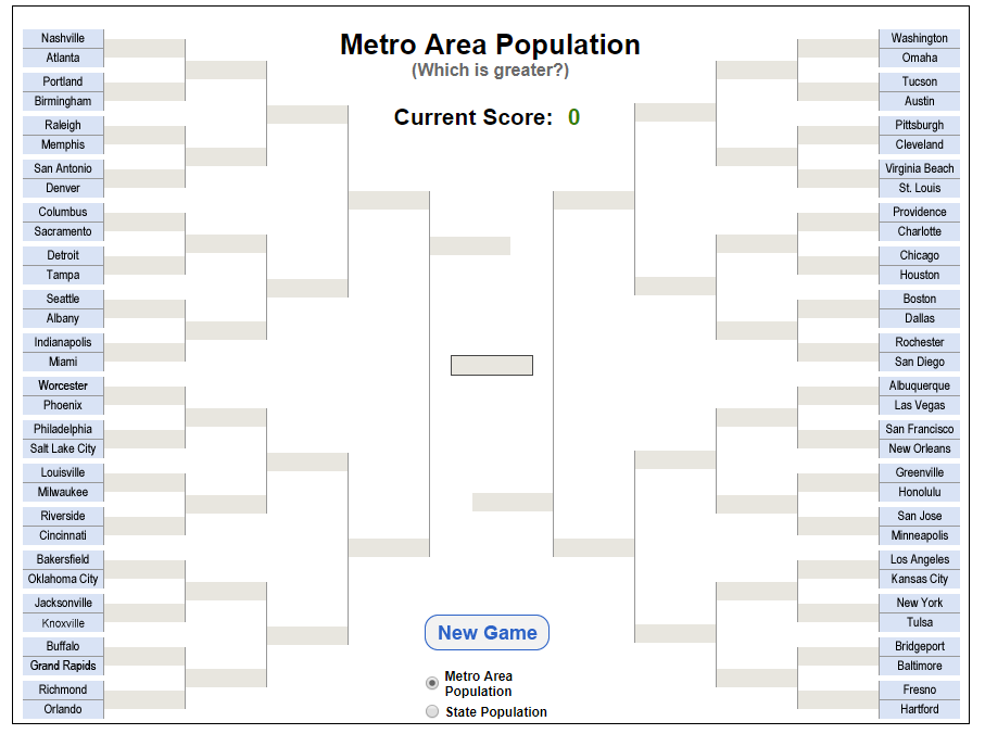
The Census Bureau has a new interactive data visualization called Population Bracketology (see the screen shot here). In the game, players have to choose the city (or state for the state version) with the largest population.  Once the game is completed users can scroll over the cities (or states) to get the size of their population.  So, how much do you know about city and state population sizes? Play the game and find out.

How much coal does the U.S. export?

The EIA article In 2018, U.S. coal exports were the highest in five years (3/27/19) summarizes coal exports.

While U.S. coal consumption has generally declined since its 2008 peak, EIA expects that U.S. coal exports reached 116 million short tons (MMst) in 2018, the highest level in five years, based on foreign trade data collected by the U.S. Census Bureau. Exports of coal from the United States have increased since 2016 as international prices have made it more economic for U.S. producers to sell coal overseas.

While coal production in the U.S. has been on the  decline (2014: 1,000,048,758 short tons;  2015: 896,940,563;  2016: 728,364,498;  2017:774,609,357 ) along with consumption, exports have been increasing. This raises philosophical questions.  U.S. coal CO2  emissions have gone down due to burning less coal, but should U.S.  CO2 emissions include U.S. coal burned in other countries?  If a country removes fossil fuels from the ground, how complicit are they in the CO2 emissions of those fuels even if they aren’t the ones burning it?

The EIA article includes links to the data such as the Annual Coal Report page.

How will raising the federal minimum wage impact workers?

The EPI article, Raising the federal minimum wage to $15 by 2024 would life pay for nearly 40 million workers, by David Cooper (2/5/19) covers their analysis of raising the minimum wage.  Their graph here shows the gap between the minimum wage and median wage over time. The report is lengthy and detailed. A few quick highlights:

Raising the minimum wage to $15 by 2024 would undo the erosion of the value of the real minimum wage that began primarily in the 1980s. In fact, by 2021, for the first time in over 50 years, the federal minimum wage would exceed its historical inflation-adjusted high point, set in 1968.

All told, raising the minimum wage to $15 by 2024 would directly or indirectly lift wages for 39.7 million workers, 26.6 percent of the wage-earning workforce.

Indexing the minimum wage to the median wage would ensure that low-wage workers share in broad improvements in U.S. living standards and would prevent future growth in inequality between low- and middle-wage workers.

The article has over 20 graphs/charts/tables and each one has the associated data.  The report does include “a discussion of the research on the likely effects such a raise would have on businesses, employment, and low-wage workers’ welfare.”

What are the gender trends in graduate school?

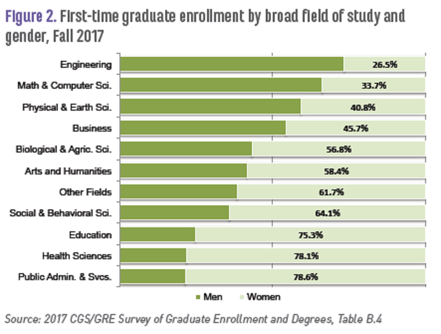
The Council of Graduate Schools (CGS) report, Graduate Enrollment and Degrees 2007 to 2017 (Oct 2018) provides data on enrollment and degrees in graduate school by gender and race.  For example, the graph here is Figure 2 in their report and provides enrollment data by field of study and  gender.  In the aggregate they note:

Academic year 2016-17 marked the eighth consecutive year in which women earned the majority of degrees awarded at the doctoral level. Women earned 64.0% of graduate certificates awarded in 2016-17, 57.3% of master’s degrees, and 53.0% of doctorates.

The report contains a number of graphs and data tables with various  demographic information (race, gender, international). For example,

Among first-time U.S. citizens and permanent resident graduate students in the Fall of 2017, about 23.9% were underrepresented minorities, including American Indian/Alaska Native (0.5%), Black/African American (11.9%), Native Hawaiian/Other Pacific Islander (0.2%), and Hispanic/Latino (11.3%) (Table B.11).

A summary page of the report, First-Time Enrollment Holds Steady – Application Counts Slightly Decline at U.S. Graduate Schools, also has a link to the full pdf report.

What is the current information on wages trends?

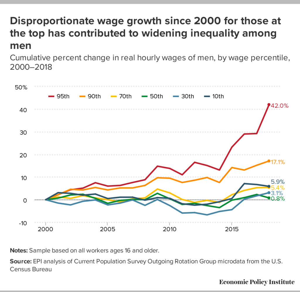
EPI has released its report: State of Working America Wages 2018, Wage inequality marches on – and is even threatening data reliability by Elise Gould (2/20/19). The report includes 19 tables and charts. The data and charts are easily downloaded, such as the chart here. The report is thorough and anyone reading it will likely be surprised about something.  A few selection from the report:

From 2017 to 2018, men at the 95th percentile saw large wage gains, while those at the middle and very bottom of their wage distribution experienced downright wage losses.

The gender wage gap at the 10th percentile remains the smallest across the wage distribution and it has narrowed since 2000; it is currently at 5.9 percent. The regression-adjusted average gender wage gap narrowed slightly from 2000 to 2018 and is currently at 22.6 percent.

In both comparison periods, both men and women at the 10th percentile saw greater wage growth in states with minimum wage changes versus those without.

Over the last 18 years, wage growth for white and Hispanic workers has been about four times faster than that of black workers in the 20th through the 70th percentiles of their respective wage distributions. The 60th and 70th percentiles of the black wage distribution remain below their 2000 levels.

The wages of those with a high school diploma rose faster than the wages of those with a college degree over the last two years, narrowing the gap between college and high school wages. As a result, the college wage premium—the regression-adjusted log-wage difference between the wages of college-educated and high school–educated workers—fell from 50.6 percent to 48.4 percent between 2016 and 2018.

Related posts:  How have wages grown since 1980?
What is the pay gap between black women and white men?
What are the prospects for high school grads?

The Interactive Graphs page has two charts on wages.

What is the peak quarter for utility revenues?

The question is answered in the Census Bureau post Census Bureau Data Show Third Quarter is Peak Time for Electric and Water Utilities by Justin Jarrett (1/5/19).

During just this year, U.S. electric utility revenue (NAICS 2211) for the third quarter of 2018 was $137.9 billion, an increase of 20.1 percent (± 2.7 percent) from the second quarter of 2018.

The graph here (copied from the post) has a couple of intriguing peaks between some Q3 years.  Worth noting:

Industries that exhibit seasonal patterns, like electric and water utilities, can mask underlying economic conditions. However, seasonal adjustment produces data in which the values of neighboring quarters are usually easier to compare.

The Census Bureau has the data available on their Quarterly Services page (look under Historical Data tab).

How warm was 2018?

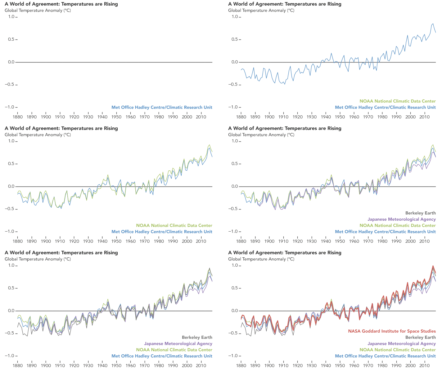
A number of agencies have reported that 2018 was the fourth hottest year on record. The report from NASA GIS, 2018 Fourth Warmest Year in Continued Warming Trend, According to NASA, NOAA (2/6/19) includes a short video showing the warming of the planet while including other facts. The report also includes the animated graph, copied here, with temperature trends from five different agencies.

Global temperatures in 2018 were 1.5 degrees Fahrenheit (0.83 degrees Celsius) warmer than the 1951 to 1980 mean, according to scientists at NASA’s Goddard Institute for Space Studies (GISS) in New York. Globally, 2018’s temperatures rank behind those of 2016, 2017 and 2015. The past five years are, collectively, the warmest years in the modern record.

The post includes a link to data.

Did a wall impact violent crime in El Paso?

Kevin Drum has an excellent post, Here’s a Closer Look at President Trump’s Big Lie About El Paso, addressing El Paso crime as an example of deceiving with charts. He first quotes the state of the union:

The border city of El Paso, Texas, used to have extremely high rates of violent crime — one of the highest in the country, and considered one of our Nation’s most dangerous cities. Now, with a powerful barrier in place, El Paso is one of our safest cities.

He then provides three charts.  The first is El Paso violent crime rate, as reported by the El Paso Police Department, from 2006 through 2013 with a line noting the wall completion in 2009. The second, copied here, is the El Paso crime rate from 1993 to 2013.  By the first graph it appears the wall had an impact by picking the low point in 2006 as the starting point, but based on the graph here it doesn’t appear the wall had much of an impact. The final graph is a selection of mid-size cities which shows El Paso has historically had a low crime rate. The post is worth reading to see all three graphs.

The FBI post crime data and a place to start is their Crime Data Explorer.  The Crime in the U.S. page is also useful.

How many people in the world don’t have electricity?

Our World in Data’s latest visualization is a bar chart from 1990 to 2016 of the number of people with and without electricity.  In 2016, out of about 7.5 billion people nearly 1 billion lived without electricity or about 12%. In 1990, 1.5 billion people were without electricity, a decrease of 1/2 a billion, but also a decrease from 35% to 2016’s 12%. Their graph is interactive and users can choose individual countries, download the graph, and download the data.

Related Post (12/14/17): How many people don’t have access to electricity?