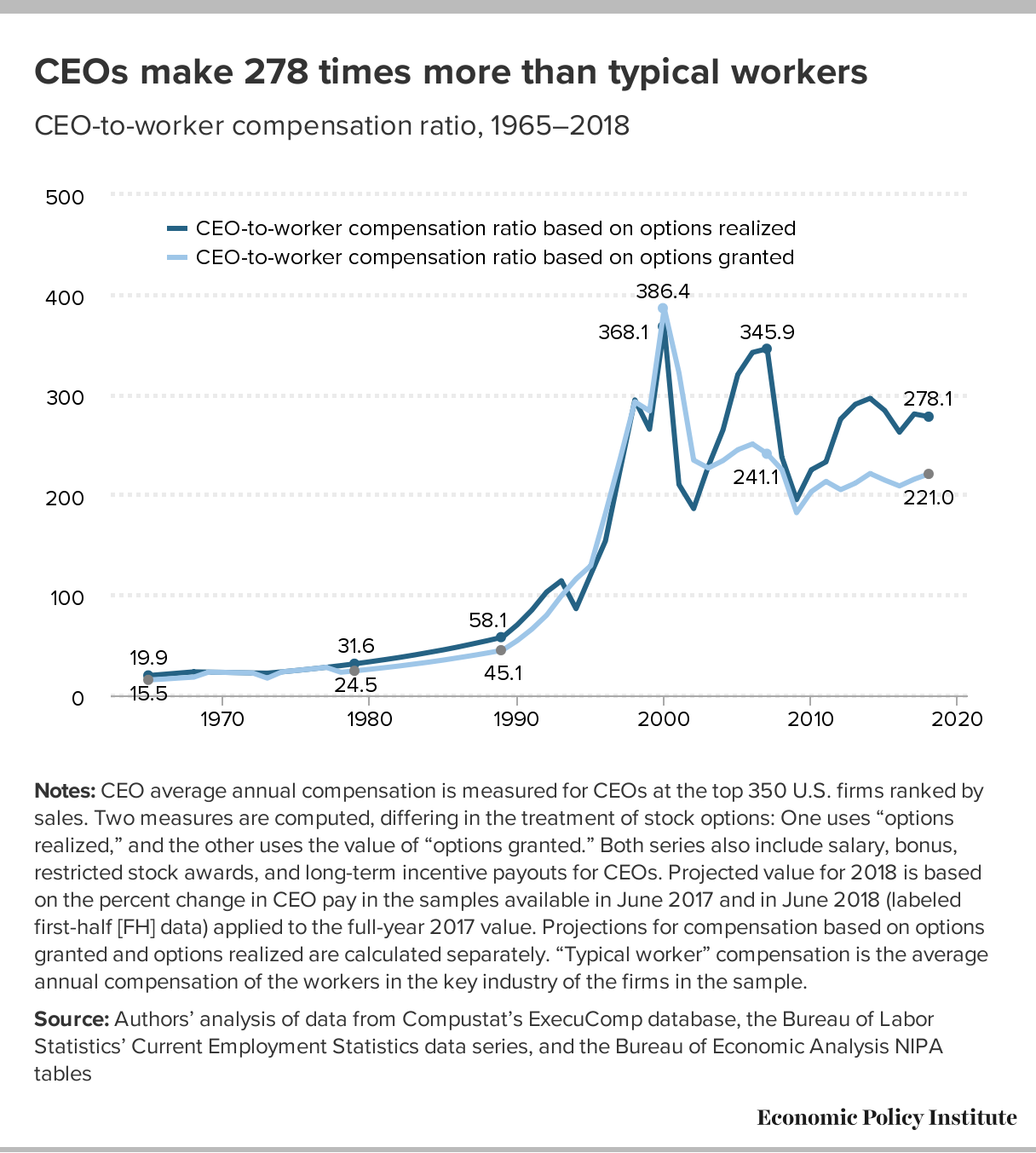
Tag Archives: data source

What new energy record did the U.S. set?

The eia reports that 44.5 Bcf of natural gas was consumed in the lower 38 on July 19 in their post United States sets new daily record high for natural gas use in the power sector by Katie Dyl (8/5/19).

Higher electricity demand for air conditioning during a heat wave from July 15 through July 22 drove the increased power generation, especially from natural gas-fired generators. Although the highest temperatures occurred during the weekend, most states east of the Rocky Mountains experienced warmer-than-normal weather in the days leading up to the heat wave. From July 16 through July 21, the average maximum temperature exceeded 85°F in most parts of the country.

Note the feedback loop. As the planet warms we use more energy (still mostly fossil fuels) to cool homes  and business (cooling takes more energy than heating) and thus emitting more co2 to warm the planet.  The post has other graphs and links to the data.

How much energy does the U.S. government consume?

The eia article U.S. government energy consumption continues to decline by Fred Mayes (7/25/19) has a half dozen charts showing U.S. government energy consumption.  For example, the chart copied here provides energy consumption by defense and civilian agencies by type (vehicles/equipment or buildings).

The U.S. federal government consumed 915 trillion British thermal units (Btu) of energy during the 2017 fiscal year (FY), or 20% less than a decade before. The slight decline in FY 2017 marks the fifth consecutive decline in annual federal government consumption.

To put this in some perspective, the eia article In 2018, the United States consumed more energy then ever before by Allen McFarland (4/16/19) shows that the U.S. consumed almost 100 quadrillion BTUs in 2017.

Primary energy consumption in the United States reached a record high of 101.3 quadrillion British thermal units (Btu) in 2018, up 4% from 2017 and 0.3% above the previous record set in 2007.

So, the U.S. government consumes about 1% of overall energy. Both articles have links to the data.

In 2100, 80% or more of the population will live where?

The Our World in Data article More than 8 out of 10 people in the world will live in Asia or Africa by 2100 by Hannah Ritchie (7/15/19) includes the (interactive) chart copied here with population projections by the United Nations.

The United Nations projects that world population growth will slow significantly over the course of the 21st century, coming close to its peak at 10.9 billion by 2100.

The striking change between now and 2100 is the expected growth in the African population. Today, its population is around 1.3 billion; by 2100 it’s projected to more than triple to 4.3 billion.

North, Central and South America, and Oceania, are projected to also see a rise in population this century – but this growth will be much more modest relative to growth in Africa. Europe is the only region where population is expected to fall – today its population stands at around 747 million; by 2100 this is projected to fall to 630 million.

The chart and the data can be downloaded.

How hot was June 2019?

The NOAA National Centers for Environmental Information Global Climate Report – June 2019:

Averaged as a whole, the June 2019 global land and ocean temperature departure from average was the highest for June since global records began in 1880 at +0.95°C (+1.71°F). This value bested the previous record set in 2016 by 0.02°C (0.04°F). Nine of the 10 warmest Junes have occurred since 2010. June 1998 is the only value from the previous century among the 10 warmest Junes on record, and it is currently ranked as the eighth warmest June on record. Junes 2015, 2016, and 2019 are the only Junes that have a global land and ocean temperature departure from average above +0.90°C (+1.62°F). June 2019 also marks the 43rd consecutive June and the 414th consecutive month with temperatures, at least nominally, above the 20th century average.

How about land-only temps?

The global land-only surface temperature for June 2019 was 1.34°C (2.41°F) above the 20th century average. This was also the highest June temperature in the 140-year record, exceeding the previous record of +1.30°C (+2.34°F) set in 2015.

What about Europe?

Europe had its warmest June on record at 2.93°C (5.27°F) above the 1910–2000 average, surpassing the previous record of 1.95°C (3.51°F) set in 2003 by +0.98°C (+1.76°F). June 2019 also marked the first time since continental records began in 1910 that Europe’s June temperature departure from average surpassed the +2.0°C (+3.6°F) mark and nearly reaching +3.0°C (+5.4°F).

That is the way to beat a record. That isn’t a type the record was beat by almost 1°C.

Data for the chart here as well as land only or ocean only can be obtained from the NOAA Climate at a Glance page.


Rain, Rain, Go, Away. . .How wet has it been?

The NOAA post Assessing the U.S. Climate in June 2019 (7/9/2019) has a quick summary of precipitation. In short, the 12 month contiguous U.S. precipitation record has been broken for the last three months.

 Average precipitation across the contiguous U.S. for July 2018–June 2019 was 37.86 inches, 7.90 inches above average, and broke a record, exceeding the previous all-time 12-month period on record set at the end of May. The previous all-time 12-month record was 37.72 inches and occurred from June 2018–May 2019. Prior to that record, the all-time 12-month record was 36.31 during May 2018–April 2019. The previous July–June record was 35.11 inches and occurred from July 1982–June 1983.

Precipitation data can be obtained from the NOAA Climate at a glance page, where a csv file can be downloaded.


How has the federal minimum wage changed?

The EPI article Congress has never let the federal minimum wage erode for this long by David Cooper (6/17/19) provides the graph here.

June 16th marks the longest period in history without an increase in the federal minimum wage. The last time Congress passed an increase was in May 2007, when it legislated that the minimum wage be raised to $7.25 per hour on July 24, 2009. Since the minimum wage was first established in 1938, Congress has never let it go unchanged for so long.

To get the data for this graph visit The FRED Blog The value(s) of the minimum wage. At the bottom of the page they provide direction on how to recreate the chart with FRED data. Knowing how to do this is valuable and should be incorporated into any statistics or QL course.

Who gets injured by fireworks?

The U.S. Consumer Product Safety Commission has annual reports on fireworks. The 2018 report on the Fireworks Information Center page includes data on injuries. In 2018 64% of injuries were male. From 2003 to 2018 injury rates varied from a low of 2.8 per 100,000 to a high of 4.0 per 100,00. Some facts:

Males experienced an estimated 2.2 fireworks-related, emergency department-treated injuries per 100,000 individuals during the special study period. Females had 1.2 injuries per 100,000 people.

There is not a statistically significant trend detected in the fireworks-related injury estimates from 2003 to 2018.8.

When considering injury rates (number of injuries per 100,000 people), children and young adults had higher estimated rates of injury than the other age groups during the 2018 special study period. Children 10 to 14 years of age had the highest estimated injury rate at 5.2 per 100,000 population. This was followed by 3.1 injuries per 100,000 people from older teens 15 to 19 years of age, and 2.7 injuries per 100,000 people from children 5 to 9 years of age.

The report has a number of tables with data and the report could easily be used in a statistics or QL course.

How much is permafrost warming?

From Permafrost is warming at a global scale, Biskaborn et. el. in Nature Communications.

The Inside Climate news article Permafrost is Warming Around the World, Study Shows – That’s a Problem for Climate Change by Bob Berwyn (1/16/19) reports on the Nature Communications paper Permafrost is warming at a global scale by Boris K. Biskaborn et. el. (1/16/19). From the article:

Detailed data from a global network of permafrost test sites show that, on average, permafrost regions around the world—in the Arctic, Antarctic and the high mountains—warmed by a half degree Fahrenheit between 2007 and 2016.

The most dramatic warming was found in the Siberian Arctic, where temperatures in the deep permafrost increased by 1.6 degrees Fahrenheit.

Why does this matter? It creates a feedback loop:

By some estimates, the Arctic permafrost contains enough carbon to nearly double the amount of CO2 currently in the Earth’s atmosphere. A rapid meltdown would be disastrous because it could release a lot of CO2—in addition to methane, a powerful short-lived climate pollutant—to the atmosphere, where it would cause additional warming, said Ted Schuur, a permafrost expert at Northern Arizona University.

There are more graphs in the paper and a link to the data. The Guardian has a recent related article Scientists shocked by Arctic permafrost thawing 70 years sooner than predicted (6/18/19)

Related posts:
Melting Permafrost and a Feedback Loop
Methane Bubbles – A Feedback Loop
How are beavers creating a climate feedback loop?

How much is Europe warming?

European Environmental Agency


With Europe in the news with record heatwaves we turn to the European Environmental Agency to get a sense of changes in temperature in Europe.  The graph here from their page Heating and cooling degree days shows changes in heating degree days (HDD) and cooling degree days (CDD) weighted by population.

Figure 1 further illustrates that HDDs and CDDs did not show a clear trend in the period 1950–1980. (The declining trend for CDDs shown in Figure 1 (right panel) is highly sensitive to the choice of start year). Since the beginning of the 1980s, however, Europe has started experiencing a markedly declining overall trend in HDDs, and a markedly increasing trend in CDDs, which points to a general increase in cooling needs and a general decrease in heating needs.

Several model-based studies agree that the projected changes in temperature reduce the total energy demand in cold countries, such as Norway, whereas total energy demand increases in warm countries, such as Italy or Spain. The studies also agree that increases or decreases in total energy or electricity demand at the national level as a result of climate change alone will be below 5 % by the middle of the century [iv]. Although these changes are rather minor, adaptation needs can arise from their combination with socio-economic changes (e.g. increased availability of cooling systems) and from changes in peak energy demand.

There is an interactive version of the graph here with a table option for the data.

What are the economic prospect for 2019 high school grads?

EPI has its annual report on the prospects for 2019 high school grads.  Class of 2019 High school edition by Elise Gould, Julia Wolfe, and Zane  Mokhiber (6/6/19) has 17 key findings and 11 graphs with data.  For example, their graph here (figure I) gives hourly wages in 2018 dollars for high school graduates not enrolled in further schooling.  As compared to 2000 wages for men as well as Black high school graduates are lower; all other groups have gone up. In fact, Hispanics make more than all other groups, including White graduates.

A few other highlights from the key findings:

Asian Americans/Pacific Islanders are significantly more likely to have begun on the college path at this age than any other racial/ethnic group.

Young black high school graduates are roughly twice as likely to be unemployed as their white and AAPI peers.

Average wages for young high school graduates recently surpassed their 2007 level, but remain just below their 2000 level, representing two lost decades of wage growth.

Black students (that go on to college) take on a disproportionate amount of debt, in part because their families generally accumulate less wealth than white families.

The entire report is worth reading.

Related post: What are the prospects for high school grads?