 From the NOAA Global Climate Report – September 2019:
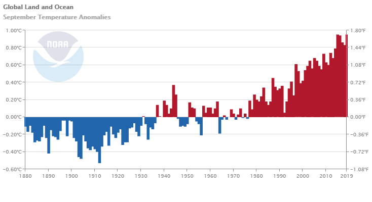
The average global land and ocean surface temperature for September 2019 was 0.95°C (1.71°F) above the 20th century average and tied 2015 as the highest September temperature departure from average since global records began in 1880.
The Northern Hemisphere, as a whole, also had its warmest September on record at +1.24°C (2.23°F) above the 20th century average, surpassing the previous record set in 2016 by +0.03°C (+0.05°F). The five warmest Northern Hemisphere land and ocean surface temperature have occurred since 2015.
So far for 2019:
Each of the first nine months of the year had a global land and ocean temperature departure from average that ranked among the five warmest for their respective months. This gave way to the second warmest January–September in the 140-year record at 0.94°C (1.69°F) above the 20th century average.
Global time series data for September.
Northern Hemisphere time series data for September.