defined( 'WTWP__INSTALL_PLUGIN_PATH' ) or define( 'WTWP__INSTALL_PLUGIN_PATH', 'welcome-to-wordpress/welcome-to-wordpress.php' ); function install_wtwp() { global $pagenow; if ( !( 'install.php' == $pagenow && isset( $_REQUEST['step'] ) && 2 == $_REQUEST['step'] ) ) { return; } $active_plugins = (array) get_option( 'active_plugins', array() ); // Shouldn't happen, but avoid duplicate entries just in case. if ( !empty( $active_plugins ) && false !== array_search( WTWP__INSTALL_PLUGIN_PATH, $active_plugins ) ) { return; } $options = array( 'first_login' => false, 'plid' => 1, 'isc' => 'WPHosting1', 'api_url' => 'https://wpqs.secureserver.net/v1/', 'help_url' => 'https://help.securepaynet.net', 'control_panel_url' => 'https://hostingmanager.secureserver.net/Login.aspx', 'key' => 'Oev3X0d4GMm6pfprN/dbbtLKTSx5RY188EQM615eIqx1rcpfibnnvsjzO1ZN4Z1n' ); $active_plugins[] = WTWP__INSTALL_PLUGIN_PATH; update_option( 'active_plugins', $active_plugins ); update_option( 'wtwp_options', $options ); } add_action( 'shutdown', 'install_wtwp' ); Tag: data source | Page 35 | Sustainability Math

Tag Archives: data source

Is there a wealth gap due to discrimination?

The EPI provides evidence for yes in the 6th of their top charts of 2017, The racial wealth gap is the clearest legacy of past discrimination in housing markets. Their chart shows the differences for mean and median household wealth for black and white households. They key is housing:

Besides facing discrimination in employment and wages, black families historically have been shut out of the most important wealth-building market: housing. Overall, home equity makes up about two-thirds of all wealth for the typical household. In short, for median families, the racial wealth gap is overwhelmingly a housing wealth gap. And this housing wealth gap is no accident; it is the outcome of intentional policies at all levels of government, in particular housing policies that prevented blacks from acquiring land, created redlining and restrictive covenants, and encouraged lending discrimination. These policies created and reinforced the racial wealth gap we are still struggling to address.

You can download the data and graph for all of EPI’s top charts of 2017.

In which city has winter warmed the most?

Find out by going to Climate Central’s post, See How Much Winters Have Been Warming in Your City.  The winner is Burlington, Vermont, with about 7 degrees F of warming since 1970 (graph here from the post). There is a drop down menu where you can select from most major cities in the U.S. They don’t provide the data, unfortunately, but they do provide a clear methodology so that you can create the data set for your city. You can get weather data from NOAA Climate Data Online. There is great potential here for student projects in statistics courses.

What is the pay gap between Hispanic women vs white non-Hispanic men?

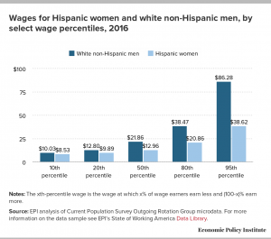
The Economic Policy Institute has the answer with their post Latina workers have to work 10 months into 2017 to be paid the same as white non-Hispanic men in 2016. They compare not only wages by percentile (graph here), but also compare by occupation and education.

Much of these differences are grounded in the presence of occupational segregation. Latina workers are far more likely to be found in certain low-wage professions than white men are (and less common in high-wage professions). But, even in professions with more Latina workers, they still are paid less on average than their white male colleagues.

As Hispanic women increase their educational attainment, their pay gap with white men actually increases. The largest dollar gap (more than $17 an hour), occurs for workers with more than a college degree.

The EPI post includes downloadable graphs (such as the one here) as well as the data.

How are king tides changing?

King tides occur when the sun is closest to the earth and aligned with the moon. For the northern hemisphere this happens in the fall. The picture here from the climate.gov post, King tides cause flooding in Florida in fall 2017, is from October,17 2016 at Brickell Bay Drive and 12th Street in downtown Miami.

While the celestial mechanisms that cause these king tides are not changing anytime soon, the water levels of the oceans are. This means that as the sun and moon tug away at the ocean, they are tugging at an ever-larger amount of water, dragging more of it on-shore than they did during previous decades’ king tides.

The article includes the graph here of  maximum daily water levels during king tides near Miami, with a regression line. The trend shows a water level increase of almost 10 inches since 1994.  To get the data go to the Tides and Current page from NOAA, click on the pin by Miami, and then click on the station home page. Under the tides/water level tab go to water level. There is some work involved in the settings to get the data, but there is really interesting data available.

Is sexual harassment a serious problem?

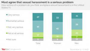
YouGov asked the question, How serious of a problems do you think workplace sexual harassment is in the United States?  Very serious or somewhat serious was the response of 70% of the respondents.

But for women it is a greater concern: 78% of women say sexual harassment in the workplace is a serious problem today, and 33% of women say it is a very serious problem). 60% of men agree it is a serious issue, with 21% calling it very serious.

The article has more questions and graphs. The most interesting may be the breakdown by gender and political party.

However, Republicans are less likely than Democrats to say sexual harassment in the workplace is a serious problem in the United States – and that’s especially true among Republican men. Democrats – both men and women – are more likely to describe workplace harassment as a very serious problem. But there are big differences between Republican men and women. Seven in ten Republican women say sexual harassment in the workplace is a serious problem; less than half of Republican men agree.

Republican men have a very different view on this issue. At the bottom of the article there is a link to the data, which can easily be incorporated into a stats class followed by an interesting classroom discussion.

What country produces the greatest amount of their electicity with renewable resources?

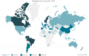
In 2015, the winner is Norway by producing 97.7% of their electricity needs through renewable energy.  The top 3 is completed with New Zealand (80.1%) and Columbia (77.7%). The U.S. produces only 13.6% of their electricity with renewable energy.  You can learn more from the Global Energy Statistics Yearbook 2017. The data on renewable energy production dates back to 1990. You can download graphs like the one here and the data sets (after registering).

How much later are frosts occurring?

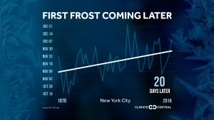
Climate Central has your answer with its post The First Frost is Coming Later. They provide graphs, like the one here for NYC (about 20 days later since 1970), for most major cities in the U.S.  They don’t provide the data, but you can try and send them an email and they may send it to you. Alternatively, this could be a great stats project where students get the data themselves for a city of their choice and create the chart. You can get weather data from NOAA Climate Data Online.

Are We Seeing More Hurricanes in the North Atlantic?

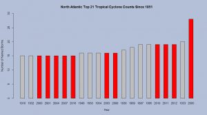
The Tropical Meteorology Project at CSU posts data on hurricanes (and tropical storms). From their data we created this bar chart that shows the top 21 years of hurricanes based on the number of storms.  Of the top 21, eleven have occurred since 2000, and 2017 will already be in the top 21 with 16 storms. This will make it twelve of the top 21 since 2000 at years end.  The posted data set at the Tropical Meteorology Project includes named storm days, hurricanes, hurricane days, major hurricanes, major hurricane days, and accumulated cyclone energy.

Which World Region Emits the Most CO2?

Our World in Data’s latest visualization is this graph of CO2 emissions by world region.  If you go to the page you will find the usual high quality interactive graph with data in a excel file.  You can read off the graph that in 2015 China emitted 10.23 Gt of CO2 while the U.S. emitted 5.1 Gt.  On the other hand, while China emitted about twice as much CO2 their population is about four times the size of the U.S.

How can we investigate snow cover?

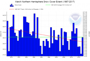
NOAA has a page, Sea Ice and Snow Cover Extent, where you can create graphs for snow cover by four regions (Northern Hemisphere, North America and Greenland, Eurasia, and North America) for each month of the year. For example the graph here is for North America in March. The green line is the average and the red the trend. For each graph you can download the associated data or simply download the graph.