Tag Archives: QL

What do we know about nighttime minimum temperatures?

The recent article on Climate.gov Extreme overnight heat in California and the Great Basin in July 2018 
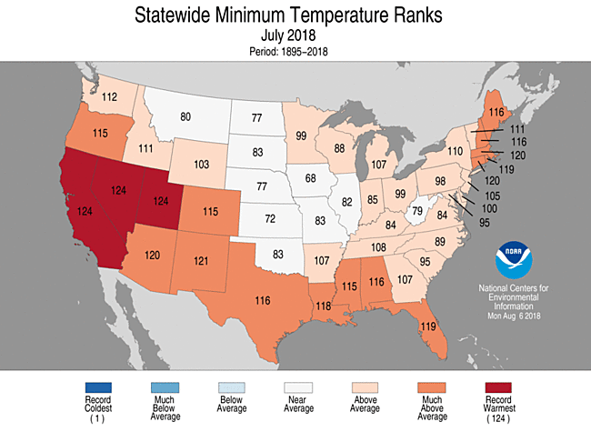
by Rebecca Lindsey (8/8/18) provides an overview in context.

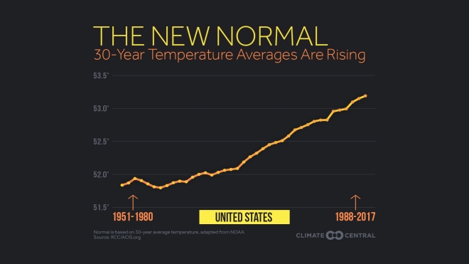
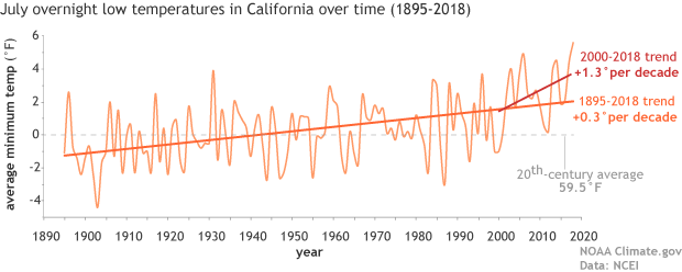
As the NCEI’s Deke Arndt has blogged about before, nighttime low temperatures are increasing faster than daytime high temperatures across most of the contiguous United States. For much of the West and Southwest, July’s record-breaking nighttime heat is a new highpoint in a long-term trend—one that has rapidly accelerated in recent decades. In California, average overnight low temperature in July rose by 0.3°F per decade over the historical record (1895-2018), but since 2000, the pace of warming has accelerated to 1.3°F per decade.

Here is an example of why this matters:

According to Tim Brown, director of NOAA’s Western Region Climate Center (WRCC), it’s a pattern that has serious consequences for wildfires and those who combat them. When temperatures cool off overnight, it’s not just a physical relief for firefighters who may be working in conditions that push the limits of human endurance; fire behavior itself relaxes as temperatures drop, winds grow calmer, and relative humidity rises.

The graph here for California July minimum temperature is from the article. A stats course can have students create a similar graph for their hometown. Go to  NOAA’s Local Climatological Data Map. Click on the wrench under Layers. Use the rectangle tool to select your local weather station. Check off the station and Add to Cart. Follow the direction from their being sure to select csv file. You will get an email link for the data within a day.  Note: You are limited in the size of the data to ten year periods. You will need to do this more than once to get the full data set available for your station.

The map here  shows statewide minimum temperature ranks for July 2018.  It is from NOAA’s National Temperature and Precipitation Maps page.  Under products select Statewide Minimum Temperature Ranks and choose the desired time period.  A map similar to the one in the article can be generated by selecting CONUS Gridded Minimum Temperature Ranks.

What are the prospects for high school grads?

The EPI article Class of 2018 High school edition by Elise Gould, Zane Mokhiber, & Julia Wolfe (6/14/18) provides a thorough review.  Figure I from the report, copied here, shows 2000 and 2018 wages for high school grads not enrolled in further schooling by race and gender.

In 2018, young workers with a high school diploma have an average hourly wage of $11.85, which translates to annual earnings of around $24,600 for a full-time, full-year worker. This overall average masks important differences in wages by gender and race.

The report has 11 graphs each with data that can be downloaded along with the graph.  A few points from the article:

  • Only 32% of 18-64 have a four year degree or more while 10.5% haven’t graduated high school. (see figure A)
  • The percent of high school grads (18-21) that are employed and not enrolled has increased from 26% in 2010 to 31% in 2018. (see figure c)
  • Over much of the last three decades, wage growth for young high school graduates has been essentially flat. (see figure H)

The first paragraph of their conclusion:

While there may be many reasons someone might choose to enter the labor force after high school rather than attend college, college should at least be a viable option; a person’s economic resources should not be the determining factor in whether they get to go to college. But, as things stand, the prospect of staggering debt may discourage students from less wealthy families from enrolling in further education or prevent them from completing a degree.

Do we disagree with factual statements that we think are opinions?

The Pew Research Center’s article Distinguishing Between Factual and Opinion Statements in the News by Amy Mitchell, Jeffrey Gottfried, Michael Barthel, and Nami Sumida (6/18/18) addresses this question and more.

A new Pew Research Center survey of 5,035 U.S. adults examines a basic step in that process: whether members of the public can recognize news as factual – something that’s capable of being proved or disproved by objective evidence – or as an opinion that reflects the beliefs and values of whoever expressed it.

We will focus on section 4 Americans overwhelmingly see statements they think are factual as accurate, mostly disagree with factual statements they incorrectly label as opinions. Odds are that a person who identifies a factual statement as opinion will also disagree with the statement (see table copied here).  For example,  41% of those surveyed said that Spending on Social Security, Medicare, and Medicaid make up the largest portion of the U.S. federal budget was an opinion and of those 82% disagreed with the statement.

This is an excellent article for a QL or Stats course as it is rich with data, graphs, and charts. You can also discuss why 41% of those surveyed thought a statement that is measurable (How much of the Federal budget goes to social security, medicare, and medicaid?) was an opinion.  The article also includes detailed information on their methodology and detailed tables of data.


How much are 30 year temperature averages increasing?

Changes in 30 year temperature averages depend on where you live, but Climate Central’s New Normal: Temperatures Are Trending Up Across U.S.  (3/16/18) has graphs for major cities across the U.S. The one here is for the U.S.

Normal temperatures, generally defined to be the 30-year average at a location, are trending up across most of the U.S. Since 1980, the average continental U.S. temperature has risen 1.4°F.

This is a change in the 30 year average so that the value for 2017 is the average from 1988-2017. In other words, the climate is changing.  A nice primer on the difference between weather and climate can be found at the NSIDC Climate vs Weather page:

Weather is the day-to-day state of the atmosphere, and its short-term variation in minutes to weeks. People generally think of weather as the combination of temperature, humidity, precipitation, cloudiness, visibility, and wind. We talk about changes in weather in terms of the near future: “How hot is it right now?” “What will it be like today?” and “Will we get a snowstorm this week?”

Climate is the weather of a place averaged over a period of time, often 30 years. Climate information includes the statistical weather information that tells us about the normal weather, as well as the range of weather extremes for a location.

The Climate Central post has a drop down menu and you can choose the graph for the city closest to you to see how much your climate has changed.  They don’t post the data that was used to create the graphs, but you can find the data for a location near you. Try starting with this NOAA map (look for a future post on using this portal for local data). This could be a great stats project for students.


What are the symptoms of inequality?

The Guardian article, Trump’s ‘cruel’ measures pushing US inequality to dangerous level – UN warns by Ed Pilkington (6/1/18) lists some symptoms two of which are:

Americans now live shorter and sicker lives than citizens of other rich democracies;

The US incarceration rate remains the highest in the world;

The article lacks some data, which we provide here. It is true that incarceration rates in the U.S. are shockingly the highest in the world, see the chart here from the Prison Policy Initiative’s States of Incarceration: The Global Context 2018. But, this isn’t much different than in 2016 as compared to Prison Policy Initiative’s States of Incarceration: The Global Context 2016 report. Both PPI pages have links to the data sets at the bottom as well as other graphs.

As for U.S. life expectancy Our World in Data has an interactive life expectancy graph.  The last year for this graph is 2015, but by that time the U.S. already had a lower life expectancy than other wealthy countries. This graph allows us to choose other countries, has a map version, and a link to download the data.

In short, the symptoms of inequality stated in the Guardian article are not new (at least the two we focused on here), although they may be getting worse. The article is worth wording as well as the PPI report. Also explore the Our World in Data life expectancy graph. There is data and context to connect all this to stats or QL courses.


Do people in poverty work?

The EPI article, 50 years after the Poor People’s Campaign poverty persists because of a stingy safety net and a dysfunctional labor market by Elise Gould and Jessica Schieder (5/24/2018), answers the question with a graph (reposted here) and this:

The bottom bar shows us that, among those working-age individuals who are otherwise employable, 63 percent are working and 45.5 percent are working full time. An additional 37.2 percent are not working, but this share includes 1.6 million people living below the poverty line who are actively seeking a job. The data make it clear that millions of people who are active participants in the labor market are unable to make ends meet, either due to insufficient hours or low wages.

How old is Arctic sea ice?

From the NYT: In the Arctic, the Old Ice Is Disappearing

The NYT article In the Arctic, the Old Ice Is Disappearing by Jeremy White and kendra Pierre-Louis (5/14/2018) notes

In the Arctic Ocean, some ice stays frozen year-round, lasting for many years before melting. But this winter, the region hit a record low for ice older than five years.

In fact, in March of 1984 5+ year old ice made up about 30% of all ice and now it makes up only a few percent. There is also less ice overall.

If you really want to explore changes in the age of  Arctic ice go to the NSIDC Satellite Observations of Arctic Change interactive graph.  You can choose a year from 1985 through 2916, see a map of the ice, a bar chart of ice by month by age, and have the graph animate through the months of the year. The differences over the years is extreme. You can get related data from the EASE-Grid Sea Ice Age, Version 3 page, although you will have to register.

What is the Great Gatsby curve?

From The 9.9 Percent Is the New American Aristocracy: The class divide is already toxic, and is fast becoming unbridgeable – You’re probably part of the problem by Matthew Stewart (June 2018) in The Atlantic. (Figure 2)

The Great Gatsby curve represents the correlation between income inequality and intergenerational income elasticity. In short, the greater the income inequality in a country the greater the relationship between a child’s income and their parent’s income.

The Atlantic article, The 9.9 Percent Is the New American Aristocracy: The class divide is already toxic, and is fast becoming unbridgeable – You’re probably part of the problem by Matthew Stewart (June 2018)  is an excellent example of weaving important quantitative information (great for a QL course), including the Great Gatsby curve, to tell an important story.

Rising immobility and rising inequality aren’t like two pieces of driftwood that happen to have shown up on the beach at the same time, he noted. They wash up together on every shore. Across countries, the higher the inequality, the higher the IGE (see Figure 2). It’s as if human societies have a natural tendency to separate, and then, once the classes are far enough apart, to crystallize.

The post What is The Great Gatsby Curve? by David Vandivier (6/11/2013) has an animated gif that explains the curve well. To update or recreate the chart, you can get country gini values from the CIA World Factbook.  Intergenerational income elasticity can be found in figure 1 of a the paper Inequality from generation to generation:the United States in Comparison by Miles Corak (2012).  Intergenerational Social Mobility in OECD Countries January 2010 OECD Journal: Economic Studies 2010(1):6-6 Orsetta Causa  and Åsa Johansson is another source.  If you find more recent data let us know.

Never miss a post. Go to sustainabilitymath.org and sign up for email alerts or follow us on twitter @SustMath.


What are the sources and uses of U.S. engergy?

Every year the EIA (U.S. Energy Information Agency) updates their energy flow and consumption diagrams. They are now available for 2017 energy use and the graph here is primary energy consumption by source and sector. For example, petroleum fulfills 37% or our energy use, 72% of petroleum is for transportation, and petroleum represents 92% of our transportation energy uses. Fossil fuels (petroleum, natural gas, and coal)  generated 78.1 quadrillion BTUs, which is 80% of our energy production, in 2017.  Links to this graph and the energy flow diagrams (total, petroleum, natural gas, coal, & electricity) are found at the bottom of the right side bar on the EIA Monthly Energy Review.

Past diagrams, dating back to 1996, are available at the Energy Flow Archives.  In 2016 fossil fuels generated 78.5 quadrillion BTUs, which was 81% of our energy production.  In 2008 (the first year this diagram appears) it was 83.4 quadrillion BTUs and 84%.

What is the state and future of snowpack out west?

Climate.gov has your answer with the article Winter so far has people out west asking, Where’s the snow?   (Feb 15, 2018) by Tom DiLiberto.

Farther south in Arizona, snows across the Rockies and in the Upper Colorado River Basin have been extremely low so far this year. Snow water equivalents—the amount of liquid water that would result  if  the snow melted in an instant—are between 0 and 30% of the median for this time of year for a broad region.  In fact, the “best” areas for snow this season lie along the Front Range in Colorado and are only just around normal.

Why does this matter?

For areas in the Upper Colorado River Water Basin along the southern Rockies which rely on snow melt for water resources later in the year, snow amounts this low bring fears. Particularly, is there going to be enough snowmelt to fill  Lakes Mead and Powell, which provide water to major cities like Tucson and Phoenix?

What is the cause? A second La Nina year in a row is part of the explanation, but (as their graph here shows)

As we continue to warm the planet due to emissions of greenhouse gases, mountain snowpack out west will likely continue to dwindle. Assuming we continue to increase global emissions of greenhouse gases (A2 scenario), the snow water equivalent of the snowpack in California by the end of the century will be 43% of what it was from 1971-2000. In Colorado, the snow water equivalent will be 26% less than that observed from 1971-2010.

A smaller and earlier-melting snowpack means less water to runoff into streams and tributaries in lower elevations. For places in the Sierra Nevada Mountains, Upper Colorado, and Upper Rio Grande River basins that rely heavily on a melting snowpack to provide the bulk of their annual runoff, climate change will have profound impacts on reservoir levels, water storage, and the people and ecosystems who rely on them.

There is enough quantitative information to use this article in a QL based course.