Tag Archives: QL

What is in the new IPCC report?

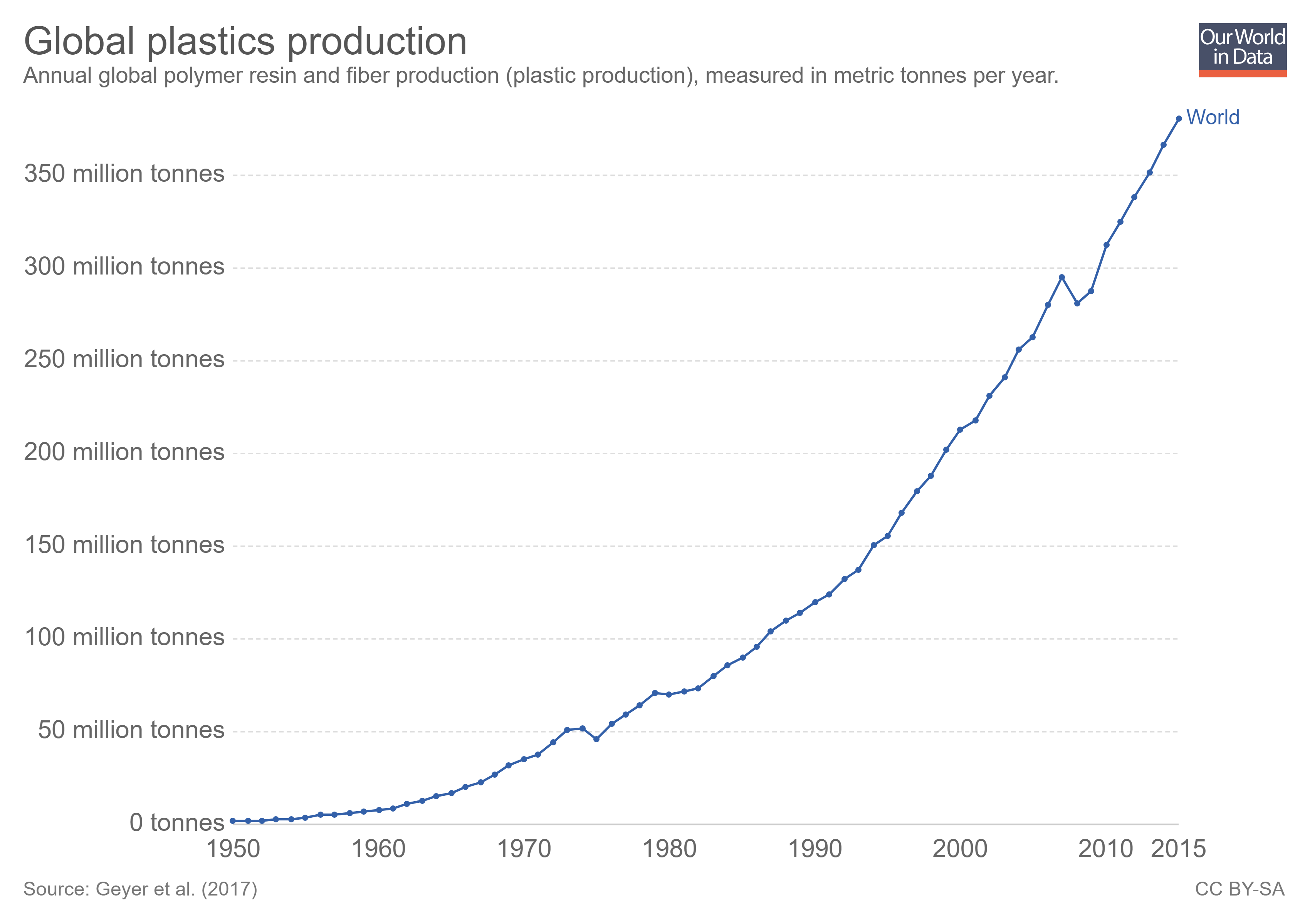
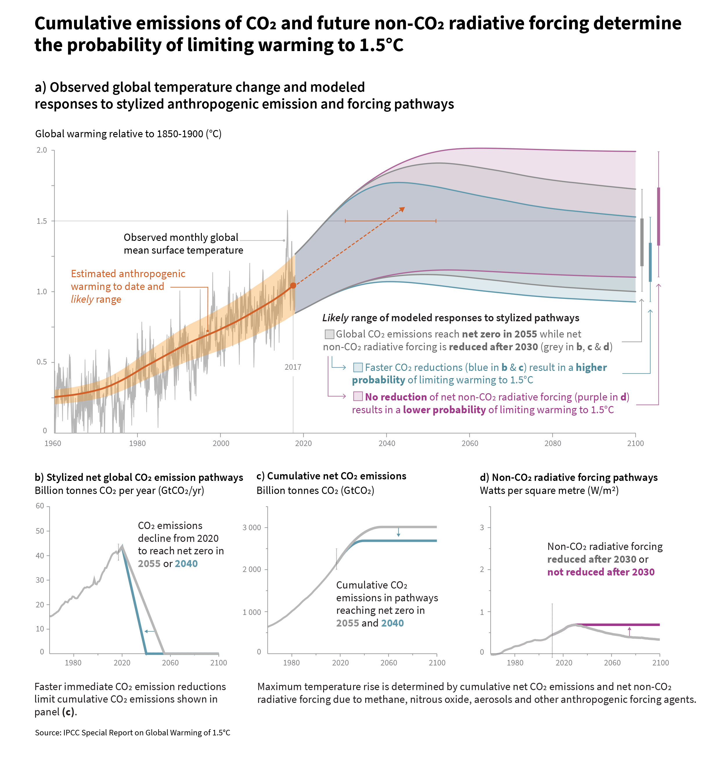
The is too much in the new IPCC report (released this week) to cover here, but we can highlight a couple of points. The first is their graph copied here.  The main graph provides projections for change in global temperature based on what happens to CO2 and non-CO2 radiative forcing gasses.  For example, if net CO2 emissions reach zero by 2055 (CO2 emitted minus CO2 absorbed graph b) and non-CO2 gases are reduces (graph d), then we are likely to stay below the 1.5 °C threshold.  What the graph does not say is what happens if society does nothing.

We recently posted about see level and here is an excerpt from the report about that:

Model-based projections of global mean sea level rise (relative to 1986-2005) suggest an indicative range of 0.26 to 0.77 m by 2100 for 1.5°C global warming, 0.1 m (0.04-0.16 m) less than for a global warming of 2°C (medium confidence). A reduction of 0.1 m in global sea level rise implies that up to 10 million fewer people would be exposed to related risks, based on population in the year 2010 and assuming no adaptation (medium confidence). {3.4.4, 3.4.5, 4.3.2}

The executive summary and/or the graphs could be used in QL rich courses.

Who perceives our economic system as fair or not fair?

The Pew Research Center’s article Partisans are divided over the fairness of the U.S. economy – and why people are rich or poor by Amina Dunn (10/4/18) provides interesting results about perceptions of our economic system.

Around six-in-ten U.S. adults (63%) say the nation’s economic system unfairly favors powerful interests, compared with a third (33%) who say it is generally fair to most Americans, according to a new Pew Research Center survey. While overall views on this question are little changed in recent years, the partisan divide has grown.

For the first time since the Center first asked the question in 2014, a clear majority of Republicans and Republican-leaning independents (57%) now say the economic system is generally fair to most Americans. As recently as the spring of 2016, a 54% majority of Republicans took the view that the economic system unfairly favors powerful interests.

And while wide majorities of Democrats and Democratic leaners have long said that the U.S. economic system unfairly favors powerful interests, the share who say this has increased since 2016 – from 76% then to 84% today.

How much have child and adolescent mortality rates changed?

The World Bank report, New child and adolescent mortality estimates show remarkable progress, but 17,000 children under 15 still died every day in 2017, by Emi Suzuki and co-author Haruna Kashiwase ( 9/18/18) provides a summary, as well as a number of charts. The good news:

There has been remarkable progress in reducing mortality among children and young adolescents in the past several decades. Between 1990 and 2017, the global under-five mortality rate dropped by 58 percent from 93 deaths per 1,000 live births to 39 deaths per 1,000 live births. During the last 17 years, the reduction in under-five mortality rates accelerated to an average 4% annual reduction, compared to an average 1.9% annual reduction between 1990 and 2000. For children aged 5-14, mortality dropped by 53 percent, from 15 deaths to 7 deaths per 1,000 children.

At the same time there is work to be done:

However, while a substantial reduction from the 14.3 million in 1990, an estimated 6.3 million children under age 15 still died in 2017, mostly from preventable causes.

The charts on the page are interactive but can’t be downloaded. On the other hand, the data is easily available and charts can be made for download. The chart here was made at the World Bank’s DataBank.  Note that the European Union has a lower under 5 mortality rate than the U.S. There are numerous variables to choose. Data can be downloaded and charts for download can be highly customized.

How have wages grown since 1980?

Source: EPI

Wage growth has varied depending on numerous factors such as gender, race, income level, and education. The EPI article,  America’s slow-motion wage crisis-Four decades of slow and unequal growth by John Schmitt, Elise Gould, and Josh Bivens (9/13/18) summarizes the findings with 30 graphs or tables (data included). For example, the cumulative percent change in inflation-adjusted hourly wages for workers in the 10th, 50th, and 90th percentile is given in the graph here (downloaded from the article).

The first key trend since 1979 is the historically slow growth in real wages. In 2017, middle-wage workers earned just 16.8 percent more than their counterparts almost four decades earlier. This corresponds to an annualized inflation-adjusted growth rate over the 38-year period of just 0.4 percent per year. The real wage increase for low-wage workers (those at the 10th percentile) was even slower: 8.9 percent over 38 years, or a 0.2 percent annualized growth rate.

This slow growth is particularly disappointing for two reasons. First, as we will see in the next section, U.S. workers today are generally older (and hence potentially more experienced) and substantially better educated than workers were at the end of the 1970s.10 Second, for workers at the bottom and the middle, most of the increase in real wages over the entire period took place in the short window between 1996 and the early 2000s. For the large majority of workers over the last four decades, wages were essentially flat or falling apart from a few short bursts of growth.

Quiz Questions: What was the cumulative change in hourly wages from 1979 to 2017 for

  1. What was the cumulative change in hourly wages from 1979 to 2017 for workers with an advanced degree?
  2. What was the cumulative change in hourly wages from 1979 to 2017 for workers with less than a high school diploma?
  3. Which ethnic group had the greatest change?
  4. What was the cumulative change in hourly wages from 1979 to 2017 for Women in the 50th percentile?
  5. What was the cumulative change in hourly wages from 1979 to 2017 for Men in the 50th percentile?

The article and/or corresponding data is ready for use in a stats or QL course in the 90th percentile.

Answers: (1) 30.0% (2) -9.6% (3) Asian American/Pacific Islander non-Hispanic 23.3% (4) 33.8% (5) 8.1%.

How much do countries spend on education?

The answer to the question depends on how it is measured.  The post  in statista, The Countries Spending the Most on Education by Martin Armstrong (9/12/2018) reports spending as a share of gross domestic product for primary, second and post-secondary non-tertiary education as well as tertiary education.  By this measure Norway spends the most. But, if the measure used is expenditure per student as a share of GDP per capita, the high spender is (south) Korea (Norway is fifth). Our graph here is a scatter plot of the two measures by country.

The data is from OECD.Stat. Go to Education and Training, Education at a Glance, Financial resources invested in education, Education finance indicators, and finally Expenditure per student as share of GDP per capita.  Under indicator at the top of the spreadsheet the measure can be changed.  Definitions of measures can be found in the OECD Handbook for Internationally Comparative Education Statistics (page 99).

Download the csv file and R-script used here.

What do we know about plastics?

The Our World in Data article Plastic Pollution by Hannah Ritchie and Max Roser (Sept 2018) is a detailed summary of plastics with 20 charts.  For example, one of the charts is a time series of plastic production (downloaded and posted here) showing that, in 2015, the world produced 381 million tons of plastic. In the same year, only 20% of the plastic was recycled (second chart in the article).  There is information on plastic waste generation.

Packaging, for example, has a very short ‘in-use’ lifetime (typically around 6 months or less). This is in contrast to building and construction, where plastic use has a mean lifetime of 35 years.7 Packaging is therefore the dominant generator of plastic waste, responsible for almost half of the global total.

Who produces the most plastic waste?

… we see the per capita rate of plastic waste generation, measured in kilograms per person per day. Here we see differences of around an order of magnitude: daily per capita plastic waste across the highest countries – Kuwait, Guyana, Germany, Netherlands, Ireland, the United States – is more than ten times higher than across many countries such as India, Tanzania, Mozambique and Bangladesh.

As always with Our World in Data, the data associated with each graph is downloadable.

How many 90+ degree days will your hometown have in the future?

The New York Times interactive article How Much Hotter Is Your Hometown Than When You Were Born? By Nadja Popovich, Blacki Migliozzi, Rumsey Taylor, Josh Williams and Derek Watkins, allows the reader to input a birth year and hometown and provides a graph with historical 90+ degree days and predictions for the future. For example a person born in 1970 in NYC would get the graph copied here.  In 1970 the expectation was six 90+ degree days, today it is 11, and by 2050 it will be 24 with a likely range of 15 to 30.

THE NEW YORK AREA is likely to feel this extra heat even if countries take action to lower their emissions by the end of the century, according to an analysis conducted for The New York Times by the Climate Impact Lab, a group of climate scientists, economists and data analysts from the Rhodium Group, the University of Chicago, Rutgers University and the University of California, Berkeley. If countries continue emitting at historically high rates, the future could look even hotter.

The future projection shown here assumes countries will curb greenhouse gas emissions roughly in line with the world’s original Paris Agreement pledges (although most countries do not appear on track to meet those pledges).

There are related human health impacts:

Worldwide, high temperatures have been found to increase the risk of illness and death, especially among older people, infants and people with chronic medical conditions. Lower-income populations, which more often lack access to air conditioning and other adaptive technologies, are also more likely to suffer the impacts of extreme heat. In America, so are people of color.

The article has other graphs and quantitative information which can be used in  QL based course.

How distracting are cell phones?

The extensive article by Pew Research, How Teens and Parents Navigate Screen Time and Device Distractions by Jingjing Jiang (8/22/18), presents detailed data on cell phone use.  For example,

And 51% of teens say they often or sometimes find their parent or caregiver to be distracted by their own cellphone when they are trying to have a conversation with them.

As they look at their own lives and those of their peers, most teens see things that worry them. Roughly nine-in-ten teens view spending too much time online as a problem facing people their age, including 60% who say it is a major problem.

The article has eight charts, one of which is reposted here.  There is a complete methodology section, which is perfect for a stats class, with enough information to use the data for statistical tests.

How much has the High Plains (or Ogallala) aquifer declined?

Source: USGS

The USGS post High Plains Aquifer Groundwater Levels Continue to Decline (6/16/17) summarizes the results from the USGS report Water-Level and Recoverable Water in Storage Changes, High Plains Aquifer, Predevelopment to 2015 and 2013–15.

In 2015, total recoverable water in storage in the aquifer was about 2.91 billion acre-feet, which is an overall decline of about 273.2 million acre-feet, or 9 percent, since predevelopment. Average area-weighted water-level change in the aquifer was a decline of 15.8 feet from predevelopment to 2015 and a decline of 0.6 feet from 2013 to 2015.

A little geography:

The High Plains aquifer, also known as the Ogallala aquifer, underlies about 112 million acres, or 175,000 square miles, in parts of eight states, including: Colorado, Kansas, Nebraska, New Mexico, Oklahoma, South Dakota, Texas and Wyoming. The USGS, at the request of the U.S. Congress and in cooperation with numerous state, local, and federal entities, has published reports on water-level changes in the High Plains aquifer since 1988 in response to substantial water-level declines in large areas of the aquifer.

A more recent article in the Conversation, Farmers are drawing groundwater from the giant Ogallala Aquifer faster than nature replaces it by Char Miller (8/7/18) provides context around the loss of water in the Ogallala. 

In my view, Plains farmers cannot afford to continue pushing land and water resources beyond their limits – especially in light of climate change’s cumulative impact on the Central Plains. For example, a recent study posits that as droughts bake the land, lack of moisture in the soil actually spikes temperatures. And as the air heats up, it further desiccates the soil.

This vicious cycle will accelerate the rate of depletion. And once the Ogallala is emptied, it could take 6,000 years to recharge naturally. In the words of Brent Rogers, a director of Kansas Groundwater Management District 4, there are “too many straws in too small of a cup.”

The USGS post and the Conversation article are useful for a QL based course. The full USGS report has links to water-level data sources starting on page 7.

Where are women less likely than men (ages 30-70) to die of a major disease?

The Our World in Data post, Why do women live longer than men?  by Esteban Ortiz-Ospina and Diana Beltekian (8/14/18) answers the question with the graph copied here.

As the next chart shows, in most countries for all the primary causes of death the mortality rates are higher for men. More detailed data shows that this is true at all ages; yet paradoxically, while women have lower mortality rates throughout their life, they also often have higher rates of physical illness, more disability days, more doctor visits, and hospital stays than men do. It seems women do not live longer than men only because they age more slowly, but also because they are more robust when they get sick at any age. This is an interesting point that still needs more research.

Interestingly, it seems that  except for Bhutan it is only countries in Africa where women are more likely to die of a major disease.  The article is an excellent example of telling a story with data while also posing questions.

The evidence shows that differences in chromosomes and hormones between men and women affect longevity. For example, males tend to have more fat surrounding the organs (they have more ‘visceral fat’) whereas women tend to have more fat sitting directly under the skin (‘subcutaneous fat’). This difference is determined both by estrogen and the presence of the second X chromosome in females; and it matters for longevity because fat surrounding the organs predicts cardiovascular disease.

But biological differences can only be part of the story – otherwise we’d not see such large differences across countries and over time. What else could be going on?

The article has three other graphs beyond this one. One compares life expectancy by country for women and men, one for life expectancy for men and women in the U.S. (and three other countries that can be selected) since 1790, and one for the difference in life expectancy at age 45 since 1790 for selected countries.  All graph can be downloaded  and the data is available for each.