Tag Archives: QL

What do SSPs have to do with modeling climate change?

Global CO2 emissions (gigatonnes, GtCO2) for all IAM runs in the SSP database. SSP no-climate-policy baseline scenarios are shown grey, while various mitigation targets are shown in colour. Bold lines indicate the subset of scenarios chosen as a focus for running CMIP6 climate model simulations. Chart produced for Carbon Brief by Glen Peters and Robbie Andrews from the Global Carbon Project.


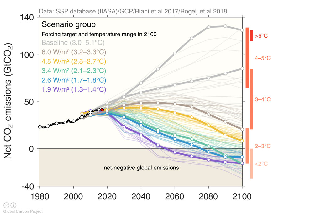
The CarbonBrief article Explainer How ‘Shared Socioeconomic Pathways (SSP)’ explore future climate change by Zeke Hausfather (4/19/18) provides a detailed overview of modeling future climate change based on future societies:

The SSPs feature multiple baseline worlds because underlying factors, such as population, technological, and economic growth, could lead to very different future emissions and warming outcomes, even without climate policy.

They include: a world of sustainability-focused growth and equality (SSP1); a “middle of the road” world where trends broadly follow their historical patterns (SSP2); a fragmented world of “resurgent nationalism” (SSP3); a world of ever-increasing inequality (SSP4); and a world of rapid and unconstrained growth in economic output and energy use (SSP5).

The graph copied here is the 5th in a series of 8 as the article explains the modeling process. The article is particularly useful for any course that discusses the modeling process.  Most of the charts are interactive and there is also an animated graphic. There are links to data sources that requires setting up an (free) account.


What are the differences in the college aspirations of teens?

Pew reports results of a detailed survey in their article Most U.S. Teens See Anxiety and Depression as a Major Problem Among Their Peers — For boys and girls, day-to-day experiences and future aspirations vary in key ways by Juliana Menasce Horowitz and Nikki Graf (2/20/19). Here, we highlight college aspirations:

Girls are more likely than boys to say they plan to attend a four-year college (68% vs. 51%, respectively), and they’re also more likely to say they worry a lot about getting into the school of their choice (37% vs. 26%). Current patterns in college enrollment among 18- to 20-year-olds who are no longer in high school reflect these gender dynamics. In 2017, 64% of women in this age group who were no longer in high school were enrolled in college (including two- and four-year colleges), compared with 55% of their male counterparts.

There are also differences by parental education and economic class:

Among teens with at least one parent with a bachelor’s degree or higher, as well as those in households with annual incomes of $75,000 or more, about seven-in-ten say they plan to attend a four-year college after high school. By comparison, about half of teens whose parents don’t have a bachelor’s degree or with household incomes below $75,000 say the same.

The article has a number of other charts and a detailed methodology section (perfect for a stats  course).


What is the peak quarter for utility revenues?

The question is answered in the Census Bureau post Census Bureau Data Show Third Quarter is Peak Time for Electric and Water Utilities by Justin Jarrett (1/5/19).

During just this year, U.S. electric utility revenue (NAICS 2211) for the third quarter of 2018 was $137.9 billion, an increase of 20.1 percent (± 2.7 percent) from the second quarter of 2018.

The graph here (copied from the post) has a couple of intriguing peaks between some Q3 years.  Worth noting:

Industries that exhibit seasonal patterns, like electric and water utilities, can mask underlying economic conditions. However, seasonal adjustment produces data in which the values of neighboring quarters are usually easier to compare.

The Census Bureau has the data available on their Quarterly Services page (look under Historical Data tab).

Why should we care about insects?

The Guardian article, Plummeting insect numbers ‘threaten collapse of nature’ by Damian Carrington (2/10/19) reports on the recent Biological Conservation paper Worldwide decline of the entomofauna: A review of its drivers by Francisco Sánchez-Bayo and Kris A.G.Wyckhuys (1/20/19).

More than 40% of insect species are declining and a third are endangered, the analysis found. The rate of extinction is eight times faster than that of mammals, birds and reptiles. The total mass of insects is falling by a precipitous 2.5% a year, according to the best data available, suggesting they could vanish within a century.

(Note percentage rate of change in the quote.) Why?

The analysis, published in the journal Biological Conservation, says intensive agriculture is the main driver of the declines, particularly the heavy use of pesticides. Urbanization and climate change are also significant factors.

So what?

One of the biggest impacts of insect loss is on the many birds, reptiles, amphibians and fish that eat insects. “If this food source is taken away, all these animals starve to death,” he said. Such cascading effects have already been seen in Puerto Rico, where a recent study revealed a 98% fall in ground insects over 35 years.

and

“If insect species losses cannot be halted, this will have catastrophic consequences for both the planet’s ecosystems and for the survival of mankind,” said Francisco Sánchez-Bayo

The Guardian article is a good QL resource. The paper has nice graphs and data but is behind a paywall.

Did a wall impact violent crime in El Paso?

Kevin Drum has an excellent post, Here’s a Closer Look at President Trump’s Big Lie About El Paso, addressing El Paso crime as an example of deceiving with charts. He first quotes the state of the union:

The border city of El Paso, Texas, used to have extremely high rates of violent crime — one of the highest in the country, and considered one of our Nation’s most dangerous cities. Now, with a powerful barrier in place, El Paso is one of our safest cities.

He then provides three charts.  The first is El Paso violent crime rate, as reported by the El Paso Police Department, from 2006 through 2013 with a line noting the wall completion in 2009. The second, copied here, is the El Paso crime rate from 1993 to 2013.  By the first graph it appears the wall had an impact by picking the low point in 2006 as the starting point, but based on the graph here it doesn’t appear the wall had much of an impact. The final graph is a selection of mid-size cities which shows El Paso has historically had a low crime rate. The post is worth reading to see all three graphs.

The FBI post crime data and a place to start is their Crime Data Explorer.  The Crime in the U.S. page is also useful.

How has growth is emigration by region changed?

The Pew Research Center article Latin America, Caribbean no longer world’s fastest growing source of international migrants by  Luis Noe-Bustamante and Mark Hugo Lopez (1/25/19) provides an overview emigration changes by region. The graph copied here shows how the growth in emigration from Latin America and the Caribbean has drooped from 58% from 1990-2000 to 7% for 2010-2017, which is slower than thew worldwide growth rate of 17%. On the other hand, 

Even though the percentage growth of the emigrant population from Latin American-Caribbean nations has slowed, the region is still a large source of emigrants. About 37 million people from the region lived outside their country of birth in 2017, up from 35 million in 2010 and accounting for nearly 15% of the world’s more than 250 million international migrants in 2017. The Asia-Pacific region is the source of the world’s largest emigrant population (85 million), as well as the largest share of the global total (33%).

The article includes three other charts, a table of data, and a methodology section with sources.

Where will our electricity come from in next two years?

The EIA Today in Energy report, EIA forecasts renewables will be fastest growing source of electricity generation (1/18/19), provides projections for electricity generation.

EIA expects non-hydroelectric renewable energy resources such as solar and wind will be the fastest growing source of U.S. electricity generation for at least the next two years. EIA’s January 2019 Short-Term Energy Outlook (STEO) forecasts that electricity generation from utility-scale solar generating units will grow by 10% in 2019 and by 17% in 2020. According to the January STEO, wind generation will grow by 12% and 14% during the next two years. EIA forecasts total U.S. electricity generation across all fuels will fall by 2% this year and then show very little growth in 2020.

The good news is more renewables, but “fastest growing” can be misleading. According to the chart (copied from the article) nonhydro renewables are projected to go from 10% in 2018 to 13% in 2020, and so their share of electricity generation is still small.  This is good good discussion for a calculus class or any QL based course.  The article includes two other charts and one is a complex bar chart that could be the focus of a class period.

What are the top charts of 2018?

EPI puts forth its top twelve charts of 2018 in the post Top charts of 2018 Twelve charts that show how policy could reduce inequality—but is making it worse instead (12/20/2018). For example,  chart 10 (copied here) compares 11 economic and social indicators between white and African american families from 1968 to 2018.

Not nearly far enough. The chart shows that, while African Americans are in many ways better off in absolute terms than they were in 1968, they are still disadvantaged in important ways relative to whites. African Americans today are much better educated than they were in 1968—but young African Americans are still half as likely as young whites to have a college degree. Black college graduation rates have doubled—but black workers still earn only 82.5 cents for every dollar earned by white workers. And—as consequences of decades of discrimination—African American families continue to lag far behind white families in homeownership rates and household wealth. The data reinforce that our nation still has a long way to go in a quest for economic and racial justice.

There are 11 other economic related charts. Each chart has a link to data and can  be downloaded.

What are six trends in western U.S. wildfires?

NASA’s Earth Right Now blog post  Six trends to know about fire season in the western U.S. by Kasha Patel (12/5/18) provides these trends.  The first (see graph copied here from NASA RECOVER/Keith Weber),

Over the past six decades, there has been a steady increase in the number of fires in the western U.S. In fact, the majority of western fires—61 percent—have occurred since 2000.

There are five other trends with another graph and three maps. The last one notes

Research suggests that global warming is predicted to increase the number of very large fires (more than 50,000 acres) in the western United States by the middle of the century (2041-2070).

The map below shows the projected increase in the number of “very large fire weeks”—periods where conditions will be conducive to very large fires—by mid-century (2041-2070) compared to the recent past (1971-2000). The projections are based on scenarios where carbon dioxide emissions continue to increase.

There isn’t a direct link to the data for the graph here or the other one, but the link to the slides of Keith Weber include an email address. Requests for data for educational purposes are often successful.

More than half the U.S. population lives in what percent of counties?

The answer is the title of the Census Bureau post More Than Half of U.S. Population in 4.6 Percent of Counties by Haya el Nasser (10/24/18). The map copied here shows the counties.

At the county level, the geographic distribution of the estimated 325.2 million people in the United States clearly distinguishes two main areas where people live: “big” counties and “small” counties.

More than half of all residents live in just 143 big counties (in terms of the number of residents), according to an analysis of U.S. Census Bureau county estimates. That means less than half of the population is spread out across the remaining 2,999 small counties.

The post has a short video with more information. For instance the average population density of big counties is 926 people per square mile and only 48 people per square mile for small counties. Small counties are almost 75% non-Hispanic white, while big counties are under 50% non-Hispanic white.

There is also a notable difference in the rate of growth. “Big-county America is growing nearly twice as fast as small-county America,” Sink said. “They’re not only getting bigger but increasingly more diverse.” Thus, if current trends continue, it’s likely that the divide between big and small will continue to become more pronounced in the future.

The post has  another map and some useful tables which include the distribution of small and large counties.