Tag Archives: QL

What are American’s view on economic inequality?

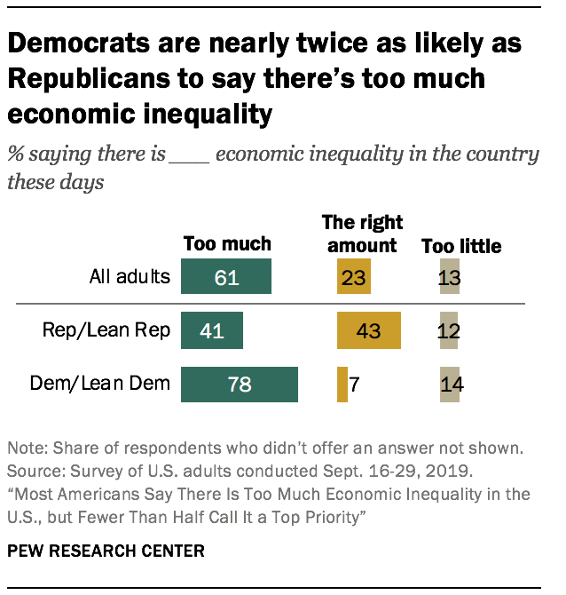
The PEW article Most Americans Say There Is Too Much Economic Inequality in the U.S., but Fewer Than Half Call it a Top Priority by Juliana Menasce Horowitz, Ruth Igielnik, and Rakesh Kochhar (1/9/2020)  is a thorough review of income and wealth inequality, as well as American’s views of inequality.  For example, the graph copied here shows the responses to if there is too much economic inequality by political affiliation.  A few highlights from the article:

From 1970 to 2018, the share of aggregate income going to middle-class households fell from 62% to 43%. Over the same period, the share held by upper-income households increased from 29% to 48%. The share flowing to lower-income households inched down from 10% in 1970 to 9% in 2018.

As of 2016, the latest year for which data are available, the typical American family had a net worth of $101,800, still less than what it held in 1998.

While a majority of Republicans overall (60%) say that people’s different choices in life contribute a great deal to economic inequality, lower-income Republicans (46%) are significantly less likely than Republicans with middle (63%) or higher (74%) incomes to say this.

There are numerous graphs in the article and a methodology section which points to the data sources.

How much does Greenland melting contribute to sea level rise?

From NASA’s Greenland’s Rapid Melt Will Mean More Flooging (12/10/2019):

Increasing rates of global warming have accelerated Greenland’s ice mass loss from 25 billion tons per year in the 1990s to a current average of 234 billion tons per year. This means that Greenland’s ice is melting on average seven times faster today than it was at the beginning of the study period. The Greenland Ice Sheet holds enough water to raise the sea level by 24 feet (7.4 meters).

The graph here is a frame from a short video on the page that is worth watching.  The data for this graph does not seem to be easily available, but data on the melting of Greenland is available at NASA’s Vital Sings Ice Sheets page.

What has improved (and not) between rich and poor countries?

The St. Louis Fed post, Healthier Countries, if Not Wealthier Countries by Guillaume Vandenbroucke (12/26/2019) notes

The income gap between rich and poor countries doesn’t seem to be closing. In fact, it seems to be getting wider. However, the gaps between these groups of countries when it comes to health may indeed be narrowing.

For example, the graph copied here provides time series of GDP of high-income countries and Sub-Saharan African countries. The gap between the two cohorts has grown. Yet,

Not surprisingly, sub-Saharan African countries exhibit a lower life expectancy at birth and a higher crude death rate than the high-income countries. What is surprising, however, is that these measures of health are converging to that of the rich countries, unlike GDP per capita.

There are two other graphs in the post. The data is from the world bank and can be found.

How much time do we spend on our phones?

The RescueTime blog post Screen time stats 2019: Here’s how much you use your phone during the workday? by Jory MacKay (3/21/2019) provides data on phone use. Note that

Let’s start with the high-level stats. When we looked at the data of 11,000 users who actively use the RescueTime app, we found that most peopleon average, spend 3 hours and 15 minutes on our phones.

So, the data comes from users of the RescueTime app and even though the sample size is large it is not a random sample. It is an interesting question if this sample of users is under users or over users of their phones. Still, the data is interesting.

And while a recent Deloitte survey found the average American checks their phone 47 times a day, our number was slightly higher. We found that, on average, users check their phones 58 times a day with 30 check-ins happening during working hours (9am–5pm).

Most people spend about 1 minute and 15 seconds on their phone each time they pick them up. This means we’re losing 37.5 minutes a day during working hours to our phones (at a minimum).

The graph copied here is a representation of what those 37.5 minutes may look like.  Why does this matter?

Psychologists have found that even brief mental blocks created by shifting between tasks can cost as much as 40% of your productive time.

And when it comes to our phones especially, it’s not just the switches themselves that interrupt our day, but the expectation of being interrupted.

In fact, a recent study in the Journal of the Association for Consumer Researchfound that even the presence of a turned off smartphone lowered our cognitive performance. In other words, just having your phone around undercuts your ability to do good work.

There are more graphs in the article and plenty of quantitative information for a stats or QL course.

What happened with the Climate in 2018?

The NOAA article Reporting on the State of the Climate in 2018 by Jessica Blunden (8/12/19) summarizes key climate markers from 2018 such as

Last year was the fourth warmest year on record despite La Niña conditions early in the year and the lack of a short-term warming El Niño influence until late in the year.

Global sea level was highest on record. For the seventh consecutive year, global average sea level rose to a new record high in 2018 and was about 3.2 inches (8.1 cm) higher than the 1993 average, the year that marks the beginning of the satellite altimeter record.

Glaciers melted around the world. Preliminary data indicate that the world’s most closely tracked glaciers lost mass for the 30th consecutive year. Since 1980, the cumulative loss is the equivalent of slicing 79 feet (24 meters) off the top of the average glacier.

There are a number of graphs and plenty of quantitative information in this article.

Could the earth be cooling?

The NASA article Nope Earth Isn’t Cooling by Alan Buis (7/12/19) is a good primer on short and long term trends as it relates to global climate change. The main graphic (copied here), which is an animation zooming into a short time period and then back to the longer time period, demonstrates the classic misleading graph of selecting only a short time period to view.

So, what’s really important to know about studying global temperature trends, anyway?

Well, to begin with, it’s vital to understand that global surface temperatures are a “noisy” signal, meaning they’re always varying to some degree due to constant interactions between the various components of our complex Earth system (e.g., land, ocean, air, ice). The interplay among these components drive our weather and climate.

For example, Earth’s ocean has a much higher capacity to store heat than our atmosphere does. Thus, even relatively small exchanges of heat between the atmosphere and the ocean can result in significant changes in global surface temperatures. In fact, more than 90 percent of the extra heat from global warming is stored in the ocean. Periodically occurring ocean oscillations, such as El Niño and its cold-water counterpart, La Niña, have significant effects on global weather and can affect global temperatures for a year or two as heat is transferred between the ocean and atmosphere.

This means that understanding global temperature trends requires a long-term perspective. An examination of two famous climate records illustrate this point.

There are two other graphs. Global temp and CO2 can be found on the Calculus Projects page.

How easy is it to understand mass incarceration?

The details of mass incarceration is complicated, but the Prison Policy Initiative report Mass Incarceration: The Whole Pie 2019 by Wendy Sawyer and Peter Wagner (3/19/19) provides an extensive look at the data. The report has over 20 graphs and links to data. A few excerpts:

The American criminal justice system holds almost 2.3 million people in 1,719 state prisons, 109 federal prisons, 1,772 juvenile correctional facilities, 3,163 local jails, and 80 Indian Country jails as well as in military prisons, immigration detention facilities, civil commitment centers, state psychiatric hospitals, and prisons in the U.S. territories.

Every year, over 600,000 people enter prison gates, but people go to jail 10.6 million times each year. Jail churn is particularly high because most people in jails have not been convicted.

People in prison and jail are disproportionately poor compared to the overall U.S. population. The criminal justice system punishes poverty, beginning with the high price of money bail: The median felony bail bond amount ($10,000) is the equivalent of 8 months’ income for the typical detained defendant. As a result, people with low incomes are more likely to face the harms of pretrial detention. Poverty is not only a predictor of incarceration; it is also frequently the outcome, as a criminal record and time spent in prison destroys wealth, creates debt, and decimates job opportunities.

It’s no surprise that people of color — who face much greater rates of poverty — are dramatically over represented in the nation’s prisons and jails. These racial disparities are particularly stark for Black Americans, who make up 40% of the incarcerated population despite representing only 13% of U.S residents. The same is true for women, whose incarceration rates have for decades risen faster than men’s, and who are often behind bars because of financial obstacles such as an inability to pay bail.

Read the whole report for considerably more information and data.

How has the economic situation of college students changed?

The Pew article A Rising Share of Undergraduates Are From Poor Families, Especially at Less Selective Colleges, by Richard Fry and Anthony Cilluffo (5/22/19) summarizes the change in the economic background of students from 1996 to 2016.

As of the 2015-16 academic year (the most recent data available), about 20 million students were enrolled in undergraduate education, up from 16.7 million in 1995-96.1 Of those enrolled in 2015-16, 47% were nonwhite and 31% were in poverty, up from 29% and 21%, respectively, 20 years earlier.2

The rising proportion of undergraduates in poverty does not mirror wider trends in society. The official poverty rate for adults age 18 to 64 (12%) was similar in 1996 and 2016, suggesting that access to college for students from lower-income backgrounds has increased since 1996.

As the graph copied here shows:

The growth in the share of dependent students from families in poverty has been uneven across postsecondary education. Their growing presence has been most dramatic among less selective institutions.

The article has a eight charts, a methodology section, and links to the data sources.

QL Blooper

The graph is from Amazon and attempting to graphically represent the number of pages printed from two different toner cartridges. Maybe the designers took into account the compression from the weight of the paper. Enjoy.

What are the economic prospects for 2019 college grads?

The yearly EPI report on economic prospects for young college grads Class of 2019 College Edition by Elise Gould, Zane Makhiber, and Julia Wolfe (5/14/19) is now available. The report has 19 key finding and 10 graphs with available data. A few highlights:

Women make up half of 21- to 24-year-olds but well over half (57.4 percent) of young college degree holders.

One out of every 20 young college graduates is unemployed, a higher rate than in 2000, when only one in 25 was.

After falling in the aftermath of the Great Recession, wages for young college graduates have been growing steadily since 2014 and have (just barely) surpassed the 2000 benchmark; however, nearly two decades of wage growth for young college graduates have been lost.

Related Post: What are the prospects for new college grads? (5/21/18)