Tag Archives: QL

Is America’s nutritional divide due to food deserts?

In a recent article by Richard Florida, It’s Not the Food Deserts: It’s the Inequality, the case is made that food deserts aren’t the real problem.

Instead of within cities, the biggest geographic differences in the way Americans eat occur across regions. The map above plots the geography of healthy versus unhealthy eating across America’s 3,500-plus counties. Dark red indicates a lower health index based on grocery purchases, while light yellow represents a higher health index. While there is some variation within cities and metro areas, by far the biggest and most obvious differences are across broad regions of the country.

Ultimately, the fundamental difference in America’s food and nutrition has more to do with class than location. More than 90 percent of the difference in Americans’ nutritional inequality is the product of socioeconomic class, according to the study. And it’s not just that higher-income Americans have more money to spend on food. In fact, the cost of healthy food is not as prohibitively high as people tend to think. While healthy food costs a little bit more than unhealthy food, most of that is driven by the cost of fresh produce.

The article has useful graphs and summary statistics and can be used in  QL or statistics based course.
How has adult death rates changed by U.S. state?

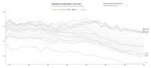
The PRB (Population Reference Bureau) post, Declines in Adult Death Rates Lag in the U.S. South, answers the question with interactive graphs.

Adult death rates in many southern states are 30 percent or 40 percent higher than in states with the lowest death rates. The growing geographic disparity means that adults (ages 55+) in the worst-off southern states can expect to die three to four years earlier, on average, than their counterparts in states with the lowest death rates.

The graphs show death rates by state and state rankings for both females and males, from 1980 to 2015.  There is a clear trend.

In 2015, all of the states with the highest female death rates (ages 55+) were located in the South. In 1980, by comparison, the five states with the highest female death rates included Louisiana, New Jersey, New York, Ohio, and Pennsylvania.

The set of graphs are perfect for a QL course. The data, cited in the post, is from the CDC which could make for a regression based statistics project.

How does a small increase in average temperature increase the chance of extremes?

The Climate Central post, Small Change in Average -Big Change in Extremes, summarizes the idea well with the graph. As the mean shifts to the right, there is a significant increase in the chance of extreme temperature. The animated gif on the site is perfect in expressing the idea.

That’s what we are seeing across much of the country. Average summer temperature have risen a few degrees across the West and Southern Plains, leading to more days above 100°F in Austin, Dallas and El Paso all the way up to Oklahoma City, Salt Lake City, and Boise.  It’s worth noting that this trend has been recorded across the entire Northern Hemisphere, as shown in this WXshift animation.

You should check out the WXshift page they link to. This material is perfect for a stats course. It is also worth pointing out that the pictures here assumes the standard deviation stays the same, but there is evidence that it may be increasing. The effect is a flatter more stretched out density, with even greeter likelihood of extremes.

What do you know about the top 1%?

The Chicago Booth post, Never mind the 1 percent Let’s talk about the 0.01 percent, provides an insightful summary of income distribution at the top.

Mankiw noted that the 1 percent’s share of total income, excluding capital gains, rose from about 8 percent in 1973 to 17 percent in 2010, the latest figures available at the time. “Even more striking is the share earned by the top 0.01 percent. . . . This group’s share of total income rose from 0.5 percent in 1973 to 3.3 percent in 2010. These numbers are not easily ignored. Indeed, they in no small part motivated the Occupy movement, and they have led to calls from policymakers on the left to make the tax code more progressive.”

There is detailed exposition on who makes up the top and how they got there. For instance,

Technology, from the internet to media such as ESPN and Bloomberg terminals, has given elite athletes, entertainers, entrepreneurs, and financiers the ability to profit on a much larger, global scale, making the fruits of their labor more valuable than what previous superstars, such as, say, Pelé or Babe Ruth, brought in. Ruth’s peak salary of $80,000 would be worth about $1.1 million in 2016 dollars, around one-thirtieth of the $33 million the highest-paid Major League Baseball player, pitcher Clayton Kershaw of the Los Angeles Dodgers, made in salary alone in 2016.

And hedge-fund managers make multiples more than top athletes and entertainers. James Simons of Renaissance Technologies and Ray Dalio of Bridgewater Associates each made more than $1 billion in 2016, even though, as Institutional Investor’s Alpha reported, the top-25 hedge-fund earners took in the least as a group since 2005, largely because of the industry’s overall poor investment performance.

This is an excellent article about income and how it is distributed, with a number of graphs suitable for QL based courses.

In which city has winter warmed the most?

Find out by going to Climate Central’s post, See How Much Winters Have Been Warming in Your City.  The winner is Burlington, Vermont, with about 7 degrees F of warming since 1970 (graph here from the post). There is a drop down menu where you can select from most major cities in the U.S. They don’t provide the data, unfortunately, but they do provide a clear methodology so that you can create the data set for your city. You can get weather data from NOAA Climate Data Online. There is great potential here for student projects in statistics courses.

How many people don’t have access to electricity?

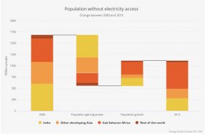
The International Energy Agency’s Energy Access Outlook 2017 has your answer. For example, the chart here answers the question for 2000 and 2015 with an interesting graphic that includes how the change occurred. In 2000, 1684 million people lacked access, 1130 million people gained access, but population grew by 557 million people, leaving 1111 million people without access in 2015. The graph is interactive on the page and breaks these changes down into four regions. There are eight other interesting charts related to electricity as well as access to clean cooking.

How do types of electricity production compare?

The Our World in Data blog post, A sense of units and scale for electrical energy production and consumption has the graph here. It provides a comparison of the scale of different types of electricity production along with comparisons to consumption. For example the Three Gorges Dam is worth 270,000 MWh while the Hoover Dam provides 11,000 MWh.  On the other hand the Alta onshore wind form generates 7,342 MWh.  The post has a nice discussion of units as well as information about the types of electricity generation they highlight in the graphic.

Do you know what is in the recent Climate Science Special Report?

There is a lot of information in the Climate Science Special Report, but you can read the Executive Summary, or this shorter summary from the Wunderground post Blockbuster Assessment: Humans Likely Responsible For Virtually All Global Warming Since 1950s. Posted here is a graph about global mean sea level (GMSL) rise from the executive summary. Yes, 8ft of sea level rise is a possibility by 2100.

Emerging science regarding Antarctic ice sheet stability suggests that, for higher scenarios, a GMSL rise exceeding 8 feet (2.4 m) by 2100 is physically possible, although the probability of such an extreme outcome cannot currently be assessed. Regardless of emission pathway, it is extremely likely that GMSL rise will continue beyond 2100 (high confidence). (Ch. 12)

Relative sea level rise in this century will vary along U.S. coastlines due, in part, to changes in Earth’s gravitational field and rotation from melting of land ice, changes in ocean circulation, and vertical land motion (very high confidence). For almost all future GMSL rise scenarios, relative sea level rise is likely to be greater than the global average in the U.S. Northeast and the western Gulf of Mexico. In intermediate and low GMSL rise scenarios, relative sea level rise is likely to be less than the global average in much of the Pacific Northwest and Alaska. For high GMSL rise scenarios, relative sea level rise is likely to be higher than the global average along all U.S. coastlines outside Alaska. Almost all U.S. coastlines experience more than global mean sea level rise in response to Antarctic ice loss, and thus would be particularly affected under extreme GMSL rise scenarios involving substantial Antarctic mass loss (high confidence). (Ch. 12)

Plenty of graphs in the executive summary and the Wundergraound post of any QL course and much of the data is available.

NOAA State Temperature Trend Charts

Are you interested in historical temperature trends for your state? NOAA’s State Annual and Seasonal Time Series page has it for you. You can create graphs of annual average min and max temperatures as well as the annual mean temperature, for almost all states (Alaska and Hawaii aren’t listed) . This can be done for annual data or for each of the four seasons.  The graphs are from 1805 to 2015.  The graph hear is the annual mean temperature for New York State.

These charts present three color-coded time series. The gray line represents the annual (or seasonal) temperature value. The blue line shows the overall trend in a fashion that smoothes out the year-to-year variability in temperature. The light blue shaded area represents the 95% confidence interval for the trend. The smoothed temperature is constructed using a locally estimated scatterplot methodology known as LOESS.

There does not appear to be easy access to the data, but if you contact them (Contact link on the top bar) they may send it to you. Either way, the graphs include confident intervals, useful in stats, and can be used in QL courses. There is also an interactive U.S. temperature map.

Life Expectancy by Health Expenditure with Comments on Differences by Race

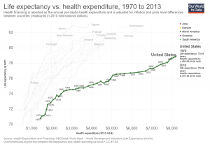
Our World in Data has an interactive graph of life expectancy by health expenditure for a number of countries, with downloadable data. The U.S. spends more money per person on health care, by far, than the other countries represented, without corresponding gains in life expectancy. At the same time, there are large differences in life expectancy by race in the U.S.  For example, the 2013 CDC National Vital Statistics Report life tables has life expectancy at birth for Non-Hispanic Black males of 71.9 years, which would be at the bottom of the chart.  Hispanic females are at the top in the U.S. with a life expectancy at birth of 84.2 years; a 12.3 year difference (data on page 3 here).  At the same time, the money spent on health care is also not likely to be equally distributed. The CDC is a source of life expectancy data and if you ask them they might have excel files. For an example of using life expectancy data, here is a 2012 paper Period Life Tables: A Resource for Quantitative Literacy published in Numeracy and freely available.