Tag Archives: data source

How hot was February 2020?

From NOAA’s Global Climate Report  – February 2020:

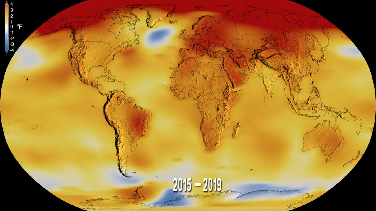
Averaged as a whole, February 2020 was near-record warm with a global land and ocean surface temperature departure from average of 1.17°C (2.11°F) above the 20th century average. Only February 2016 was warmer.

The February 2020 temperature departure from average was also the third highest monthly temperature departure from average for any month in the 1,682-month record. Only March 2016 (+1.31°C / +2.36°F) and February 2016 (+1.26°C / +2.27°F) had a higher temperature departure.

This means that the February 2020 global land and ocean surface temperature departure from average was the highest monthly temperature departure without an El Niño present in the tropical Pacific Ocean, surpassing the previous record set only last month (January 2020).

The data is available for the graph copied here. Click on Temperature Anomalies Time Series for February.


Who posts C-19 data?

If you are looking for COVID-19 data there are two good resources. The first is the Our World in Data Cornonavirus page by Max Roser, Hannah Ritchie, and Esteban Ortiz-Ospina. They have a number of interactive graphs, such as the one copied here where you can select countries to view, that are updated daily.

The second source is the GitHub page CSSEGISandData maintained at Johns Hopkins. They have three csv files that are updated daily which are confirmed, deaths, and recovered. The data is maintained down to the county level is some places.

How have counties grown since the great recession?

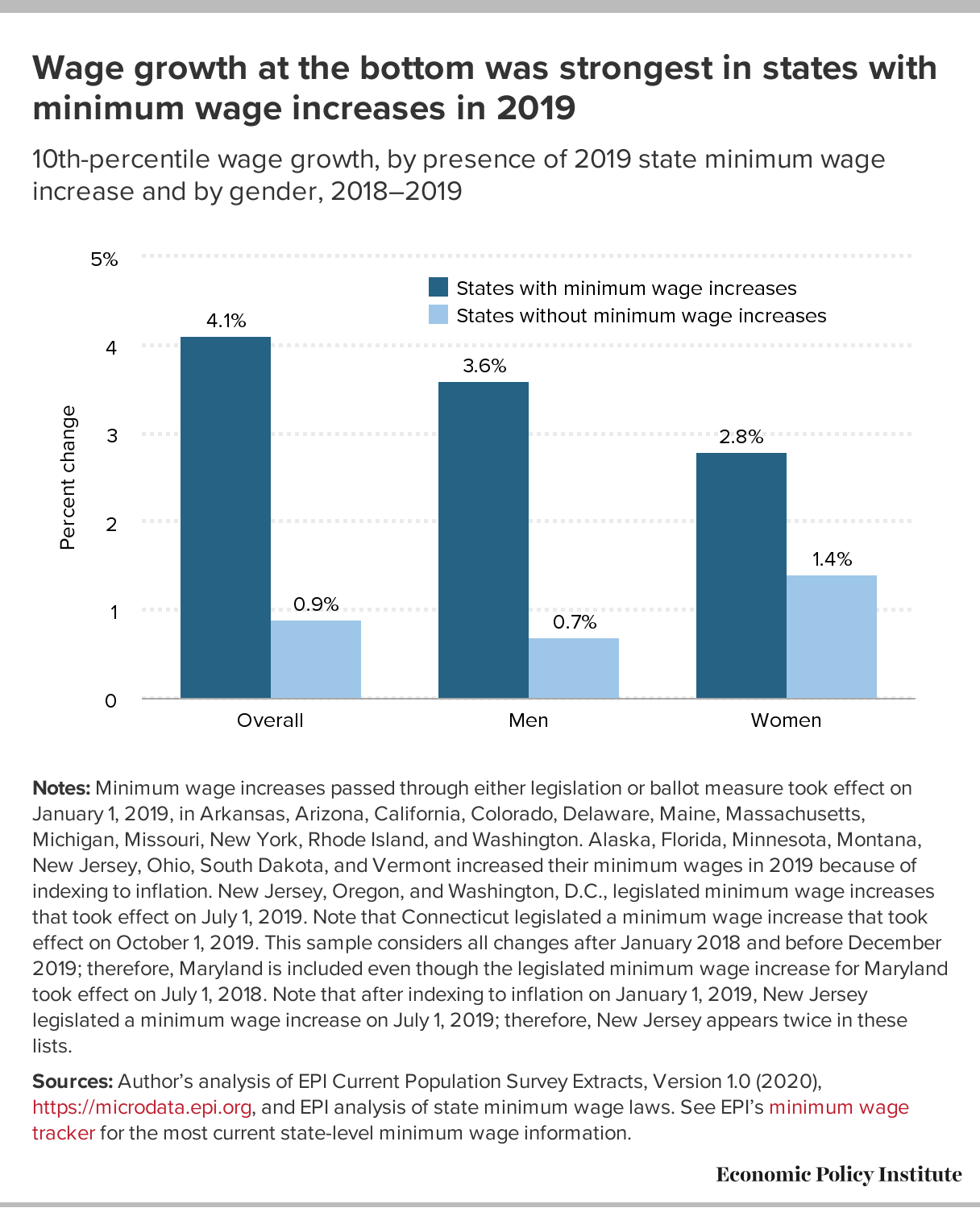
The Washington Center for Equitable Growth article New measure of county-level GDP gives insight into local-level U.S. economic growth by Raksha Kopparam (12/16/2019) provides the map copied here.

Making GDP a more useful metric may require peeling it apart and looking at the data more closely. On December 12, the U.S. Department of Commerce’s Bureau of Economic Analysis released a new measure of economic growth that does just this—Local Area Gross Domestic Product. LAGDP is an estimate of GDP at the county level between the years of 2001—2018. This measure allows policymakers and economists alike to examine local-level economic conditions and responses to economic shocks and recovery.

The new data measurement shows that private-sector industries across the nation have experienced growth since the end of the Great Recession in mid-2009, yet most of this growth is concentrated in the West Coast states and parts of the Midwest.

The article has three other maps two of which are growth based on the tech sectors and manufacturing. Each graph has a url citation for the data.


How did minimum wage increases impact wage growth?

This graph from the EPI post Low-wage workers saw the biggest wage growth in sates that increased their minimum wage between 2018 and 2019 by Elise Gould (3/4/2020) answers part of the question. It is worth noting that:

Strong wage growth at the 10th percentile is not simply due to stronger overall wage growth in those states.

Between 2018 and 2019, the median and 80th percentile wage in states with minimum wage changes increased 0.7% and 1.5%, respectively, while they increased 2.1% and 2.4%, respectively, in non-changing states.

There are three other graphs in the article and each has a link to data.

What’s New at sustainabilitymath?

In a follow up to last week’s graph, I have added a demographic graph of New York State, which provides the number of students in each grade in the 2017-2018 school year by race. The hover information includes percentages for each group. The data comes from the National Center for Education Statistics Elementary/Secondary Information System (ELSi). The link will take you to various table generators and it is easy enough to get data for your state and even data at the district level is available.

How much has spring snow cover changed?

This graph shows average area covered by snow in the Northern Hemisphere during March and April as the difference from the 1981-2010 average.

The Climate.gov article Climate Change: Spring Snow Cover by LuAnn Dahlman and Rebecca Lindsey (2/14/2020) provides the answer as seen in their graph here.

This change is another example of a feedback loop.

About one-third of Earth’s land surface is covered by snow for some part of the year. The bright white covering affects global conditions by reflecting solar energy away from surfaces that would otherwise absorb it. Therefore, the earlier decrease in snow cover increases the amount of sunlight absorbed by Earth, and in turn, surface temperatures.

The article includes the data for the graph shown here.

Who is in high-poverty schools?

The EPI article Schools are still segregated, and black children are paying a price by Emma García (2/12/2020) provides an overview of inequities in secondary schools. Figure B in the article is copied here and speaks clearly to issues of inequality by race. There is also a political perspective that the percentages hide. According to Table 2 on the Census Bureau page School Enrollment in the United States: October 2018 – Detailed tables, there were 1,214,00 13 and 14 year old black students and 6,058,000 white students. (Note 13 and 14 years of age is approximately 8th grade and the Census Bureau is 2018 data while the EPI graph here is 2017. ) What this means is that there are 1,214,000*0.724=878,936 black eighth graders in high-poverty schools and 6,058,000*0.313=1,896,154 white eighth graders in high-poverty schools, or over twice as many white student in high-poverty schools.

The EPI article has a total of four graphs with available data.

How hot was 2019?

From the NOAA Global Climate Report – Annual 2019:

The year 2019 was the second warmest year in the 140-year record, with a global land and ocean surface temperature departure from average of +0.95°C (+1.71°F). This value is only 0.04°C (0.07°F) less than the record high value of +0.99°C (+1.78°F) set in 2016 and 0.02°C (0.04°F) higher than the now third highest value set in 2015 (+0.93°C / +1.67°F). The five warmest years in the 1880–2019 record have all occurred since 2015, …

The report contains summaries by region and has abundance of quantitative information such as:

North America was the only continent that did not have an annual temperature that ranked among its three highest on record. Overall, North America’s temperature was 0.90°C (1.62°F) above the 1910–2000 average, marking the 14th warmest year in the 110-year continental record. The yearly temperature for North America has increased at an average rate of 0.13°C (0.23°F) per decade since 1910; however, the average rate of increase is more than twice as great (+0.29°C / +0.52°F per decade) since 1981.

The graphic here is from NASA, NOAA Analyses Reveal 2019 Second Warmest Year on Record (1/15/2020). Time series data can be obtained from Climate at a Glance Global Time Series.


Who ranks countries by levels of perceived corruption?

Transparency International has a yearly corruption perceptions index. The graph here is for 2019 (high score – lighter colors – clean, low score – darker colors – corrupt).

The Corruption Perceptions Index ranks 180 countries and territories by their perceived levels of public sector corruption, according to experts and business people. This year’s analysis shows corruption is more pervasive in countries where big money can flow freely into electoral campaigns and where governments listen only to the voices of wealthy or well-connected individuals.

At the bottom of the page is a link to download an extensive data set including a timeseries from 2012 – 2019.  Each country has a designated region and so one could compare corruptions by region in a stats course.


What are American’s view on economic inequality?

The PEW article Most Americans Say There Is Too Much Economic Inequality in the U.S., but Fewer Than Half Call it a Top Priority by Juliana Menasce Horowitz, Ruth Igielnik, and Rakesh Kochhar (1/9/2020)  is a thorough review of income and wealth inequality, as well as American’s views of inequality.  For example, the graph copied here shows the responses to if there is too much economic inequality by political affiliation.  A few highlights from the article:

From 1970 to 2018, the share of aggregate income going to middle-class households fell from 62% to 43%. Over the same period, the share held by upper-income households increased from 29% to 48%. The share flowing to lower-income households inched down from 10% in 1970 to 9% in 2018.

As of 2016, the latest year for which data are available, the typical American family had a net worth of $101,800, still less than what it held in 1998.

While a majority of Republicans overall (60%) say that people’s different choices in life contribute a great deal to economic inequality, lower-income Republicans (46%) are significantly less likely than Republicans with middle (63%) or higher (74%) incomes to say this.

There are numerous graphs in the article and a methodology section which points to the data sources.