About a year ago I posted this about stripes:
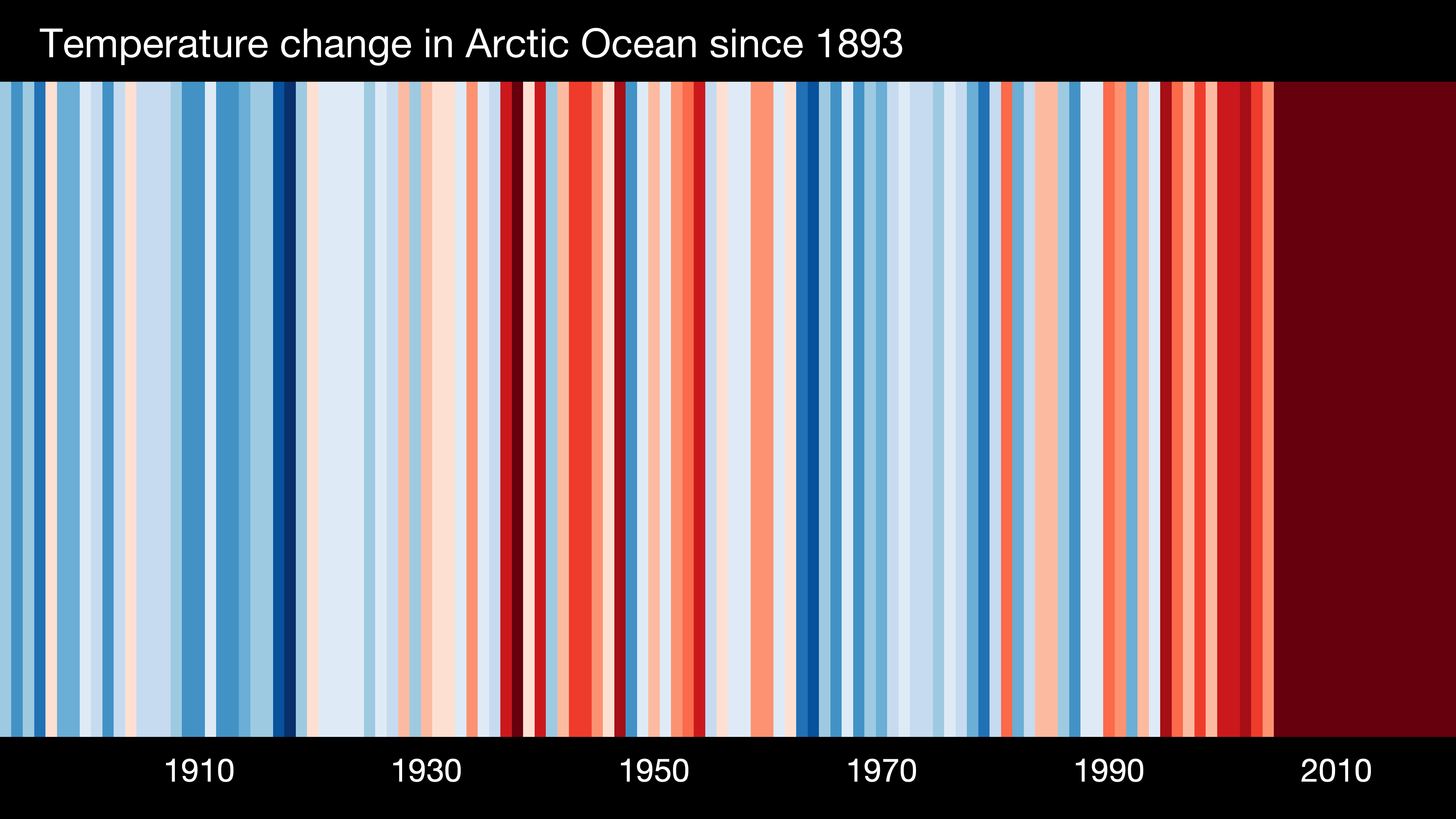
The image here from ShowYourStripes has a vertical strip representing global average temperature anomalies from 1850 to 2019 where darker blue is cooler and darker red is warmer. This graphic style, warming stripes, is credited to Ed Hawkins. The ShowYourStripes page has similar graphics for different regions.
These are excellent images to help understand changing climate. For the image this year I chose the Arctic Ocean temperature. Most of the data for creating these images can be found on Berkeley Earth’s Data Overview page. If you don’t like the stripes you can select a bar chart instead on the show your stripes page.