How do I find climate rankings for my state?

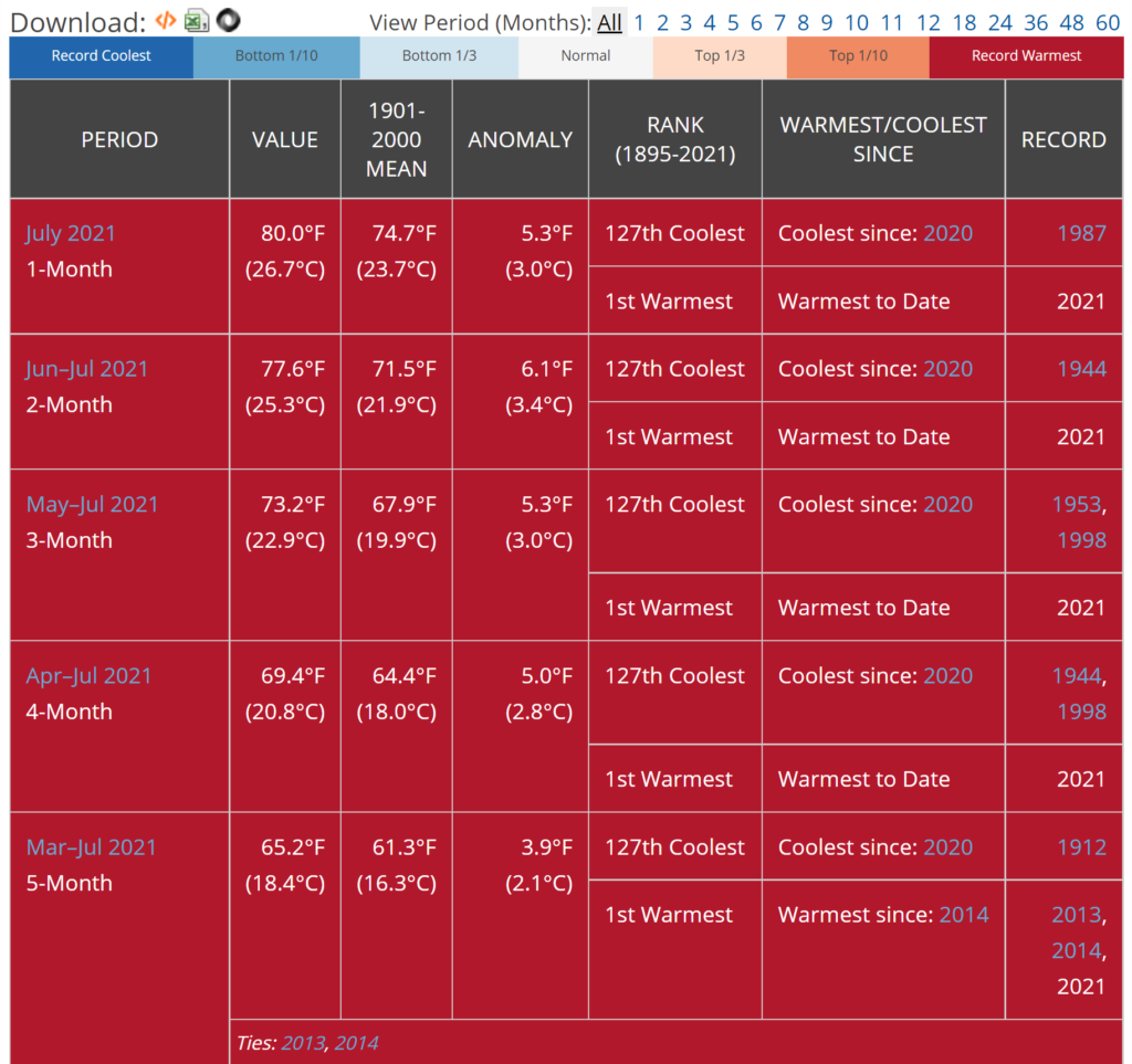
Have you wondered if your state just had the hottest, driest, wettest, etc. month? You can get this information from NOAA’s Statewide Ranking page. For example, the graphic here is for California for July 2021. The output will provide ranking information for 1-12, 18, 24, 36, 48, and 60-month time periods.  The 1, 2, 3, 4, and 5 month periods ending in July 2021 have been the hottest on record going back 127 years. The page allows users to select a state and various periods. Each output also has a link to the data. An overview and definitions of these ranking is given on the Climatological Rankings page.

How much LNG do we export?

The eia article U.S. natural gas net trade is growing as annual LNG exports exceed pipeline exports by Kristen Tsai (8/16/2021) has the chart here that answers the question.

In our August 2021 Short-Term Energy Outlook (STEO), we forecast that U.S. natural gas exports will exceed natural gas imports by an average of 11.0 billion cubic feet per day (Bcf/d) in 2021, or almost 50% more than the 2020 average of 7.5 Bcf/d. Increases in liquefied natural gas (LNG) exports and in pipeline exports to Mexico are driving this growth in U.S. natural gas exports. For the first time since U.S. LNG exports from the Lower 48 states began in 2016, annual LNG exports are expected to outpace pipeline exports—by an estimated 0.6 Bcf/d—this year.

We roughly export 10-15 billion cubic feet per day of natural gas. Is this a good idea from a sustainability perspective or national security perspective?

eia has links to their data.


How hot was July 2021?

From NOAA’s Global Climate Report – July 2021:

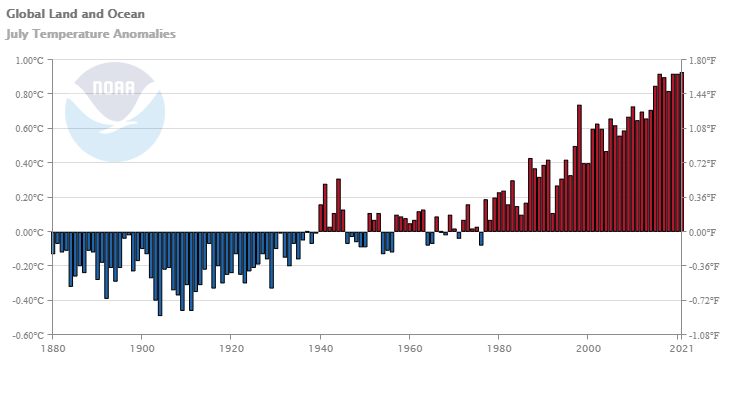
As a whole, the July 2021 global surface temperature was the highest for July since global records began in 1880 at 0.93°C (1.67°F) above the 20th-century average of 15.8°C (60.4°F). This value surpassed the previous record set in 2016 (and subsequently matched in 2019 and 2020) by only 0.01°C (0.02°F). Because July is the warmest month of the year from a climatological perspective, July 2021 was more likely than not the warmest month on record for the globe since 1880. Nine of the 10 warmest Julys have occurred since 2010, with the last seven Julys (2015-2021) being the seven warmest Julys on record.

The data is available at the top of the page under Additional Resources.

How did CEOs do during the pandemic?

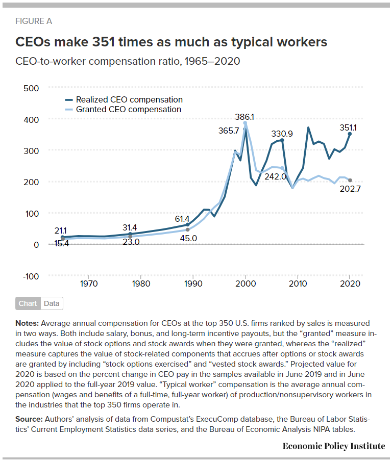
Did CEOs take a pay hit like many workers did during the pandemic? The article CEO pay has skyrocketed 1,322% since 1978 by Lawrence Mishel and Jori Kandra (8/10/2021) suggests CEOs did just fine last year. Their chart shows that realized CEO compensation grew during 2020 compared to the average worker.

Details on the metric:

We focus on the average compensation of CEOs at the 350 largest publicly owned U.S. firms (i.e., firms that sell stock on the open market) by revenue. Our source of data is the S&P ExecuComp database for the years 1992 to 2020 and survey data published by the Wall Street Journal for selected years back to 1965. We maintain the sample size of 350 firms each year when using the ExecuComp data.

The realized measure of compensation includes the value of stock options as realized (i.e., exercised), capturing the change from when the options were granted to when the CEO invokes the options, usually after the stock price has risen and the options values have increased. The realized compensation measure also values stock awards at their value when vested (usually three years after being granted), capturing any change in the stock price as well as additional stock awards provided as part of a performance award.

The granted measure of compensation values stock options and restricted stock awards by their “fair value” when granted (Compustat estimates of the fair value of options and stock awards as granted determined using the Black Scholes model).

Well maybe CEO pay just went down less than worker pay and that is why the ratio went up. In table 1, realized pay for 2019 is $20,351,000 with 2020 projected as $24,194,00. There are other graphs in the article and data available for download.

What are the latest climate projections?

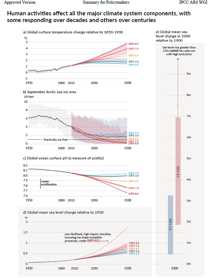
The IPCC sixth assessment report was just released. The graph here is from the summary for policymakers.  The 42 page summary could be used as part of a sustainability or QL type course as there are plenty of graphs.  Page 15 starts the discussion on the different scenarios, which is an opportunity to talk about modeling and assumptions. For a sense of the long term consequences:

In the longer term, sea level is committed to rise for centuries to millennia due to continuing deep ocean warming and ice sheet melt, and will remain elevated for thousands of years (high confidence). Over the next 2000 years, global mean sea level will rise by about 2 to 3 m if warming is limited to 1.5°C, 2 to 6 m if limited to 2°C and 19 to 22 m with 5°C of warming, and it will continue to rise over subsequent millennia (low confidence). Projections of multi-millennial global mean sea level rise are consistent with reconstructed levels during past warm climate periods: likely 5–10 m higher than today around 125,000 years ago, when global temperatures were very likely 0.5°C–1.5°C higher than 1850–1900; and very likely 5–25 m higher roughly 3 million years ago, when global temperatures were 2.5°C–4°C higher (medium confidence).

How dry is Arizona?

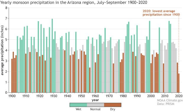
From the climate.gov article Western Drought 2021 Spotlight: Arizona by Tom Di Liberto (7/29/2021):

Looking back even farther by using a drought indicator known as the Standardized Precipitation Index, the current drought in Arizona is also the worst on record back to the late 1800s. Going back even farther than THAT by using tree rings across the Southwest as stand-ins for soil moisture, the current drought over the entire region is one of a handful of the worst droughts in the last 1200 years. Other especially bad droughts occurred in the late 1500s and late 1200s (known as the Great Drought). Basically, this is a long-winded way of saying the current drought in Arizona and the Southwest is bad no matter if you look back 10 years, 100 years, or 1,000 years.

The graph copied here shows that it has been 6 years since a wet year with 2020 precipitation the lowest since 1900. And, of course:

According to the Climate Science Special Report, temperatures across the Southwest have increased by 1.61 degrees Fahrenheit since the first half of the 20th century. These increases in temperature contribute to aridification in the Southwest by increasing evapotranspiration, lowering soil moisture, reducing snow cover and impacting snowmelt.

Looking to the future, temperatures in the Southwest are projected to increase by the end of the century by around 5 degrees Fahrenheit if carbon dioxide emissions follow a lower path and up to 9 degrees if emissions follow a much higher path. Increasing temperatures can make soils even drier, amplifying drought.

There are other graph in the article but no direct links to data. Still, there is good information and plenty of material for a QL course.

How much of the West is in drought?

Over 99% of the West has been in drought for the month of July and 4/6/2021 was the last time it was below 90%. Roughly 25% has been in exceptional drought since May. Over 60 million people (about 20% of the U.S. population) are estimated in the drought areas in the West. The definition of exceptional drought:

  • Exceptional and widespread crop/pasture losses

  • Shortages of water in reservoirs, streams, and wells creating water emergencies

The U.S. Drought Monitor has data for download including time series and GIS files.

How much has CO2 emissions increased?

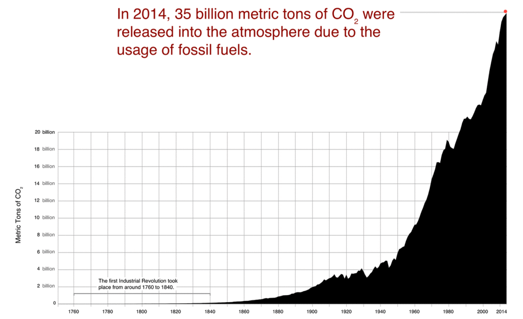
The visual here is from the NASA feature How Much Carbon Dioxide Are We Emitting? by Matthew Conlen (7/15/2021) may help us all understand the change in CO2 emissions.

In 1900, almost 2 billion metric tons of CO2 were released due to fossil fuel usage. By 1960, that number had more than quadrupled to over 9 billion metric tons.

The latest data from the Carbon Dioxide Information Analysis Center shows that over 35 billion metric tons of CO2 were released in 2014. *

There is a link to CO2 data at the bottom of the article. If you’d like a graph this one is included on the page:

Is voting a right or a privilege?

The answer to the question is correlated with party affiliation as Pew reports in their article Wide partisan divide on whether voting is a fundamental right or a privilege with responsibilities by Vianney Gomez and Carroll Doherty (7/22/2021) as their chart here shows.

Democrats and Democratic-leaning independents overwhelmingly say voting is a fundamental right that should not be restricted in any way – 78% hold this view, while fewer than a quarter (21%) say it is a privilege. Two-thirds of Republicans and Republican leaners say voting is a privilege that can be limited if requirements are not met, compared with about half as many (32%) who say it is a fundamental right.

On another question we have this:

Nearly all Americans (94%) – including 95% of both Republicans and Democrats – say it is important that people who are legally qualified to vote are able to cast a ballot, with 82% saying it is very important.

This makes me wonder if there is a different interpretation to “can be limited.”  There are three other charts and links to the questions used and the methodology. All great for a stats course.

What is the connection between heat and electricity use?

From the eia article June heat wave in the Northwest United States resulted in more demand for electricity by Johnathan DeVilbiss and Mark Morey (7/21/2021):

heat wave in the Northwest United States in late June led to more regional demand for electricity. During periods of high temperatures, electricity demand increases as people turn up their air conditioners, dehumidifiers, fans, and other cooling equipment. Very high temperature events, like the one in June in the Northwest, tend to push electricity demand to very high levels.

Portland, Oregon: On Monday, June 28, the temperature at Portland International Airport reached an all-time record high of 115°F. At 5:00 p.m., the temperature was 114°F, and electricity demand for the Portland General Electric Balancing Authority for the hour ending at 5:00 p.m. was 4,471 megawatthours (MWh).

This provides as example of a feedback loop. At the planet warms we’ll use more electricity to keep us cool. If that electricity is generated by CO2 emitting sources we continue to warm the planet and then use even more electricity.

The article links to the hourly electric grid monitor where you can download data.