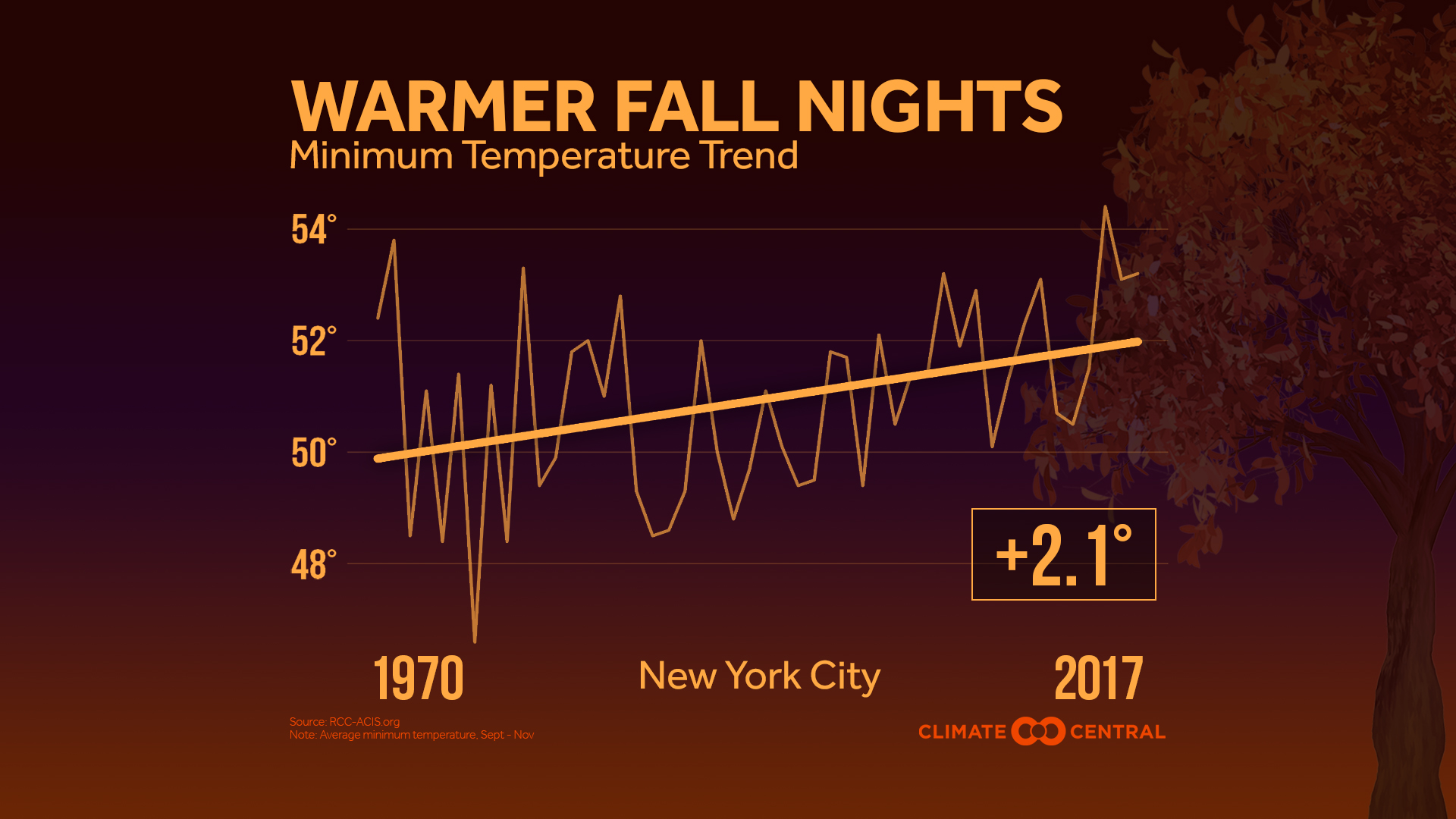
The recent BBC article Climate change: Oceans ‘soaking up more heat than estimated’ b
The key element is the fact that as waters get warmer they release more carbon dioxide and oxygen into the air.
“When the ocean warms, the amount of these gases that the ocean is able to hold goes down,” said Dr Resplandy.
“So what we measured was the amount lost by the oceans, and then we can calculate how much warming we need to explain that change in gases.”
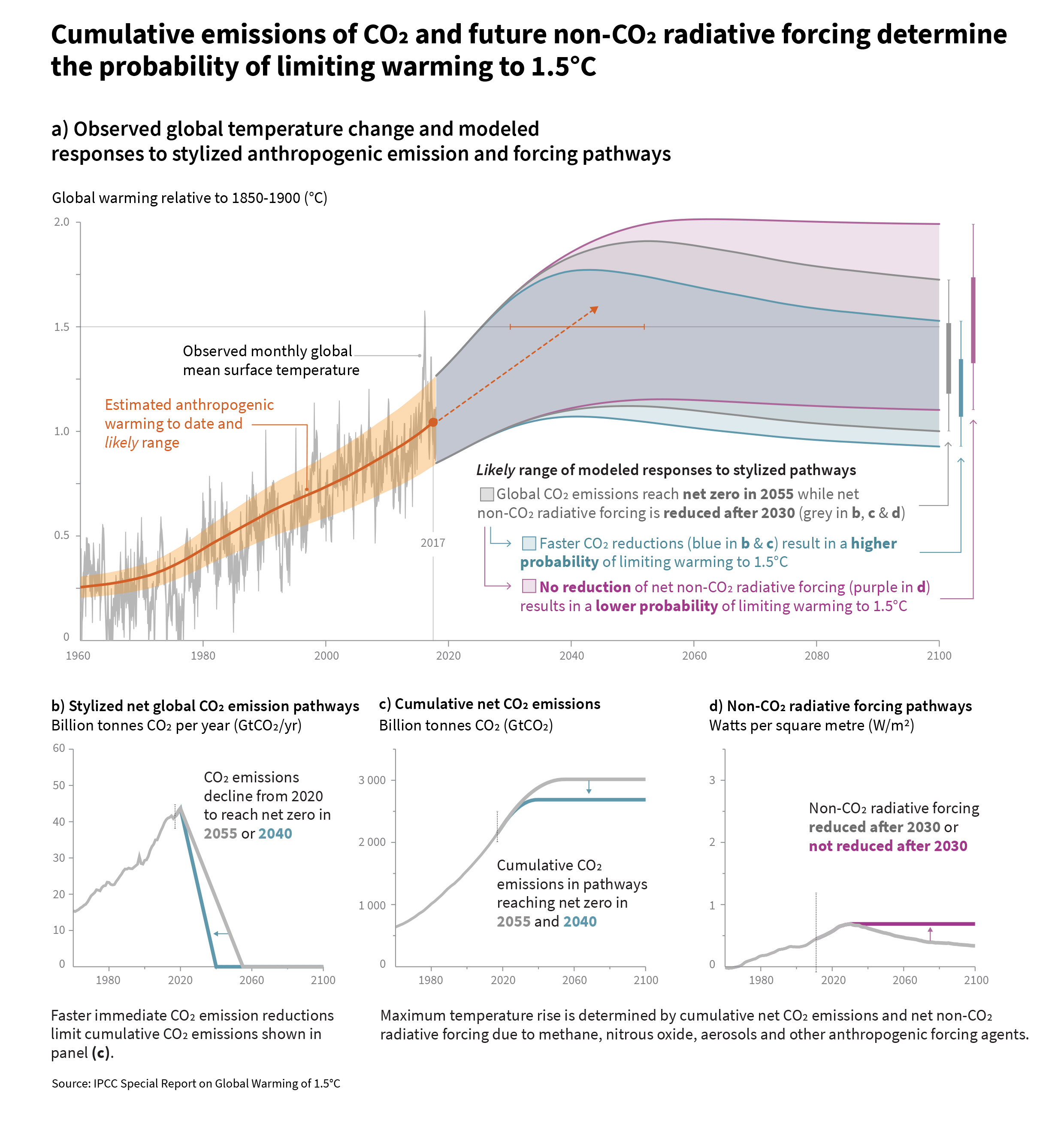
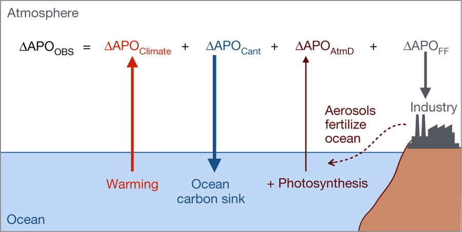
The image here is copied from the original article in Nature, Quantification of ocean heat uptake from changes in atmospheric O2 and CO2 composition by Resplandy et. el (10/31/18) . The abstract to the paper provides a nice summary:
The ocean is the main source of thermal inertia in the climate system1. During recent decades, ocean heat uptake has been quantified by using hydrographic temperature measurements and data from the Argo float program, which expanded its coverage after 20072,3. However, these estimates all use the same imperfect ocean dataset and share additional uncertainties resulting from sparse coverage, especially before 20074,5. Here we provide an independent estimate by using measurements of atmospheric oxygen (O2) and carbon dioxide (CO2)—levels of which increase as the ocean warms and releases gases—as a whole-ocean thermometer. We show that the ocean gained 1.33 ± 0.20 × 10²² joules of heat per year between 1991 and 2016, equivalent to a planetary energy imbalance of 0.83 ± 0.11 watts per square metre of Earth’s surface. We also find that the ocean-warming effect that led to the outgassing of O2 and CO2 can be isolated from the direct effects of anthropogenic emissions and CO2 sinks. Our result—which relies on high-precision O2 measurements dating back to 19916—suggests that ocean warming is at the high end of previous estimates, with implications for policy-relevant measurements of the Earth response to climate change, such as climate sensitivity to greenhouse gases7 and the thermal component of sea-level rise8.
The paper has other interesting graphs that could be used in a QL based class. For a calculus class, the graph here is an example of the use of the Δx notation in the “real world”.