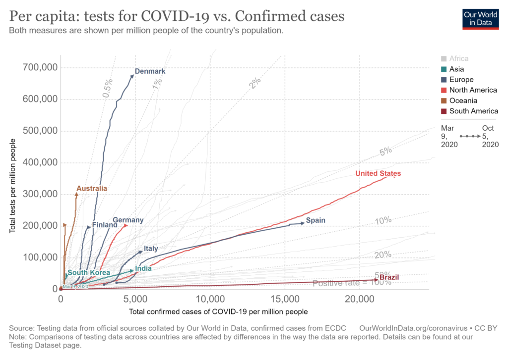
 Our World in Data has an interactive graph that plots covid confirmed cases by tests both per million people and including an element of time. Copied here is one example with the U.S. and other selected countries. The paths for each country is from Jan 21 to Oct 5. So, for example, while the U.S. has increased testing (going up along the y-axis) it has also had an increase in the confirmed cases (moving to the right along the x-axis). In the end the test positive rate has been fairly stable around 6-7%. Explore this graph by comparing other countries. As always, Our World in Data makes the data available.
Are hurricanes getting stronger?
 Climate Central provides some graphs and facts related to hurricanes in their article Stronger Hurricanes (9/23/2020). The graph shows the trend in Atlantic water temperature and here are the related key concepts from the article:
Sea surface temperatures in the tropical Atlantic, known as the Main Development Region for tropical systems (depressions, storms, and hurricanes), have risen 1.85°F in the last century.
The likelihood of tropical cyclones (the term scientists broadly use to represent hurricanes, typhoons, etc) reaching Category 3 status has increased since 1979.
Warming water and air from climate change creates the potential for stronger hurricanes, with heavier rain and higher storm surge, increasing the risk of flooding when they make landfall.
There are two other graphs, further information, and citations of data sources along with methodolgy.
What is the connection between poverty and extracurricular activities?
 The Census Bureau post Even Short-Term Spells of Poverty Lower School-Aged Children’s Involvement in Extracurricular Activities by Brian Know (9/23/2020) quantifies the challenges of students due to even temporary spells of poverty.
The percentage of children ages 6 to 11 taking lessons was significantly different between those who were in poverty some months in the year (22.5%) and those in poverty the entire year (16.2%).
Among children ages 12 to 17, involvement in lessons did not differ between children in poverty some months compared to all months in the year.
Similar to involvement in sports, taking lessons was more common in both age groups among children who did not experience any poverty compared to children who experienced poverty some months in the year.
There are links to data sources and two other graphs.
What was the 2020 Arctic sea ice minimum?
 The climate.gov article 2020 Arctic sea ice minimum second lowest on record by Michon Scott (9/21/2020) reports:
On September 15, 2020, the National Snow and Ice Data Center (NSIDC) announced, Arctic sea ice appeared to have reached its annual minimum extent. At 1.44 million square miles (3.74 million square kilometers), this minimum was second only to the record-low extent observed on September 17, 2012. The 2020 figure—preliminary because a late-season surge of summer warmth could still drop the extent further—continued an observed trend of long-term Arctic sea ice decline.
The graph here is from the National Snow and Ice Data Center’s Chartic Interactive Sea Ice Graph (a really great visual). I selected 2010-2020. The year 2012, still the current record, was an impressive minimum and this year is the first in the last 8 to come close.
From the article:
Among long-time observers of Arctic sea ice, the 2020 value was significant in that it not only punctuated a long-term decline, but also because it fell below the 4-million-kilometer (1.5-million-mile) threshold for only the second time in the satellite record—after 2012, when the minimum extent dipped to 1.31 million square miles (3.39 million square kilometers). Ted Scambos, senior research scientist at the Earth Science Observation Center at the University of Colorado-Boulder, says, “This threshold means the Arctic is more ocean than ice, a blue highway that’s been open since mid-July and won’t close until well into October, and a huge fetch for wave action along an 8,000-mile open coast of Siberia and Alaska.” The combination of sea ice decline and permafrost thaw can lead to coastal erosion as more abundant waves wear away newly softened coastlines.
What is median household income by race and ethnicity?
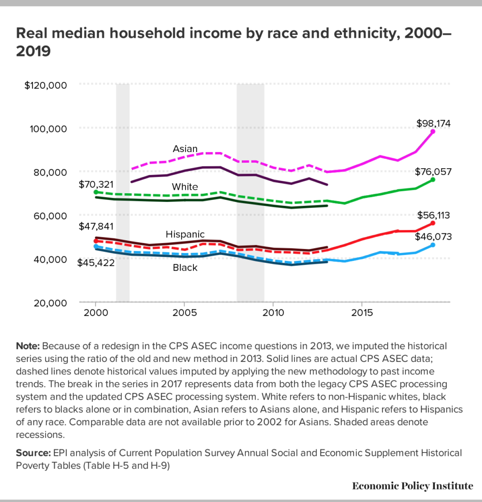 The EPI article Racial disparities in income and poverty remain largely unchanged amid strong income growth in 2019 by Valerie Wilson (9/16/2020) reports the data from the Census Bureau on income and poverty in the graph copied here.
…real median household income increased 10.6% among Asian households (from $88,774 to $98,174), 8.5% among Black households (from $42,447 to $46,073), 7.1% among Hispanic households (from $52,382 to $56,113), and 5.7% among non-Hispanic white households (from $71,922 to $76,057), …
There is a second graph on poverty rates and data is included for both graphs, as well as a link to the original Census Bureau data.
How hot was Aug 2020?
 From the NOAA Global Climate Report – August 2020:
Averaged as a whole, the August 2020 global land and ocean surface temperature was 0.94°C (1.69°F) above average and the second highest August temperature since global records began in 1880. Only August 2016 was warmer with a temperature departure from average of +0.98°C (+1.76°F). The 10 warmest Augusts have all occurred since 1998; however, the five warmest Augusts have occurred since 2015. August 2020 also marked the 44th consecutive August and the 428th consecutive month with temperatures, at least nominally, above the 20th-century average.
The global land-only surface temperature for August 2020 was the third highest on record at 1.26°C (2.27°F) above average. Meanwhile, the global-ocean surface temperature tied with 2016 as the second highest in the 141-year record at 0.82°C (1.48°F) above average.
For the summer months:
The Northern Hemisphere had its warmest summer on record at 1.17°C (2.11°F) above average, surpassing the now second-warmest such period set in 2016 and again in 2019. The five warmest summers for the Northern Hemisphere have occurred since 2015.
The time series data is available at the links above the Introduction. See Temperature Anomalies Time Series.
What is the fossil fuel percent of our energy consumption?
The eia post Fossil fuels account for the largest share of U.S. energy production and consumption by Bill Sanchez (9/14/2020) summarizes our energy production and consumption since 1950. From the graph copied here we see that even though we have increased renewable energy capacity they still make up a small percent of our total energy consumption. Some good news:
The share of U.S. total energy consumption that originated from fossil fuels has fallen from its peak of 94% in 1966 to 80% in 2019. The total amount of fossil fuels consumed in the United States has also fallen from its peak of 86 quads in 2007.
There are three other graphs and links to data.
Where do we find CA wildfire data?
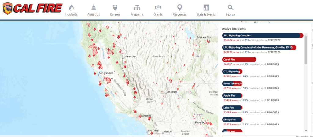
CAL FIRE provides information about current fires as well as historical data. The picture here is from their incidents page where users can choose current fires or select particular year. For active incidents the right side bar provides the status of current fires. The stats and events page has historical information such as the top 20 fires. There is also a page with historical acres burned by year, although currently updated to only 2018 which was a record year of just under 2,000,000 acres burned.
The climate.gov article Over a million acres burned in California in second half of August 2020 by Tom Di Liberto (8/26/2020) provides some context about CA wildfires and connection to climate change.
Do you know everything that contributes to sea level?
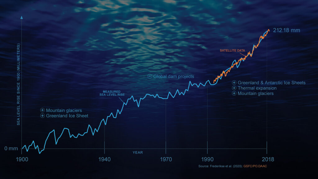 The NASA feature article on Vital Sings on the Planet, NASA-led Study Reveals the Causes of Sea Level Rise Since 19900 (8/21/2020) summarizes results from the paper in Nature, The causes of sea-level rise since 1900 (behind a paywall). What you might not have known:
In addition, the new study found that during the 1970s, when dam construction was at its peak, sea level rise slowed to a crawl. Dams create reservoirs that can impound freshwater that would normally flow straight into the sea.
For example, in its recent flooding report, the National Oceanic and Atmospheric Administration (NOAA) noted a rapid increase in sea level rise-related flooding events along U.S. coasts over the last 20 years, and they are expected to grow in extent, frequency, and depth as sea levels continue to rise.
Sea level data can be found on NASA’s Sea Level page.
How many people are employed in manufacturing?
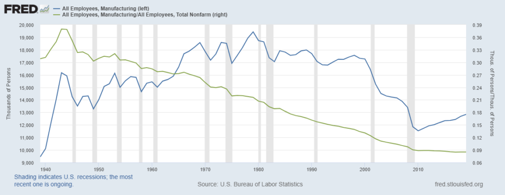 Elections seem to bring out various statements about manufacturing employment in the U.S. So, here is a review of manufacturing in the U.S. The graph here was created using FRED, which is a great resource for economic data. As a percent of all employees, manufacturing peaked in the early 1940s at 38% and has been declining ever since to now below 9%. As a total number of workers the peak was in 1979 at 19,428,00 people and bottomed out at the end of the great recession at 11,529,00 people. The numbers have recovered slightly to 12,839,00 people in 2019, but this is still shy of the 13,403,00 people in 2008 before the recession. Kevin Drum has a point on fact checking related to this in his post Fact of the Day: Manufacturing as a % of the Workforce, 1985-2020.
