What is the Indo-Pacific warm pool?

The climate.gov article A warm pool in the Indo-Pacific Ocean has almost doubled in size, changing global rainfall patterns by Alison Stevens (12/3/2020) is your primer on the Indo-Pacific warm pool.

Due to human-caused climate change, our planet’s ocean has been heating up at a rate of 0.06 degrees C (0.11 degrees F) per decade over the past century. But this warming isn’t uniform. In fact, recent NOAA-funded research shows that a large pool of the ocean’s warmest waters,  stretching across the Indian and west Pacific Oceans, has grown warmer and almost doubled in size since 1900. This expanding warm pool not only impacts ocean life; according to the study, it is driving changes in the Madden Julian Oscillation (MJO), a key weather and climate pattern, and in regional rainfall around the globe.

Here is how it works:

The warming is uneven across the region, with greater warming in the west Pacific. This unevenness creates a temperature contrast that enhances cloud-forming winds, moisture, and energy over the region, and it draws in warm moist air from the Indian Ocean. The uneven expansion of the Warm Pool has warped the MJO—a global pattern of clouds, wind, rain and pressure, active in the winter, that starts over the Indian Ocean and travels eastward around the tropics in 30-60 days. Though the total lifespan of its global trek has stayed the same, the study finds that the MJO’s clouds and rain now spend 3-4 fewer days over the Indian Ocean and 5-6 more days over the Maritime Continent and west Pacific, fueled by heat and moisture where the warming is greater.

The first link in the quote above is to global ocean temperature data.

How many people live in poverty?

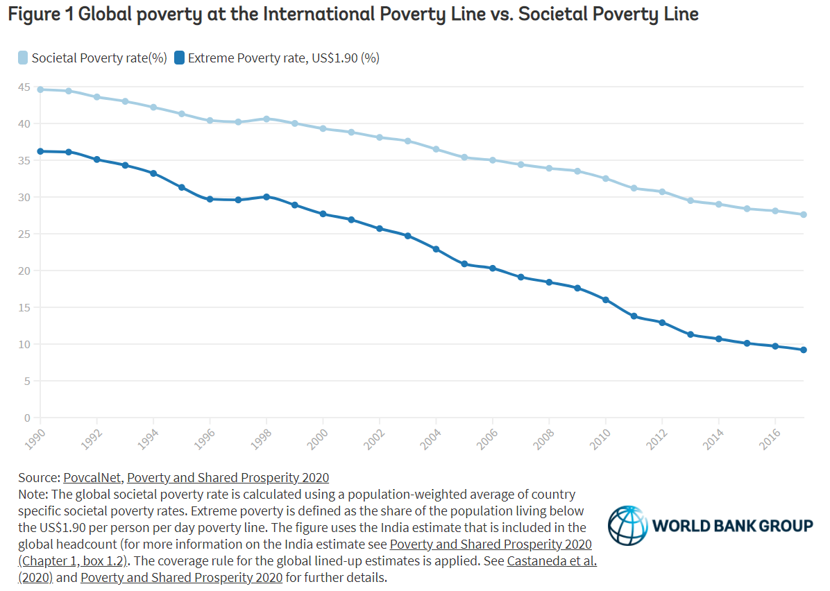
It depends on what we mean by poverty.  The World Bank blog post A quarter of the world lives in societal poverty by Marta Schoch, Dean Mitchell Joliffe, & Christoph Lakner (12/2/2020):

Measures of absolute poverty, such as poverty at the US$1.90US$3.20 and the US$5.50 international poverty lines, have the advantage of remaining fixed (in constant dollars), allowing one to measure poverty against the same benchmark over time and across countries. However, when countries set their own national poverty lines, they typically increase the real value of these lines as their economies evolve.

The absolute poverty line  misses the fact that “the ability to participate in society is costlier in richer countries.”  So,

In 2018, the World Bank introduced a Societal Poverty Line (SPL),

The SPL is a hybrid line, combining the US$1.90-a-day absolute poverty line with a relative component that increases as median consumption or income in an economy rises.

The SPL is the max of US$1.90 and US$1+ 0.5*median, where median is the daily median income or consumption per capita in the household survey.

The is more information and other graphs in the article.

Where is state level covid data?

The 91-DIVOC page An interactive visualization of the exponential spread of COVID-19 has excellent visualizations of state level data along with world data. For example, the graph downloaded from their visualization here is the top 10 states for deaths per 100,000 (day 0 is 11/30/2020). You might find it surprising the the Dakotas are in the top 10. The visualizations allow the user to select numerous categories and highlight selected elements. Each visualization has a csv link to download the data.

Fossil fuel free shipping?

(Image credit: Jocelyn Timperley)

This is not my typical post with charts, graphs, and data, but as a fan of both wood and boats the BBC article The futuristic cargo ship made of wood by Jocelyn Timperley (11/17/2020) is one I had to share.

In a small, rustic shipyard on the Pacific coast of Costa Rica, a small team is building what they say will be the world’s largest ocean-going clean cargo ship.

Ceiba is the first vessel built by Sailcargo, a company trying to prove that zero-carbon shipping is possible, and commercially viable. Made largely of timber, Ceiba combines both very old and very new technology: sailing masts stand alongside solar panels, a uniquely designed electric engine and batteries.

Ok, a little bit of data:

The global shipping sector emitted just over a billion tonnes of greenhouse gases in 2018, equivalent to around 3% of global emissions – a level that exceeds the climate impact of Germany’s entire economy.

A major study found shipping emissions rose by 10% between 2012 and 2018, and projected that they could rise up to 50% further still by 2050 as more and more things are shipped around the world.


Data on Sustainable Development Goals?

The World Bank has 17 sustainable development goals and a portal to information about the goals as well as an abundance of data: Atlas of Sustainable Development Goals  One path from this page is the World Development Indicators page:

The World Development Indicators is a compilation of relevant, high-quality, and internationally comparable statistics about global development and the fight against poverty. The database contains 1,600 time series indicators for 217 economies and more than 40 country groups, with data for many indicators going back more than 50 years.

One can explore data with interactive graph, query databases, or download data.

How hot was October 2020?

From the NOAA Global Climate Report – October 2020:

The October 2020 global land and ocean surface temperature was the fourth highest for October since global records began in 1880 at 0.85°C (1.53°F) above the 20th century average of 14.0°C (57.1°F). Only Octobers of 2015 (+1.03°C / +1.85°F), 2019 (+0.95°C / +1.71°F), and 2018 (+0.93°C / +1.67°F) were warmer. The ten warmest Octobers have occurred since 2005, while the seven highest October temperature departures from average have occurred in the last seven years (2014–2020). October 2020 also marks the 44th consecutive October and the 430th consecutive month with temperatures, at least nominally, above the 20th century average.

Europe was warm:

According to NCEI’s regional analysis, Europe had its warmest October on record, with a temperature departure of +2.17°C (+3.91°F). This surpassed the previous record set in 2001 by 0.06°C (0.11°F).

For the year so far:

Averaged as a whole, this was the second warmest January–October for global land and ocean, with a temperature departure at 1.0°C (1.8°F) above the 20th century average. This value is only 0.03°C (0.05°F) shy of tying the record set in January–October 2016. According to our Global Annual Temperature Rankings Outlook, the year 2020 is very likely to rank among the three warmest years on record.

The data is available in the additional resources box near the top of the page.

How frequently are high tides occurring?

NASA’s Vital Signs of the Planet article Beating Back the Tides by Jenny Marder (11/11/2020) provides an update on the increasing frequency of high tides (see the graph copied here for one example).

Between 2000 and 2015, high-tide flooding in the U.S. doubled from an average of three days per year to six along the Northeast Atlantic, according to a 2018 NOAA report. It is especially common along the East Coast and Gulf Coast, where the frequency is up by roughly 200% over the last two decades. In some areas like Annapolis, the numbers are even more extreme. Annapolis had a record 18 days of high-tide flooding from May 2019 to April 2020, according to flooding thresholds for the city established by NOAA. That’s up from the previous record of 12 days in 2018. Before 2015, the record number of high-tide flood days in one year was seven, and the yearly average of high-tide floods from 1995 to 2005 was two.

The article includes a 7 minute video on high tide flooding. There is also a link to NOAA’s Tides and Currents page The State of High Tide Flooding and Annual Outlook. The page has a map of projected high tide flood days for 2020. For more detailed information, including lots of graphs, see the 2019 State of U.S. High Tide Flooding with 2020 Outlook technical report from NOAA.

Where are fish going?

The Climate.gov article In search of cooler waters, marine species are shifting northward or diving deeper by John Dos Passos Coggin (4/3/2020) explains:

The graphs show the annual change in latitude and depth of 140 marine species along the northeastern U.S. coast and in the eastern Bering Sea. Changes in geographic distribution have been aggregated across all 140 species. In waters off the Northeast, fish and shellfish are moving northward at a significant rate; in the eastern Bering Sea, they are still shifting northward but at a lesser rate. Likewise, marine species in both regions are moving to deeper waters, but the rate of change in depth is especially high along the northeastern coast.

To learn more go to the GlobalChange.gov Marine Species Distribution page. On this page there is a link to oceanadapt.rutgers.edu to get data, although you will have to register.

Who earned the most in the 3rd quarter of 2020?

The U.S. Bureau of Labor Statistics has a Graphics for Economic News Releases page. The graph copied here is median usual weekly earnings of full-time wage and salary workers. Most of the patters are not a surprise, such as men earning more than women.  What may be new here is that Asian women ($1224) out earned White men ($1122). Asian men out earned all others at $1542. The page includes seven other charts with the data.

Who Votes?

Pew has a summary of voter demographics by party in their article What the 2020 electorate looks like by party, race and ethnicity, age, education and religion by John Gramlich (10/26/2020). For example, see the graph copied here.

White Americans accounted for 67% of eligible voters nationally in 2018, but they represented a much larger share in several key battlegrounds in the Midwest and Mid-Atlantic, including Wisconsin (86%), Ohio (82%), Pennsylvania (81%) and Michigan (79%). The reverse was true in some battleground states in the West and South. For example, the White share of eligible voters was below the national average in Nevada (58%), Florida (61%) and Arizona (63%). You can see racial and ethnic breakdown of eligible voters in all 50 states – and how it changed between 2000 and 2018 – with this interactive feature.

Check out the interactive graph that is referenced in this quote, along with the half a dozen other graphs in the article. All great for a QL or stats based course.