 Some good news today. NOAA has an update on the Antarctic ozone hole in the article Antarctic ozone hole slightly smaller in 2022 (10/26/2022).
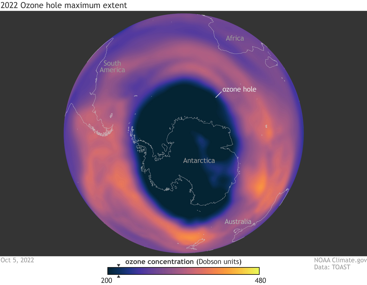
The hole in the ozone layer — the portion of the stratosphere that protects our planet from the sun’s ultraviolet rays — is continuing to decrease. The hole over Antarctica had an average area of 8.91 million square miles (23.2 million square kilometers). That measurement is slightly smaller than the extent of 8.99 million square miles (23.3 million square kilometers) reached last year, and well below the average seen in 2006 when the hole size peaked.
And
“Over time, steady progress is being made and the hole is getting smaller,” said Paul Newman, chief scientist for Earth Sciences at NASA’s Goddard Space Flight Center. “We see some wavering as weather changes and other factors make the numbers wiggle slightly from day to day and week to week. But overall, we see it decreasing through the last two decades. Eliminating ozone-depleting substances through the Montreal Protocol is shrinking the hole.”
Ozone hole data can be found at NASA Ozone Watch and there is a project on the Calculus Projects page.