 The answer to the question depends on where you live, which will dictate the odds of snow on the ground on Dec 25. If you aren’t sure then take a look at the map on the NOAA’s climate.gov article Interactive map: Are you dreaming of a white Christmas? by Rebecca Lindsey and Susan Osborne (12/6/2022).
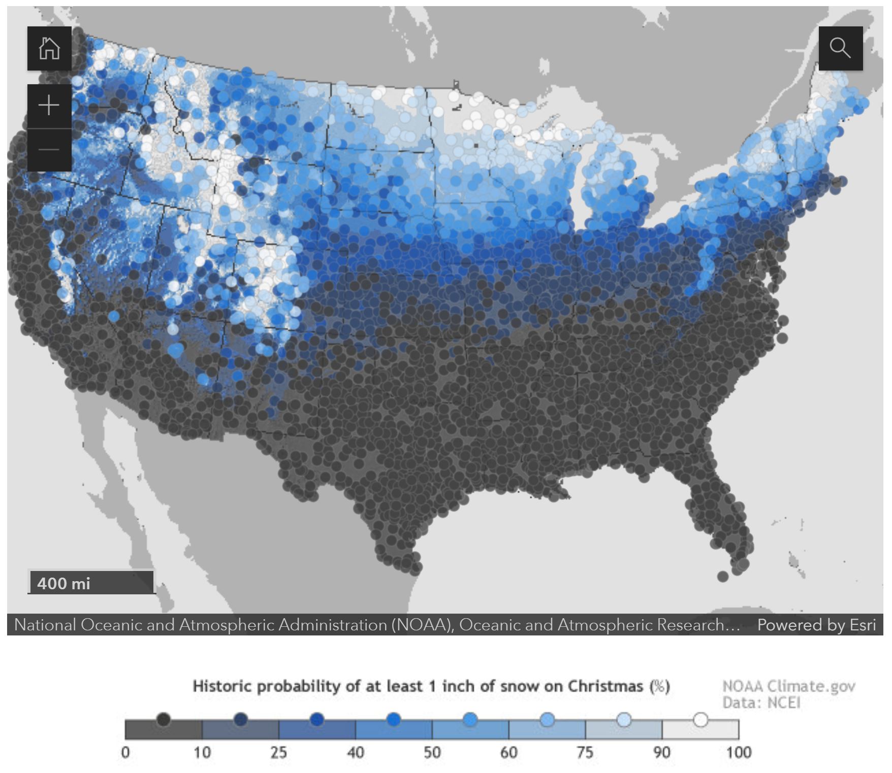
The interactive map on the page allows you to zoom in on a dot and get information about the chance of at least an inch of snow on the ground on Dec 25. Here in Ithaca we have a 51% chance of at least an inch of snow on the ground. The page includes links to other maps and at the bottom there are links to other snow related resources. There is a link to download a spreadsheet of the data which includes the state and location name, along with elevation and the chance of snow. Is there relationship between elevation and snow on Dec 25? This seems like a stats project in the making.