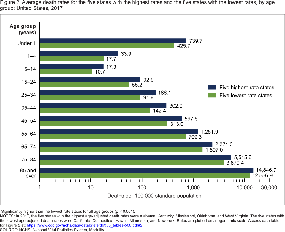
What is the distribution of people by age and race?

The Pew article, The most common age among whites in U.S. is 58, more than double that of racial and ethnic minorities by katherine Schaeffer (7/30/19) provides this graph of the distribution of age by race.

Whites had a median age of 44, meaning that if you lined up all whites in the U.S. from youngest to oldest, the person in the middle would be 44 years old. This compares with a median age of just 31 for minorities and 38 for the U.S. population overall.

U.S. Hispanics were also a notably youthful group, with a median age of 30. As a separate Pew Research Center report noted, Latinos have long been one of the nation’s youngest racial or ethnic groups, dating back to at least 1980.

The demographic differences leads to questions about studies that compare variables by race. If they don’t adjust for these differences they may be inaccurate. In general, a random sample of people will end up with an older cohort for whites and some variables are correlated with age.

How much energy will we use in the future?

The EIA article EIA projects nearly 50% increase in world energy usage by 2050, led by growth in Asia by ARi Kahan (9/24/2019) provides regional energy consumption projections by decade through 2050.  The report includes six other graphs including sources of energy.

With the rapid growth of electricity generation, renewables—including solar, wind, and hydroelectric power—are the fastest-growing energy source between 2018 and 2050, surpassing petroleum and other liquids to become the most used energy source in the Reference case. Worldwide renewable energy consumption increases by 3.1% per year between 2018 and 2050, compared with 0.6% annual growth in petroleum and other liquids, 0.4% growth in coal, and 1.1% annual growth in natural gas consumption.

The eia projects that even with the rapid growth of renewables they will only make up 28% of energy production. There are links to the data.

How is the white working class share of the population changing?

The St. Louis Federal Reserve Bank post The White Working Class: National Trends, Then and Now by Bill Emmons, Ana Kent, and Lowell Ricketts (9/24/2019) looks at the share of the U.S. population for Non-Hispanic White and Hispanic or Minority Race (< 4 year degree) and Non-Hispanic White and Hispanic or Minority Race (at least 4 year degree).

Both the white working class’ share and its absolute numbers are shrinking. In fact, our projections indicate that the white working class will be a minority group by 2034.3 Several trends may help to explain this group’s decline. For example, the shares and numbers of white four-year college graduates (i.e., white grads) and nonwhites are increasing.4

Of course, the shrinking absolute numbers of the white working class also contribute. Other researchers have convincingly argued that increases in “deaths of despair”—including alcohol, drug and other opioid-related deaths, and suicides—have hit middle-aged whites with less than a bachelor’s degree particularly hard.5

The article includes four graphs similar to the one copied here but for the four regions of the U.S. one of which the white working class is no longer the largest group. There are also links to the data.

How closely linked are CO2 and Global Temperature?

The Climate.gov article, If carbon dioxide hits a new high every year, why ins’t every year hotter than the last by Rebecca Lindsey (9/9/19), provides a primer on the carbon dioxide and global temperature link, along with the role of the oceans.

Thanks to the high heat capacity of water and the huge volume of the global oceans, Earth’s surface temperature resists rapid changes. Said another way, some of the excess heat that greenhouse gases force the Earth’s surface to absorb in any given year is hidden for a time by the ocean. This delayed reaction means rising greenhouse gas levels don’t immediately have their full impact on surface temperature. Still, when we step back and look at the big picture, it’s clear the two are tightly connected.

There are nice rate of change statements:

Atmospheric carbon dioxide levels rose by around 20 parts per million over the 7 decades from 1880­–1950, while the temperature increased by an average of 0.04° C per decade.

Over the next 7 decades, however, carbon dioxide climbed nearly 100 ppm (5 times as fast!). . . . At the same time, the rate of warming averaged 0.14° C per decade.

There is another graph, a fun cartoon, and links to the data.

What is in the Income and Poverty 2018 report?

The U.S. Census Bureau report Income and Poverty in the United States: 2018 by Jessica Semega, Melissa Kollar, John Creamer, and Abinash Mohanty (9/10/19) is now available.  A few highlights can be found in the post Pay is Up. Poverty is Down. How Women are Making Strides  by Jessica Semega (9/10/19). For example, the graph copied here is poverty rates for  2917 and 2018 for men, women, and by race for women. In terms of households:

Median incomes of married-couple households and those with male householders did not change from 2017.

In 2018, the poverty rate for families with a female householder was 24.9%, higher than that for married-couple families (4.7%) and families with a male householder (12.7%).

However, the poverty rate for families with a female householder declined from the previous year, at 26.2% in 2017.

The full report contains 20 pages of charts and summaries related to income and poverty by numerous categories. The other 50 or so pages are data tables that are also available in excel files (see links on right sidebar of the report page).  There is ample data here for use in courses.

Is the sun causing climate change?

The NASA post, What is the Sun’s Role in Climate Change (9/6/19) make it clear that the sun isn’t to blame for climate change.

For more than 40 years, satellites have observed the Sun’s energy output, which has gone up or down by only .01 percent during that period. Since 1750, the warming driven by greenhouse gases coming from the human burning of fossil fuels is over 50 times greater than the slight extra warming coming from the Sun itself over that same time interval.

Even a grand minimum won’t help:

Several studies in recent years have looked at the effects that another grand minimum might have on global surface temperatures.2 These studies have suggested that while a grand minimum might cool the planet as much as 0.3 degrees C, this would, at best, slow down (but not reverse) human-caused global warming. There would be a small decline of energy reaching Earth, and just three years of current carbon dioxide concentration growth would make up for it. In addition, the grand minimum would be modest and temporary, with global temperatures quickly rebounding once the event concluded.

Where does NY state rank on energy consumption?

The eia Beta site allows users to choose a state to obtain energy information for that state.  When selecting a state users get data about energy consumption and production, along with other facts.

New York generates about one-third of its electricity from nuclear power plants, and the state includes nuclear power as a zero emissions resource that counts toward New York’s 2040 emissions reduction goals.

New York is the fifth-largest consumer of petroleum among the states, but, in part because almost three-tenths of state residents use public transit to commute to work (more than five times the U.S. average), New Yorkers consume less petroleum per capita than residents of any other state in the nation.

There is a tab for rankings. The graph copied here ranks states based on energy consumption per person. Only one other state, Rhode Island, has a lower energy consumption per capita than NY. Louisiana tops the ranking.

Is there a country where women smoke more than men?

The Our World in Data page Smoking by max Roser and Hannah Ritchie has 19 graph, with data, related to smoking. In general, men smoke more than women except in Nauru (see graph copied here).

Every 5th adult in the world smokes tobacco. But there are large differences between men and women.

More than one-third (35%) of men in the world smoke. Just over 6% of women do. Here is the data for men; here for women.

We see that almost all countries lie above the grey line, meaning a higher share of men smoke. But there are a few exceptions: in the Pacific island-state of Nauru 43% of women smoke compared to 37% of men; and smoking rates in Denmark and Sweden show almost no sex difference.

How different is weekly pay of women and men by race?

The BLS report, Highlights of women’s earning in 2017 has four charts with data about women’s earnings and occupation.  The chart copied her compares men and women by race.

Asian women and men earned more than their White, Black, and Hispanic counterparts in 2017. Among women, Whites ($795) earned 88 percent as much as Asians ($903); Blacks ($657) earned 73 percent; and Hispanics ($603) earned 67 percent. Among men, these earnings differences were even larger: White men ($971) earned 80 percent as much as Asian men ($1,207); Black men ($710) earned 59 percent as much; and Hispanic men ($690), 57 percent. (See chart 3 and table 1.)

Note:

The earnings comparisons in this report are on a broad level and do not control for many factors that can be important in explaining earnings differences, such as job skills and responsibilities, work experience, and specialization.

The BLS is an excellent source for data.