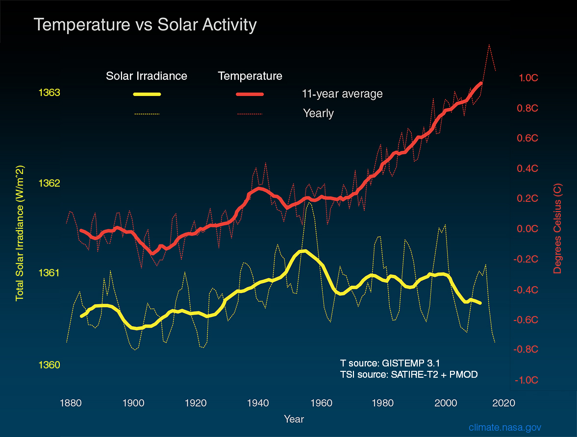
How is wealth accumulated?

The Census Bureau note, Many U.S. Households Do Not Have Biggest Contributors to Wealth: Home Equity and Retirement Accounts by Jonathan Eggleston and Donald Hays (8/27/19), highlights gaps in wealth by household type.

Wealth inequality between homeowners and renters is striking: Homeowners’ median net worth is 80 times larger than renters’ median net worth.

In 2015, 37% of households did not own a home and 47.1% of households did not have a retirement account. This gap in two key assets contributes to wealth inequality.

The chart here comes from the report linked to in the note, New Worth of Households: 2015. For the “typical” household the home accounts for almost 35% of wealth. Two other statistics from the note:

Non-Hispanic white and Asian householders had more household wealth than black and Hispanic householders. Non-Hispanic whites had a median household wealth of $139,300, compared with $12,780 for black householders and $19,990 for Hispanic householders. Asians had a median household wealth of $156,300, which is not statistically different from the estimate for non-Hispanic whites.

Higher education is associated with more wealth. Households in which the most educated member held a bachelor’s degree had a median wealth of $163,700, compared with $38,900 for households where the most educated member had a high school diploma.

The note links to Detailed Tables:2015 which provides extensive demographic information regarding wealth.

How are CEOs doing?

The EPI article, CEO compensation has grown 940% since 1978 by Lawrence Mishel and Julia Wolfe (8/14/2019), summarizes CEO compensation.  Selected Key findings:

Using the stock-options-realized measure, we find that the average compensation for CEOs of the 350 largest U.S. firms was $17.2 million in 2018. Compensation dipped 0.5% in 2018 following a 7.6% gain in 2017.

The fact that CEO compensation has grown far faster than the pay of the top 0.1% of wage earners indicates that CEO compensation growth does not simply reflect a competitive race for skills (the “market for talent”) that also increased the value of highly paid professionals: Rather, the growing differential between CEOs and top 0.1% earners suggests the growth of substantial economic rents in CEO compensation (income not related to a corresponding growth of productivity). CEO compensation appears to reflect not greater productivity of executives but the power of CEOs to extract concessions. Consequently, if CEOs earned less or were taxed more, there would be no adverse impact on the economy’s output or on employment.

Over the last three decades, CEO compensation increased more relative to the pay of other very-high-wage earners than did the wages of college graduates relative to the wages of high school graduates. This finding indicates that the escalation of CEO pay does not simply reflect a more general rise in the returns to education.

There are six tables/graphs in the article and the data is available for download.

How much time do we spend on our phones?

The RescueTime blog post Screen time stats 2019: Here’s how much you use your phone during the workday? by Jory MacKay (3/21/2019) provides data on phone use. Note that

Let’s start with the high-level stats. When we looked at the data of 11,000 users who actively use the RescueTime app, we found that most peopleon average, spend 3 hours and 15 minutes on our phones.

So, the data comes from users of the RescueTime app and even though the sample size is large it is not a random sample. It is an interesting question if this sample of users is under users or over users of their phones. Still, the data is interesting.

And while a recent Deloitte survey found the average American checks their phone 47 times a day, our number was slightly higher. We found that, on average, users check their phones 58 times a day with 30 check-ins happening during working hours (9am–5pm).

Most people spend about 1 minute and 15 seconds on their phone each time they pick them up. This means we’re losing 37.5 minutes a day during working hours to our phones (at a minimum).

The graph copied here is a representation of what those 37.5 minutes may look like.  Why does this matter?

Psychologists have found that even brief mental blocks created by shifting between tasks can cost as much as 40% of your productive time.

And when it comes to our phones especially, it’s not just the switches themselves that interrupt our day, but the expectation of being interrupted.

In fact, a recent study in the Journal of the Association for Consumer Researchfound that even the presence of a turned off smartphone lowered our cognitive performance. In other words, just having your phone around undercuts your ability to do good work.

There are more graphs in the article and plenty of quantitative information for a stats or QL course.

How hot was July 2019?

NOAA’s Global Climate Report – July 2019 notes

The July 2019 global land and ocean surface temperature departure from average was the highest for July since global records began in 1880 at 0.95°C (1.71°F) above the 20th century average. This value surpassed the previous record set in 2016 by 0.03°C (0.05°F). Nine of the 10 warmest Julys have occurred since 2005, with the last five years (2015–2019) ranking among the five warmest Julys on record.

This makes July the hottest month ever. If we consider land-only (oceans absorb much of the warming)

The global land-only surface temperature for July 2019 was 1.23°C (2.21°F) above the 20th century average and was the second highest July temperature in the 140-year record. July 2017 holds the record for the highest July global land-only temperature at +1.24°C (+2.23°F).

The links in the quotes point to the data sets.

What happened with the Climate in 2018?

The NOAA article Reporting on the State of the Climate in 2018 by Jessica Blunden (8/12/19) summarizes key climate markers from 2018 such as

Last year was the fourth warmest year on record despite La Niña conditions early in the year and the lack of a short-term warming El Niño influence until late in the year.

Global sea level was highest on record. For the seventh consecutive year, global average sea level rose to a new record high in 2018 and was about 3.2 inches (8.1 cm) higher than the 1993 average, the year that marks the beginning of the satellite altimeter record.

Glaciers melted around the world. Preliminary data indicate that the world’s most closely tracked glaciers lost mass for the 30th consecutive year. Since 1980, the cumulative loss is the equivalent of slicing 79 feet (24 meters) off the top of the average glacier.

There are a number of graphs and plenty of quantitative information in this article.

What new energy record did the U.S. set?

The eia reports that 44.5 Bcf of natural gas was consumed in the lower 38 on July 19 in their post United States sets new daily record high for natural gas use in the power sector by Katie Dyl (8/5/19).

Higher electricity demand for air conditioning during a heat wave from July 15 through July 22 drove the increased power generation, especially from natural gas-fired generators. Although the highest temperatures occurred during the weekend, most states east of the Rocky Mountains experienced warmer-than-normal weather in the days leading up to the heat wave. From July 16 through July 21, the average maximum temperature exceeded 85°F in most parts of the country.

Note the feedback loop. As the planet warms we use more energy (still mostly fossil fuels) to cool homes  and business (cooling takes more energy than heating) and thus emitting more co2 to warm the planet.  The post has other graphs and links to the data.

How can we find out how much a city may warm?

The BBC Visual and Data Journalism team has posted How much warmer is your city? (7/31/19) The page includes a menu to select a city around the globe to see how January and July temperatures may increase under different scenarios. For example, the graph here is for Washington DC. The page includes animations and reveals information as we scroll down. Other information on the page, for example,

The Indonesian capital (Jakarta), home to 10 million people, is one of the fastest sinking cities in the worldThe northern part of the city is sinking at a rate of 25cm a year in some areas. The dramatic rate is due to a combination of excessive groundwater extraction causing subsidence and sea level rise caused by climate change. A 32km sea wall and 17 artificial islands are being built to protect the city at a cost of $40bn.

There are links to data sources.

Could the earth be cooling?

The NASA article Nope Earth Isn’t Cooling by Alan Buis (7/12/19) is a good primer on short and long term trends as it relates to global climate change. The main graphic (copied here), which is an animation zooming into a short time period and then back to the longer time period, demonstrates the classic misleading graph of selecting only a short time period to view.

So, what’s really important to know about studying global temperature trends, anyway?

Well, to begin with, it’s vital to understand that global surface temperatures are a “noisy” signal, meaning they’re always varying to some degree due to constant interactions between the various components of our complex Earth system (e.g., land, ocean, air, ice). The interplay among these components drive our weather and climate.

For example, Earth’s ocean has a much higher capacity to store heat than our atmosphere does. Thus, even relatively small exchanges of heat between the atmosphere and the ocean can result in significant changes in global surface temperatures. In fact, more than 90 percent of the extra heat from global warming is stored in the ocean. Periodically occurring ocean oscillations, such as El Niño and its cold-water counterpart, La Niña, have significant effects on global weather and can affect global temperatures for a year or two as heat is transferred between the ocean and atmosphere.

This means that understanding global temperature trends requires a long-term perspective. An examination of two famous climate records illustrate this point.

There are two other graphs. Global temp and CO2 can be found on the Calculus Projects page.

How easy is it to understand mass incarceration?

The details of mass incarceration is complicated, but the Prison Policy Initiative report Mass Incarceration: The Whole Pie 2019 by Wendy Sawyer and Peter Wagner (3/19/19) provides an extensive look at the data. The report has over 20 graphs and links to data. A few excerpts:

The American criminal justice system holds almost 2.3 million people in 1,719 state prisons, 109 federal prisons, 1,772 juvenile correctional facilities, 3,163 local jails, and 80 Indian Country jails as well as in military prisons, immigration detention facilities, civil commitment centers, state psychiatric hospitals, and prisons in the U.S. territories.

Every year, over 600,000 people enter prison gates, but people go to jail 10.6 million times each year. Jail churn is particularly high because most people in jails have not been convicted.

People in prison and jail are disproportionately poor compared to the overall U.S. population. The criminal justice system punishes poverty, beginning with the high price of money bail: The median felony bail bond amount ($10,000) is the equivalent of 8 months’ income for the typical detained defendant. As a result, people with low incomes are more likely to face the harms of pretrial detention. Poverty is not only a predictor of incarceration; it is also frequently the outcome, as a criminal record and time spent in prison destroys wealth, creates debt, and decimates job opportunities.

It’s no surprise that people of color — who face much greater rates of poverty — are dramatically over represented in the nation’s prisons and jails. These racial disparities are particularly stark for Black Americans, who make up 40% of the incarcerated population despite representing only 13% of U.S residents. The same is true for women, whose incarceration rates have for decades risen faster than men’s, and who are often behind bars because of financial obstacles such as an inability to pay bail.

Read the whole report for considerably more information and data.

How much energy does the U.S. government consume?

The eia article U.S. government energy consumption continues to decline by Fred Mayes (7/25/19) has a half dozen charts showing U.S. government energy consumption.  For example, the chart copied here provides energy consumption by defense and civilian agencies by type (vehicles/equipment or buildings).

The U.S. federal government consumed 915 trillion British thermal units (Btu) of energy during the 2017 fiscal year (FY), or 20% less than a decade before. The slight decline in FY 2017 marks the fifth consecutive decline in annual federal government consumption.

To put this in some perspective, the eia article In 2018, the United States consumed more energy then ever before by Allen McFarland (4/16/19) shows that the U.S. consumed almost 100 quadrillion BTUs in 2017.

Primary energy consumption in the United States reached a record high of 101.3 quadrillion British thermal units (Btu) in 2018, up 4% from 2017 and 0.3% above the previous record set in 2007.

So, the U.S. government consumes about 1% of overall energy. Both articles have links to the data.